Choosing the perfect paint color can transform any space from ordinary to extraordinary. We know how overwhelming it feels to stand in front of endless color swatches wondering which shade will bring your vision to life. The right paint color doesn’t just cover walls – it sets the mood creates atmosphere and reflects your personal style.
Whether you’re looking to create a cozy bedroom retreat a vibrant living room or a calming bathroom oasis we’ve got you covered. Paint colors have the power to make small rooms feel larger dark spaces brighter and bland areas burst with personality.
We’ll explore trending color palettes timeless classics and bold statement shades that’ll give your home the makeover it deserves. From warm neutrals that never go out of style to dramatic accent walls that steal the show you’ll discover paint color ideas that work for every room and budget.
Neutral Paint Color Ideas for Timeless Appeal
We’ve found that neutral paint colors create the perfect foundation for any home design style. These versatile shades work beautifully across different lighting conditions and complement various furniture pieces and decor elements.
Warm Beiges and Creams
Warm beiges transform living spaces into cozy retreats that feel inviting year round. Benjamin Moore’s “Windham Cream” offers a sophisticated butter tone that pairs beautifully with both modern and traditional furnishings. Sherwin Williams “Accessible Beige” provides the perfect balance of warmth without appearing too yellow in natural light.
Consider these popular warm neutral options for your next project:
- “Natural Linen” by Benjamin Moore creates a soft, spa like atmosphere
- “Balanced Beige” by Sherwin Williams works exceptionally well in open floor plans
- “Creamy” by Sherwin Williams delivers a classic, versatile backdrop for artwork
Cool Grays and Whites
Cool grays create sophisticated spaces that feel fresh and contemporary. “Agreeable Gray” by Sherwin Williams remains our top recommendation for its ability to shift beautifully between warm and cool tones throughout the day. Benjamin Moore’s “Classic Gray” offers a timeless option that complements both bold accent colors and subtle textures.
White paint colors deserve special consideration for their groundbreaking power:
- “Simply White” by Benjamin Moore provides crisp, clean lines without feeling stark
- “Pure White” by Sherwin Williams offers a true white that works in any room
- “Chantilly Lace” by Benjamin Moore creates bright, airy spaces perfect for small rooms
Greige Combinations
Greige paint colors combine the warmth of beige with the sophistication of gray. “Repose Gray” by Sherwin Williams stands out as our most recommended greige for its perfect balance and versatility across different home styles. This trending color family works particularly well in homes with mixed metal finishes and varied wood tones.
- “Balanced Gray” by Benjamin Moore offers subtle warmth with gray undertones
- “Dorian Gray” by Sherwin Williams provides a deeper greige perfect for accent walls
- “Edgecomb Gray” by Benjamin Moore delivers a lighter option ideal for smaller spaces
Bold Paint Color Ideas to Make a Statement
 2")
Ready to move beyond neutrals? We’ll explore daring color choices that transform any room into a captivating focal point.
Deep Jewel Tones
Rich Blues like navy blue or bold sapphire create sophisticated and dramatic spaces that command attention. These deep blue shades work beautifully in dining rooms, bedrooms, and home offices where you want to establish an elegant atmosphere.
Emerald Greens add luxurious appeal to any room while maintaining a timeless quality. Deep green tones pair exceptionally well with brass fixtures, natural wood elements, and cream colored furnishings for a balanced look.
Ruby Reds create warm and inviting atmospheres that make spaces feel cozy and welcoming. Bold red walls work particularly well in entryways, living rooms, and dining areas where you want to encourage conversation and connection.
Vibrant Accent Walls
Vibrant Pinks deliver playful and energetic vibes that instantly brighten any space. Saturated pink walls work best as accent features in bedrooms, home offices, or powder rooms where you can embrace bold creativity.
Sunny Yellows create cheerful and uplifting spaces that boost mood and energy levels. Bright yellow walls make excellent statement pieces in kitchens, breakfast nooks, or children’s playrooms where positivity is essential.
Acidic Greens add fresh and lively feelings to rooms that need an invigorating boost. Bold green accent walls complement natural materials like wood and stone while creating striking visual interest.
Dramatic Dark Colors
Charred Terracotta brings deep, earthy warmth that creates cozy and intimate environments. This rich color works beautifully in living rooms, bedrooms, or reading nooks where you want to establish a grounding presence.
Deep Indigo delivers sophisticated and dramatic appeal similar to navy blue but with added depth. This versatile shade creates stunning backdrops for artwork, photographs, and decorative accessories.
Sherwin Williams Green Black offers the perfect solution for creating dramatic, modern looks in any room. This unique color combines the richness of green with the boldness of black for truly striking results.
| Bold Color Category | Best Room Applications | Key Benefits |
|---|---|---|
| Deep Jewel Tones | Dining rooms, bedrooms, offices | Sophisticated, luxurious appeal |
| Vibrant Accent Walls | Kitchens, powder rooms, playrooms | Energy, creativity, mood enhancement |
| Dramatic Dark Colors | Living rooms, reading nooks, modern spaces | Intimate, grounding, contemporary feel |
Balance these bold paint colors with neutral elements to avoid overwhelming your space. Strategic placement of dramatic shades creates cohesive design statements that reflect your personal style without sacrificing functionality.
Trending Paint Color Ideas for Modern Homes
 4")
Modern homeowners are embracing nature-inspired shades that bring warmth and tranquility to contemporary living spaces. These trending paint colors reflect our growing desire to create homes that feel grounded and connected to the natural industry.
Earth-Inspired Hues
Earth tones dominate 2025’s paint color trends, offering homeowners sophisticated alternatives to stark whites and cool grays. Urbane Bronze and Deep Creek lead the brown color movement, providing rich depth that complements both urban lofts and rustic retreats. These warm shades create cozy atmospheres while maintaining the clean lines essential to modern design.
Breezy blue hues like Gossamer Blue and Palladian Blue capture the essence of coastal living without overwhelming smaller spaces. Pairing these shades with crisp whites or warm wood accents creates visual interest that feels both fresh and timeless. Collections from HGTV Home by Sherwin-Williams feature complementary options including Snowbound, Quietude, and Rocky River for cohesive color schemes.
Benjamin Moore’s Color of the Year, Cinnamon Slate, exemplifies the quietly colorful movement with its unique blend of heathered plum and velvety brown. This sophisticated shade works beautifully as an accent wall or throughout entire rooms seeking subtle drama.
Sage Green Palettes
Sage green emerges as 2025’s most prominent trending color, offering the perfect balance between calming neutrals and natural vibrancy. This versatile shade creates harmonious exterior appearances when paired with earthy tones and soft whites. Interior applications showcase sage green’s ability to transform living rooms, bedrooms, and kitchens into serene retreats.
Homeowners appreciate sage green’s adaptability across various design styles, from minimalist modern to farmhouse chic. The color’s natural undertones complement both warm and cool accent pieces, making it an excellent foundation for evolving decor preferences. Kitchen cabinets painted in sage green create sophisticated focal points that won’t feel dated in years to come.
Terracotta and Clay Tones
Warm terracotta and clay tones bring rustic charm to modern homes while maintaining contemporary sophistication. These earthy shades excel at helping homes blend seamlessly into their natural surroundings, creating inviting exteriors that feel both grounded and welcoming. Interior applications work particularly well in dining rooms and living spaces where cozy atmospheres enhance gathering experiences.
Clay inspired colors from collections like HGTV Home by Sherwin-Williams include Spiced Cider and Nomadic Desert, which offer varying intensities of warm earth tones. These shades pair beautifully with natural materials like wood and stone, reinforcing the connection between indoor and outdoor living spaces that defines modern home design.
Small Space Paint Color Ideas That Maximize Light
 6")
We’ve explored bold statements and trending hues, but small spaces require a different approach to paint color selection. Strategic color choices can transform cramped rooms into bright, airy sanctuaries that feel significantly larger than their actual square footage.
Light Reflective Shades
Off white and white colors serve as the foundation for maximizing natural light in compact spaces. These classic shades reflect available light throughout the room, creating an instant brightening effect that makes walls appear to recede. Benjamin Moore’s Simply White stands out as a top choice for homeowners seeking to amplify natural light without sacrificing warmth.
Light neutral palettes offer versatility while maintaining the brightness essential for small spaces. Shades like gray, taupe, beige, and greige provide subtle warmth without absorbing precious light. These colors create a sophisticated backdrop that allows natural light to bounce freely around the room.
High gloss finishes on painted surfaces can dramatically enhance light reflection. We recommend considering shiny, high gloss paint for floors and trim work to maximize the bouncing of light throughout compact areas.
Monochromatic Schemes
Pale and pastel color combinations create visual continuity that makes small spaces feel more expansive. Painting walls and ceilings in similar light shades produces an airy effect that visually heightens the room’s proportions. This technique eliminates harsh contrasts that can make spaces feel choppy and confined.
Monochromatic neutral approaches using different shades of the same color family establish a sense of openness and flow. Layering various tones of beige, gray, or white creates depth without overwhelming the space. These schemes allow the eye to move smoothly around the room without interruption.
Strategic Color Placement
Accent walls can add personality to small spaces without sacrificing brightness when executed thoughtfully. Bold colors like navy blue, charcoal gray, or deep green work effectively on a single focal wall, creating depth and visual interest while maintaining the room’s overall light feel.
Bright yellows and citrusy hues bring warmth and energy to compact areas when used strategically. These vibrant colors excel as feature wall treatments or cabinet colors, injecting personality without overwhelming the space. Use these energizing shades in moderation to maintain the room’s open feeling.
Floor paint treatments offer an unexpected opportunity to enhance light reflection in small spaces. Applying high gloss finishes to painted floors creates additional surfaces for light to bounce off, contributing to the overall brightness of the room.
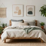
Bedroom Paint Color Ideas for Relaxation
 8")
Creating a peaceful bedroom sanctuary requires thoughtful paint color selection that promotes rest and tranquility. We’ll explore color psychology backed options that transform your sleeping space into a calming retreat.
Calming Blues and Lavenders
Soft blues create the most effective foundation for bedroom relaxation, mimicking the peaceful qualities of clear skies and still waters. These gentle hues actively reduce stress and anxiety levels, making them ideal for promoting restful sleep patterns. We recommend pairing powder blue walls with white trim to maximize the calming effect while maintaining brightness.
Lavender shades combine blue’s serenity with red’s subtle warmth, resulting in a uniquely soothing atmosphere perfect for unwinding. Muted lavender tones work particularly well in bedrooms with eastern exposure, as they soften harsh morning light. Consider using lavender as an accent wall behind your headboard to create a focal point that enhances relaxation without overwhelming the space.
Periwinkle variations offer a lighter alternative that maintains the calming properties of blue while adding gentle sophistication. This versatile shade pairs beautifully with cream colored bedding and natural wood furniture, creating a cohesive design that feels both peaceful and elegant.
Soft Pinks and Peaches
Pastel pink tones foster comfort and nurturing feelings that make bedrooms feel more cozy and inviting. These warm hues create a gentle environment perfect for ending stressful days, particularly when combined with soft lighting and natural textures. We suggest using blush pink on feature walls while keeping remaining walls neutral to prevent color saturation.
Peach shades deliver warmth without overwhelming intensity, making them excellent choices for bedrooms lacking natural light. The subtle orange undertones in peach colors energize the space gently while maintaining the relaxing atmosphere essential for quality sleep. Consider pairing peach walls with white or cream accents to balance the warmth.
Dusty rose variations provide sophisticated alternatives to traditional pink, offering mature elegance that works well in adult bedrooms. These muted tones complement both modern and traditional furniture styles while maintaining the calming properties that promote relaxation. Pair dusty rose with sage green or soft gray accents for a contemporary color scheme.
Muted Earth Tones
Soft brown shades ground bedroom spaces naturally, creating connections to earth elements that promote feelings of stability and peace. These versatile colors work as excellent base tones that complement various accent colors and furniture styles. We recommend using warm taupe or mushroom brown as primary wall colors with lighter trim for contrast.
Warm gray options like Benjamin Moore’s Stone provide clean, contemporary foundations that feel both calming and sophisticated. These neutral tones offer flexibility for changing decor while maintaining a serene atmosphere year round. Consider using different gray tones throughout the room to create subtle depth without disrupting the peaceful ambiance.
Gentle green hues such as Benjamin Moore’s Palest Pistachio connect bedrooms to nature while promoting renewal and balance. These refreshing tones work particularly well in bedrooms with abundant natural light, as they enhance the connection between indoor and outdoor spaces. Pale green walls paired with natural wood elements create harmonious environments that support both relaxation and rejuvenation.
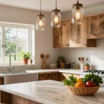
Kitchen Paint Color Ideas That Enhance Functionality
 10")
Kitchen spaces demand paint colors that balance beauty with practicality. Strategic color choices can transform your cooking area into a harmonious blend of style and efficiency.
Classic White Cabinets
Classic white cabinets remain the gold standard for kitchen functionality and timeless appeal. We’ve found they create an incredibly versatile foundation that complements virtually any design style. Off-whites, soft grays, and blues work beautifully as wall colors when paired with white cabinetry. These combinations maximize natural light reflection while maintaining a clean, organized appearance that makes meal preparation more enjoyable.
White cabinets also hide fingerprints and water spots better than darker alternatives. They make small kitchens appear larger and create a neutral backdrop that allows colorful accessories and artwork to shine.
Two-Tone Color Schemes
Two-tone color schemes add sophisticated depth while maintaining kitchen functionality. We recommend using lighter shades for upper cabinets and darker tones for lower ones to create visual balance. Navy blue base cabinets paired with white upper cabinets deliver striking contrast that’s both practical and stylish.
This approach offers several functional benefits beyond aesthetics. Lower cabinets experience more wear from daily use, so darker colors conceal scuffs and stains effectively. Upper cabinets in lighter tones reflect light downward onto work surfaces, improving visibility during food preparation.
Bold Backsplash Coordination
Bold backsplashes serve as functional focal points that enhance both style and practicality. We’ve seen how vibrant red backsplashes energize cooking spaces while calming blue options create soothing work environments. Coordinating your backsplash with cabinet and wall colors creates a cohesive design that supports kitchen workflow.
Strategic backsplash colors can define different kitchen zones effectively. Darker tiles behind cooking areas hide grease splatter, while lighter shades near prep areas reflect task lighting. This thoughtful color coordination ensures your kitchen remains both beautiful and highly functional for daily cooking activities.
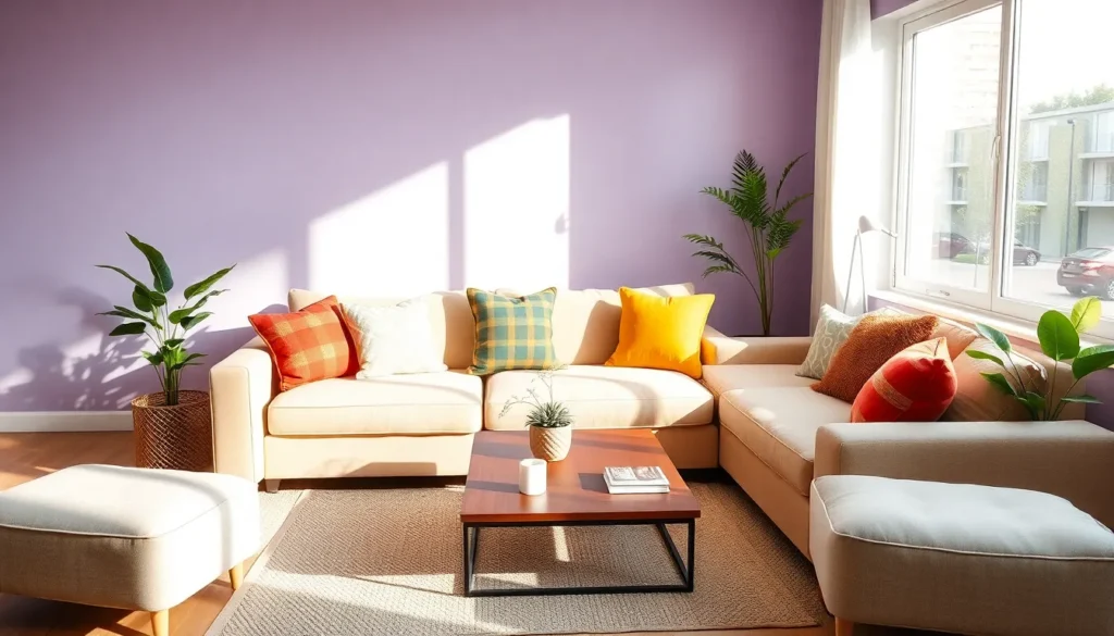
Living Room Paint Color Ideas for Entertaining
 12")
Creating an inviting living room that encourages conversation and connection requires strategic color choices that balance energy with comfort. The right paint colors can transform your space into the perfect entertaining hub for friends and family.
Conversation-Starting Colors
Lilac purple serves as a sophisticated yet playful choice that immediately draws attention and sparks conversation. This unique shade pairs beautifully with tropical accent tones to create an inviting atmosphere that guests will remember long after they leave.
Sunshine yellow brings vibrant energy to your living space while maintaining a cheerful ambiance that naturally encourages social interaction. The warm, sunny quality of this color creates an uplifting environment that makes everyone feel welcome and engaged.
Orange walls create ever-changing visual interest when paired with complementary blue accents throughout your furniture and accessories. This bold color combination establishes a cozy yet inviting space that feels both energetic and comfortable for extended gatherings.
Cozy Warm Tones
Deep brown neutrals like Anonymous by Sherwin-Williams provide an intimate foundation that makes guests feel instantly at home. These rich, earthy tones create a cozy atmosphere perfect for meaningful conversations and relaxed entertaining.
Warm green shades such as Sweater Weather by Sherwin-Williams offer a green-gray tone that adds natural warmth to your living space. This versatile color works exceptionally well in rooms where you want to create a comfortable, welcoming environment for extended socializing.
Sage green walls deliver calming effects while maintaining enough visual interest to keep conversations flowing naturally. This trending color pairs beautifully with warm wood furnishings and neutral textiles to create a balanced, inviting space.
Sophisticated Color Combinations
Black and white schemes add dramatic glamour to your living room while creating a timeless backdrop for entertaining. This classic combination allows your furniture, artwork, and guests to take center stage while maintaining an elegant, sophisticated atmosphere.
Soft purple accents with gray or blue undertones create a luxurious yet cozy environment that feels both upscale and approachable. These subtle color combinations work particularly well when balanced with neutral furniture and metallic accessories.
Vintage blue walls in shades like Twilight or Champion Cobalt evoke nostalgic charm while providing a rich backdrop for entertaining. These deep, sophisticated blues pair beautifully with vintage accents and warm lighting to create an atmosphere that encourages lingering conversations.
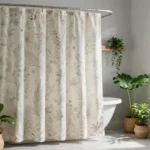
Bathroom Paint Color Ideas That Create Spa-Like Atmosphere
 14")
Transform your bathroom into a serene retreat with carefully chosen paint colors that evoke the tranquility of luxury spas. Calming hues like soft blues, gentle greens, muted pinks, and pale grays create the perfect foundation for your personal sanctuary.
Moisture-Resistant Options
Specially formulated bathroom paints provide the durability needed in high humidity environments. We recommend selecting paints labeled as mildew resistant or high gloss finishes that withstand condensation and moisture damage effectively.
Mold and mildew inhibitors are essential features to look for when choosing bathroom paint colors. These additives ensure longevity and make maintenance significantly easier over time.
Soft beiges and creamy whites work beautifully in moisture resistant formulations while maintaining that spa like atmosphere. Warm neutrals like taupes ground the space with a cozy feel that resists humidity damage.
Gentle greens and muted blues are available in specialized bathroom paint formulas that combine calming aesthetics with practical performance. These nature inspired hues mimic luxury spa environments while protecting your walls.
Bright and Airy Schemes
Light neutrals and soft pastels maximize both natural and artificial light to create an illusion of spaciousness and cleanliness. We’ve found that these colors work particularly well in smaller bathrooms where light reflection is crucial.
White and off white remain classic choices that pair beautifully with subtle accents or textures for added visual interest. These timeless options create a crisp, clean foundation that enhances any bathroom size.
Pale blues and soft grays contribute to a refreshing, open feel that instantly brightens your space. Light greens add a natural element while maintaining that bright, airy quality essential for spa like atmospheres.
Cream tones and warm whites create brightness without the starkness of pure white. These softer alternatives provide warmth while still maximizing light reflection throughout your bathroom.
Luxurious Deep Tones
Jewel toned blues and emeralds create dramatic, high end looks when used on accent walls or in smaller powder rooms. These rich colors add sophistication and depth while maintaining that luxurious spa feeling.
Deep charcoal and navy bring elegance and contemporary appeal to bathroom spaces. We recommend balancing these darker colors with metallic or white elements to prevent the space from feeling heavy.
Rich amethyst and deep teal work exceptionally well for statement walls that create bold contrast. These sophisticated shades offer the perfect backdrop for elegant fixtures and accessories.
Black accent walls provide striking focal points in powder rooms where dramatic impact is desired. Pairing these bold choices with lighter elements creates the perfect balance between luxury and functionality.
Exterior Paint Color Ideas for Curb Appeal
 16")
Your home’s exterior paint creates the first impression visitors receive, making curb appeal crucial for both personal satisfaction and property value.
Classic Combinations
Louisburg Green HC-113 by Benjamin Moore delivers timeless appeal when paired with Castle Peak Gray 1561 for doors and Halo OC-46 for accent details. This nature-inspired palette brings organic warmth to your home’s facade while maintaining sophisticated elegance.
Revere Pewter HC-172 serves as the perfect neutral foundation, especially when combined with Swiss Coffee OC-45 trim and Copley Gray HC-104 accents. This versatile color scheme adapts beautifully to various architectural styles, from colonial to contemporary designs.
Carrington Beige HC-93 creates a welcoming atmosphere with China White OC-141 trim and Lucerne AF-530 accents featuring deep blue undertones. This light neutral combination works exceptionally well with both traditional and transitional home styles.
Modern Monochromatic Looks
Stormy Gray dominates contemporary exterior design when paired with crisp white or charcoal detailing. This coordinated approach creates visual cohesion while allowing architectural features to shine through strategic contrast.
Flagstone offers a sophisticated light blue tone that captures coastal living essence. Combine this shade with stormy gray elements and crisp white trim to achieve a fresh, maritime-inspired aesthetic perfect for modern homes.
Accent Color Coordination
Autumn Red transforms your exterior with smoky red tones complemented by crisp white detailing around windows and eaves. This striking combination creates dramatic focal points while maintaining classic appeal.
Snow (Opal Exterior) pairs beautifully with light-colored roofing and crisp white trim, enhanced by strategic red accents throughout the design. This fresh combination brightens your home’s appearance while adding visual interest.
Red accent elements including front porch cushions, doorway treatments, and planted containers provide vibrant pops of color. These strategic additions enhance your home’s curb appeal without overwhelming the primary color palette.
Seasonal Paint Color Ideas to Refresh Your Space
 18")
Transform your home throughout the year with paint colors that capture each season’s unique energy and mood. We’ve curated seasonal palettes that’ll help you create the perfect atmosphere for every time of year.
Spring-Inspired Pastels
Soft peach brings warmth and renewal to any room, evoking the gentle feelings of springtime awakening. This delicate hue works beautifully in bedrooms and dining areas where you want to create an inviting, nurturing atmosphere.
Lilac adds elegant sophistication with its pastel purple tones that feel fresh yet refined. We recommend using this delicate shade in powder rooms, reading nooks, or as an accent wall in master bedrooms for a touch of understated luxury.
Mint green captures the essence of new spring foliage while maintaining a calming, refreshing quality. This versatile color works exceptionally well in kitchens, bathrooms, and home offices where you need both energy and tranquility.
Summer Bright Combinations
Coral and white creates vibrant energy that perfectly captures summer’s playful spirit. Pair coral accent walls with crisp white trim and furniture to achieve a lively yet balanced look that works in living rooms and children’s spaces.
Turquoise and yellow delivers bold personality through this unexpected combination that radiates warmth and joy. Use turquoise as your primary wall color with yellow accents in throw pillows, artwork, and decorative elements for maximum impact.
Sea salt offers a soothing light blue green that recalls ocean breezes and coastal living. This calming shade works beautifully in bedrooms, bathrooms, and any space where you want to create a serene retreat from summer heat.
Fall and Winter Cozy Hues
Warm beige provides the perfect neutral foundation for fall and winter interiors that need comfort and sophistication. This versatile shade complements rich textures, warm lighting, and seasonal decor while maintaining timeless appeal.
Cinnamon Slate, Benjamin Moore’s 2025 Color of the Year, blends plum and brown tones to create the ultimate cozy winter atmosphere. This sophisticated shade works beautifully in living rooms, dining areas, and bedrooms where you want to embrace seasonal warmth.
Rich burgundy from BEHR’s 2025 trends adds deep, luxurious warmth that transforms any room into an inviting sanctuary. Use this dramatic color on accent walls or in formal spaces where you want to create intimate, elegant environments.
Cedar, BEHR’s Exterior Stain Color of the Year, brings natural cedarwood inspiration to outdoor spaces and covered porches. This warm, earthy hue connects your home’s exterior to nature while providing year round appeal.
Convivial Yellow and Spiced Cider from HGTV Home by Sherwin Williams’ 2025 collection deliver warmth and energy perfect for fall and winter interiors. These colors work beautifully in kitchens, family rooms, and entryways where you want to create welcoming, energetic spaces.
Conclusion
We’ve covered an extensive range of paint color options to help you create the perfect atmosphere in every room of your home. From timeless neutrals that provide versatile foundations to bold statement colors that express your personality these ideas offer something for every style and budget.
Remember that the right paint color can completely transform your space whether you’re working with a cozy bedroom or maximizing light in a small room. Don’t be afraid to experiment with trending nature-inspired hues or seasonal palettes that keep your home feeling fresh throughout the year.
Your paint choices should reflect both your personal taste and the functionality of each space. With these comprehensive color ideas and expert tips you’re ready to tackle your next painting project with confidence and create the home you’ve always envisioned.
Frequently Asked Questions
What are the best neutral paint colors for a timeless look?
Neutral colors like Benjamin Moore’s “Windham Cream,” Sherwin Williams’ “Accessible Beige,” and “Agreeable Gray” are excellent choices. These versatile shades serve as a foundation for any design style, with warm beiges creating cozy spaces and cool grays offering contemporary appeal. Greige combinations like “Repose Gray” blend warmth and sophistication perfectly.
How can I make a small room look bigger with paint?
Use light reflective shades like off-whites and light neutrals to amplify natural light and create spaciousness. Consider high-gloss finishes to enhance light reflection and monochromatic schemes with pale colors for visual continuity. Strategic accent walls with bright hues can add personality without overwhelming the space.
What are the trending paint colors for 2025?
Nature-inspired earth tones dominate 2025 trends, including Urbane Bronze and Deep Creek. Benjamin Moore’s Color of the Year, Cinnamon Slate, leads the “quietly colorful” movement. Sage green, breezy blues like Gossamer Blue, and warm terracotta tones are also popular for bringing natural tranquility indoors.
Which paint colors work best for bedrooms?
Calming blues and soft lavenders promote relaxation and better sleep. Pastel pinks and peaches create cozy, inviting atmospheres, while muted earth tones like warm taupe provide grounding. Gentle greens connect you to nature and enhance the bedroom’s peaceful ambiance for optimal rest.
How do I choose kitchen paint colors for functionality?
Classic white cabinets maximize natural light and maintain a clean appearance. Two-tone color schemes offer visual balance and practicality. Consider bold backsplashes as functional focal points, and use strategic color coordination to define different kitchen zones while balancing beauty with everyday functionality.
What paint colors create the best living room atmosphere?
Conversation-starting colors like lilac purple and sunshine yellow create engaging environments for entertaining. Cozy warm tones such as deep brown neutrals and warm greens provide comfort. Sophisticated combinations like classic black and white or vintage blue walls add elegance and charm to your living space.
How can I create a spa-like bathroom with paint?
Use calming hues like soft blues, gentle greens, muted pinks, and pale grays for tranquility. Choose moisture-resistant paints with mildew-resistant labels and high-gloss finishes for durability. Light neutrals maximize brightness, while luxurious deep jewel tones like emerald add sophisticated spa-like ambiance.
What exterior paint colors boost curb appeal?
Classic combinations like Louisburg Green with Castle Peak Gray create timeless appeal. Modern monochromatic looks using Stormy Gray with crisp white detailing offer contemporary style. Accent colors like Autumn Red provide striking focal points while maintaining cohesive aesthetics that enhance property value and first impressions.
How often should I change paint colors seasonally?
Seasonal updates can refresh your space throughout the year. Spring calls for soft peach, lilac, and mint green. Summer benefits from coral and turquoise energy. Fall and winter work well with warm beige, Cinnamon Slate, and rich burgundy for cozy atmospheres that match each season’s mood.
What’s the difference between bold and statement paint colors?
Bold colors include deep jewel tones like rich blues and emerald greens that create sophisticated drama. Statement colors are vibrant accent walls in pink, yellow, or acidic green that add playful energy. Both should be balanced with neutral elements to maintain functionality while expressing personal style.