We’ve all stood in our living rooms wondering how a simple color change could transform the entire space. The right paint color doesn’t just cover walls – it sets the mood creates atmosphere and reflects our personal style in ways we never imagined possible.
Choosing living room colors can feel overwhelming with endless options from warm neutrals to bold statement hues. We understand that this central gathering space needs to work for relaxation entertainment and daily life which makes the color decision even more crucial.
Whether you’re drawn to timeless classics or trending palettes we’ll explore color combinations that enhance natural light complement your furniture and create the perfect backdrop for your lifestyle. From cozy earth tones to dramatic accent walls these ideas will help you discover the groundbreaking power of the right living room color scheme.
Neutral Tones for Timeless Elegance
Neutral living room colors create sophisticated spaces that never go out of style. These versatile shades provide the perfect foundation for any decorating approach while maintaining long-term appeal.
Warm Beiges and Creams
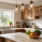
Beige creates welcoming atmospheres that instantly make guests feel comfortable in your living space. We recommend shades like mushroom, oatmeal, and champagne for walls that complement both traditional and contemporary furniture styles. Cream colors work beautifully as accent walls behind entertainment centers or fireplaces, adding depth without overwhelming the room.
Temperature balance matters when selecting warm neutrals for different lighting conditions. North-facing rooms benefit from warmer beiges like honey or camel to counteract cool natural light, while south-facing spaces can handle cooler cream tones. We’ve found that layering different cream shades through throw pillows, curtains, and area rugs creates visual interest while maintaining the cohesive neutral palette.
Cool Grays and Whites
Gray offers incredible versatility as a living room base color that pairs well with virtually any accent shade. We suggest charcoal gray for feature walls that create dramatic focal points, while lighter grays like dove or silver work perfectly for entire room transformations. White trim and molding against gray walls creates crisp architectural definition that enhances room proportions.
White paint reflects maximum light to make smaller living rooms appear more spacious and airy. Pure white works best in modern homes with clean lines, while off-white shades like ivory or pearl complement traditional decor styles. We recommend testing white paint samples in different lighting throughout the day since undertones can shift from cool blue to warm yellow depending on natural light exposure.
Soft Taupe Combinations
Taupe blends the best qualities of both beige and gray to create sophisticated neutral backgrounds. We love using greige (gray-beige) combinations that provide warmth without appearing too yellow or pink in different lighting conditions. Soft taupe walls pair beautifully with white ceilings and darker wood furniture for balanced contrast.
Layering taupe shades creates depth and visual texture without requiring bold color commitments. We suggest painting walls in light taupe while using deeper taupe shades for window treatments and upholstery to establish cohesive color flow. Stone-inspired taupes like mushroom and linen work especially well in living rooms with natural materials like wood beams or stone fireplaces.
Bold Accent Walls for Statement Making

Transform your living room with dramatic focal points that command attention and create visual interest throughout the space.
Deep Navy Blue Features
Navy blue accent walls add sophisticated elegance that elevates any living room design. We recommend choosing one statement wall to showcase this rich color while keeping remaining walls in neutral tones like beige or gray for perfect balance. This classic combination creates a timeless look that pairs beautifully with both modern and traditional furniture pieces.
Position your navy accent wall behind your main seating area or entertainment center to establish a natural focal point. The deep hue works exceptionally well in rooms with abundant natural light, preventing the space from feeling too enclosed. Consider incorporating white or cream trim around windows and doors to create striking contrast against the navy backdrop.
Rich Emerald Green Highlights
Emerald green brings vibrant energy and natural sophistication to living spaces when used strategically. We suggest applying this bold color to a single accent wall to avoid overwhelming your room’s overall aesthetic. The rich jewel tone pairs beautifully with gold accents, brass fixtures, and warm wood furniture for a luxurious atmosphere.
Target the wall behind your sofa or fireplace for maximum visual impact without dominating the entire space. This approach allows you to enjoy the color’s dramatic effect while maintaining balance with lighter complementary shades. Emerald green works particularly well in rooms with white or cream base colors, creating a fresh and inviting contrast.
Dramatic Charcoal Black Elements
Charcoal black creates stunning depth and contemporary contrast in modern living rooms. We recommend using this dramatic shade for accent walls rather than entire room coverage to maintain brightness and visual balance. The sophisticated color works beautifully with metallic accents, white furniture, and colorful artwork for striking visual interest.
Focus on architectural features like built-in shelving, fireplace surrounds, or media walls when incorporating charcoal black elements. This strategic placement adds definition without making your space feel cramped or dark. Consider pairing charcoal accents with warm lighting fixtures and light-colored furnishings to create a balanced and inviting atmosphere that feels both bold and welcoming.
Warm Earth Tones for Cozy Atmospheres

Earth tones bring natural warmth to living rooms while creating inviting spaces that feel grounded and comfortable. These colors work beautifully with both traditional and contemporary furniture styles.
Terracotta and Rust Shades
Terracotta walls instantly transform any living room into a warm, earthy sanctuary that feels both sophisticated and welcoming. Paint one accent wall in terracotta to create a stunning focal point without overwhelming your space with color. Rust colored throw pillows and blankets add depth to neutral furniture while maintaining the earthy theme throughout your room.
Stone and brick elements pair naturally with terracotta shades to create a cohesive design that feels authentically grounded. Wicker baskets and rattan furniture complement these warm tones while adding natural textures that enhance the cozy atmosphere. Terracotta vases filled with dried grasses or pampas create beautiful decorative accents that reinforce the earthy color palette.
Warm Brown and Chocolate Hues
Chocolate brown sofas anchor your living room with rich, inviting tones that create an instantly cozy atmosphere. Oak and pine wood furniture pieces complement chocolate hues while adding natural warmth through their grain patterns and organic textures. Warm brown area rugs ground your seating arrangement and define the conversation area within larger open floor plans.
Plush throw blankets in cream and beige soften the intensity of chocolate furniture while maintaining the warm color story. Coffee tables in walnut or mahogany finishes echo the brown theme without creating monotonous color repetition. Brown leather accent chairs add sophisticated texture while reinforcing the rich, earthy atmosphere you’re creating.
Golden Ochre Accents
Golden ochre decorative items bring sunny warmth to living rooms without requiring major paint commitments or furniture changes. Wall art featuring ochre tones creates visual interest against beige and cream backgrounds while maintaining a cohesive neutral palette. Accent pillows in golden ochre instantly refresh existing furniture and can be easily switched out with seasonal changes.
Woven baskets in natural fibers complement ochre accents while adding functional storage that enhances your room’s organized appearance. Table lamps with ochre colored shades create warm ambient lighting that makes evenings feel more intimate and welcoming. Ceramic vases in golden ochre tones serve as beautiful focal points on coffee tables and side tables throughout your living space.
Cool Blues and Greens for Calming Spaces

Cool blues and greens create the perfect balance between tranquility and natural comfort in living rooms. These hues combine blue’s naturally soothing properties with green’s harmonious, earth-connected energy to transform any space into a peaceful retreat.
Soft Powder Blue Palettes
Soft powder blue walls instantly create an airy, serene atmosphere that enhances natural light throughout your living room. These light, versatile shades work beautifully with neutral accents like cream cushions, white trim, and natural wood furniture to establish a peaceful backdrop. Pastel blue tones transform ordinary walls into calming focal points that encourage relaxation after long days.
We recommend pairing powder blue with soft whites and warm beiges to maintain the gentle, cozy feeling these shades naturally provide. Light blue schemes create spacious feelings in smaller rooms while adding sophisticated color without overwhelming your existing decor.
Sage Green Color Schemes
Sage green brings muted, earthy elegance into living spaces with its gentle, natural tone that harmonizes effortlessly with both warm and cool color palettes. This sophisticated shade creates peaceful ambiance when paired with soft furnishings like linen throws, woven baskets, and natural texture elements. Sage walls foster balance and calm while maintaining enough color interest to avoid bland, uninspiring rooms.
Designers often combine sage green with cream accents, natural wood tones, and soft gray textiles to emphasize the color’s organic, grounding qualities. This versatile hue works particularly well in rooms with abundant natural light, where its subtle variations create depth throughout different times of day.
Seafoam and Mint Combinations
Seafoam and mint greens offer fresh, light alternatives that brighten living rooms with their subtle blue undertones and vibrant yet restful energy. These coastal inspired shades evoke garden like feelings while adding personality without creating overwhelming visual impact. Mint walls paired with white trim and soft gray furniture create airy, rejuvenating spaces perfect for both relaxation and entertaining.
We suggest combining seafoam with crisp whites, natural textures, and light wood accents to enhance the refreshing, spa like atmosphere these colors naturally create. These ever-changing blue green mixtures change beautifully with different lighting conditions, offering mood shifting effects similar to iconic shades like Farrow & Ball’s Inchyra Blue throughout your daily routine.
Sophisticated Jewel Tones for Luxury Appeal

Jewel tones bring precious gemstone inspiration to living room design, creating spaces that feel both luxurious and inviting. These rich, vibrant colors add depth and personality while maintaining sophisticated appeal.
Deep Purple and Plum Shades
Deep purple tones transform ordinary living rooms into warm, elegant retreats that feel intimate and welcoming. Amethyst purple creates a soothing atmosphere that’s perfect for relaxation and conversation areas. We recommend using these colors on accent walls or through upholstery to avoid overwhelming the space.
Plum shades offer versatility that works beautifully with both modern and traditional furniture styles. Rich plum accent pieces like throw pillows, curtains, or area rugs add warmth without requiring major room changes. These colors create cozy environments that feel sophisticated rather than dark.
Rich Burgundy and Wine Colors
Burgundy brings passionate energy to living spaces while maintaining refined elegance that guests notice immediately. Wine colored walls create dramatic focal points when paired with neutral furnishings and metallic accents. We suggest incorporating these deep red shades through statement furniture pieces or luxurious fabric choices.
Rich burgundy upholstery on sofas or armchairs creates anchor points that ground the entire room’s color scheme. Wine tones work exceptionally well with gold and brass hardware, creating combinations that feel expensive and thoughtfully curated. These colors add depth and luxury without appearing overwhelming in well lit spaces.
Sapphire and Cobalt Blue Options
Sapphire blue creates serene atmospheres reminiscent of clear night skies, bringing calming energy to busy living areas. Cobalt blue walls make stunning backdrops for artwork and photographs while maintaining fresh, contemporary appeal. We recommend balancing these bold blues with neutral tones to prevent the space from feeling too intense.
Cool blue jewel tones enhance natural light during daytime hours while creating cozy environments in evening settings. Sapphire accents through decorative objects, lighting fixtures, or textile choices add refreshing elements without major renovation commitments. These blues work particularly well in rooms with white or cream colored furniture, creating elegant contrasts that feel both timeless and current.
Monochromatic Schemes for Modern Minimalism

Monochromatic color schemes offer the perfect foundation for achieving modern minimalist aesthetics in living rooms. We’ll explore how single-color palettes create sophisticated spaces that emphasize clean lines and uncluttered design.
All-White Contemporary Looks
All-white contemporary schemes create sleek, modern looks that emphasize cleanliness and simplicity. We recommend layering different shades of white to add visual interest without compromising the minimalist aesthetic. Pure whites work beautifully on walls, while cream and ivory tones can be incorporated through furniture and textiles.
Texture becomes crucial in all-white spaces since we’re working within a single color family. Mixing matte and glossy finishes helps create depth and prevents the room from feeling flat. Natural materials like white oak flooring or linen upholstery add warmth to the crisp palette.
Lighting plays a important role in all-white living rooms, as different light sources can reveal subtle undertones. We suggest testing white paint samples throughout the day to ensure they maintain their desired appearance under various lighting conditions.
Tonal Gray Variations
Tonal gray variations offer sophisticated alternatives to all-white schemes while maintaining monochromatic elegance. We can create depth by using light gray on walls and incorporating charcoal gray through accent pieces or furniture. This approach adds visual interest without breaking the single-color rule.
Different gray undertones provide opportunities for subtle variation within the monochromatic scheme. Cool grays with blue undertones work well in rooms with abundant natural light, while warm grays with beige undertones suit spaces with limited daylight.
Metallic accents complement gray monochromatic schemes beautifully, with brushed nickel and stainless steel fixtures improving the modern aesthetic. We recommend limiting metallic finishes to one type throughout the space for maximum cohesion.
Single-Color Gradient Effects
Single-color gradient effects create gradual transitions from light to dark within one color family. We can achieve dramatic visual impact by starting with pale blue on one wall and gradually deepening to navy across the room. This technique visually expands or contracts spaces depending on the gradient direction.
Gradient schemes work particularly well with blues, greens, and neutrals like beige or gray. Starting with the lightest shade on the largest wall and progressing to deeper tones on smaller surfaces creates balanced proportions. This method helps define different zones within open-concept living spaces.
Professional execution requires careful color matching to ensure smooth transitions between shades. We suggest purchasing paint samples from the same color family and testing them in natural light before committing to the full gradient effect.
Color Psychology Considerations for Room Mood

Understanding how colors affect our emotions helps us make smarter decisions when choosing living room palettes. We’ll explore how different color families influence mood and behavior to create the perfect atmosphere for your space.
Energizing Warm Color Impacts
Red stimulates the senses and raises both heart rate and blood pressure, making it perfect for creating ever-changing conversation areas. This powerful hue can invigorate your living room but we recommend using it sparingly since overuse may create feelings of urgency or intensity. Orange promotes creativity and social interaction, transforming your space into a lively gathering hub that encourages connection among family and guests.
Yellow brightens spaces with its association to happiness and positivity, creating a cheerful and welcoming atmosphere throughout your room. This sunny hue works exceptionally well in north-facing rooms that need extra warmth. Combining warm colors like terracotta with golden accents can amplify the energizing effects while maintaining sophistication.
Relaxing Cool Color Benefits
Blue frequently links to tranquility and contentment, with studies showing it can reduce stress levels and promote restfulness in living spaces. This calming color works particularly well for rooms where you’ll spend quiet evenings reading or watching movies. Green reminds us of nature and offers a sense of serenity that supports mental health and overall wellbeing.
Sage and seafoam greens create garden-like atmospheres that feel both refreshing and grounding. Purple adds spiritual or soothing undertones, especially when used in lighter lavender shades that complement neutral furniture. Cool colors encourage mental clarity and help balance the energy in multipurpose living rooms that serve both active and restful functions.
Balanced Neutral Color Effects
White conveys purity and cleanliness while making spaces feel open and airy, creating the perfect foundation for any design style. This versatile color reflects natural light beautifully and allows your furniture and artwork to take center stage. Beige and gray provide calming backdrops that balance bolder accent colors while helping to ground the overall mood of your room.
Greige combinations offer sophisticated backgrounds that pair effortlessly with various decor styles from modern to traditional. Neutral tones create lasting designs that won’t feel outdated in a few years, making them smart investment choices for major renovations. These flexible colors allow easy updates through accessories or accent pieces while maintaining a harmonious environment that adapts to changing seasons and trends.
Seasonal Color Trends for Year-Round Style

We’ll explore how changing colors throughout the year can keep your living room feeling fresh and connected to the natural industry around us.
Spring Fresh Color Palettes
Pastel hues transform living rooms into airy sanctuaries that mirror the season’s gentle awakening. Soft pink walls create romantic backdrops that pair beautifully with white trim and natural wood furniture. Baby blue accents through throw pillows and artwork evoke clear spring skies while maintaining a serene atmosphere. Pale yellow cushions and curtains infuse spaces with subtle sunshine without overwhelming neutral color schemes.
Nature inspired greens bring the outdoors inside with refreshing vitality that energizes any living space. Mint green accent walls create spa like environments that promote relaxation and mental clarity. Sage green upholstery and decorative accessories offer sophisticated earth tones that complement both modern and traditional furniture styles. Moss green throws and area rugs establish grounding elements that connect interior spaces to spring’s natural renewal.
Summer Bright Color Schemes
Vibrant corals energize living rooms with warmth that reflects summer’s passionate intensity and social energy. Coral painted feature walls create stunning focal points that pair perfectly with crisp white furniture and natural textures. Statement coral sofas anchor seating areas while maintaining balance through neutral wall colors and wooden accents. Coral decorative pillows and artwork add pops of color that can easily transition between seasons.
Ocean blues provide cooling relief that captures summer’s refreshing coastal atmosphere in any living space. Light blue walls reminiscent of tropical waters create expansive feelings that make smaller rooms appear larger. Turquoise accent pieces and ceramics bring beachside tranquility to urban environments without requiring major renovations. Navy blue throw blankets and curtains add depth while maintaining the ocean inspired theme throughout summer months.
Autumn Warm Color Combinations
Rich earth tones create cozy atmospheres that embrace autumn’s comforting warmth and natural beauty. Terracotta walls establish sophisticated focal points that complement leather furniture and wooden architectural details. Ochre accent pieces and textiles bring golden harvested field colors into contemporary living spaces. Sienna colored area rugs and throw pillows anchor seating arrangements while reflecting the season’s rich natural palette.
Deep berry shades add luxurious depth that mirrors autumn’s dramatic foliage and creates intimate gathering spaces. Burgundy accent walls provide elegant backdrops for artwork while maintaining sophisticated color balance throughout the room. Plum colored upholstery and curtains create rich focal points that pair beautifully with neutral walls and metallic accents. Wine colored decorative accessories bring autumn’s passionate energy into living spaces without overwhelming existing color schemes.
Winter Cool Color Ideas
Frosted whites create serene winter sanctuaries that mimic snow’s peaceful tranquility and promote restful relaxation. Pure white walls reflect natural light beautifully while creating clean backdrops for colorful artwork and furniture pieces. Cream colored textiles and upholstery add warmth to all white schemes without disrupting the season’s minimalist aesthetic. Off white accent pieces provide subtle variation that prevents stark white rooms from feeling cold or unwelcoming.
Deep blues establish calming winter retreats that reflect the season’s contemplative mood and starlit evenings. Midnight blue feature walls create dramatic focal points that make rooms feel intimate and sophisticated during long winter nights. Navy blue furniture and textiles anchor living spaces while maintaining connection to winter’s deep sky colors. Steel blue decorative elements and artwork bring icy elegance that complements both modern and traditional design styles.
Lighting Considerations for Color Choice Success

We can’t discuss living room colors without understanding how lighting transforms their appearance throughout the day. The interplay between natural and artificial light sources dramatically affects how colors look and feel in our spaces.
Natural Light Impact on Colors
Natural light changes our color perception dynamically as the sun moves across the sky and weather conditions shift. Windows flood our rooms with varying intensities of sunlight that can make colors appear brighter or more muted depending on the time and atmospheric conditions.
South-facing rooms receive abundant warm daylight that makes pale or soft colors appear spacious and vibrant throughout most of the day. This consistent natural illumination creates ideal conditions for experimenting with lighter color palettes that might appear washed out in dimmer spaces.
Colors shift subtly as morning light gives way to afternoon sun, then evening shadows. These natural transitions affect how we experience our chosen paint colors, making some appear richer during golden hour while others may seem cooler under overcast skies.
Artificial Lighting Effects
Artificial lighting dramatically alters wall and decor colors depending on the color temperature we choose for our fixtures. Warm artificial light with temperatures between 2700K and 3000K enhances reds, oranges, and browns, making them appear deeper and richer against our walls.
Cool lighting temperatures ranging from 3500K to 6500K make blues and grays pop while creating cleaner, crisper appearances that work perfectly with modern decor styles. This cooler artificial light complements contemporary color schemes featuring whites and cool-toned grays.
| Lighting Type | Color Temperature | Best Color Matches | Effect on Colors |
|---|---|---|---|
| Warm artificial | 2700K-3000K | Reds, oranges, browns | Deeper, richer appearance |
| Cool artificial | 3500K-6500K | Blues, grays, whites | Cleaner, crisper look |
| Ambient lighting | 10-20 lumens/sq ft | All color palettes | General room illumination |
| Task lighting | 30-40 lumens/sq ft | Accent colors | Focused color enhancement |
Adjusting lumens for ambient lighting (10-20 lumens per square foot) and task lighting (30-40 lumens per square foot) helps us achieve the desired functionality while maintaining our chosen color’s integrity.
Room Orientation Influences
Room orientation determines the quality and intensity of sunlight our living spaces receive throughout the day. South-facing rooms benefit from consistent warm light that makes color selection easier and more forgiving for most paint choices.
North-facing rooms feature cooler, indirect light that often requires lighter or warmer colors to compensate for the lack of natural warmth. These spaces benefit from colors that can brighten the room and create a welcoming atmosphere even though limited direct sunlight.
East-facing rooms capture gentle morning light that gradually shifts throughout the day, while west-facing rooms endure intense afternoon sun that can wash out certain colors or make others appear overly saturated. Understanding these patterns helps us select colors that look balanced regardless of the time of day.
Conclusion
We’ve explored countless possibilities for transforming your living room through thoughtful color choices. From timeless neutrals to bold jewel tones each palette offers unique opportunities to express your personal style while creating the perfect atmosphere for your space.
Remember that lighting plays a crucial role in how colors appear throughout the day. We recommend testing paint samples in different lighting conditions before making your final decision. This simple step can save you from costly mistakes and ensure your chosen colors look stunning at all hours.
Your living room should reflect who you are while providing comfort for daily life. Whether you’re drawn to seasonal color changes or prefer a consistent monochromatic scheme there’s a perfect palette waiting to bring your vision to life. Trust your instincts and don’t be afraid to experiment with colors that speak to you.
Frequently Asked Questions
How does paint color affect the mood of a living room?
Paint colors significantly influence the emotional atmosphere of your living room. Warm colors like red, orange, and yellow create energizing, social environments that stimulate conversation and creativity. Cool colors such as blue and green promote relaxation, tranquility, and mental clarity. Neutral tones provide balanced, versatile backdrops that adapt to different moods and decorating styles.
What are the best neutral paint colors for living rooms?
The most versatile neutral colors include warm beiges like mushroom and oatmeal, which create welcoming atmospheres. Cool grays and whites offer timeless elegance, with charcoal gray perfect for dramatic accent walls. Greige (gray-beige) combinations provide sophisticated backgrounds that complement various decor styles while maintaining warmth and depth.
Should I paint an accent wall in my living room?
Accent walls can transform your living room by adding visual interest and depth. Deep navy blue creates sophisticated focal points when paired with neutral tones. Rich emerald green brings vibrant energy without overwhelming the space. Dramatic charcoal black adds contemporary contrast while maintaining room brightness. Choose one wall to avoid visual chaos.
How do I choose colors that work well with natural light?
Consider your room’s orientation when selecting colors. South-facing rooms receive warm daylight and can handle cooler color palettes. North-facing rooms benefit from warmer, lighter colors to compensate for cooler natural light. East and west-facing rooms experience changing light throughout the day, making neutral and adaptable colors ideal choices.
What colors make a living room feel larger?
Light, cool colors make spaces appear larger and more open. Soft whites, pale grays, and powder blues reflect light and create airy atmospheres. Monochromatic schemes using varying shades of the same color also expand visual space. Avoid dark colors on all walls, but consider using them strategically on single accent walls for depth.
How can I incorporate seasonal colors into my living room?
Use seasonal accessories and accent pieces to refresh your space throughout the year. Spring calls for pastel hues and nature-inspired greens. Summer embraces vibrant corals and ocean blues. Autumn features rich earth tones and deep berry shades. Winter incorporates frosted whites and deep blues. Change pillows, throws, and artwork seasonally.
What’s the difference between warm and cool paint colors?
Warm colors contain red, orange, or yellow undertones and create cozy, energetic atmospheres. Examples include terracotta, rust, and golden ochre. Cool colors have blue, green, or purple undertones and promote calm, relaxing environments. Examples include sage green, powder blue, and seafoam. Understanding undertones helps create desired moods.
How do I create a monochromatic color scheme?
Monochromatic schemes use varying shades, tints, and tones of a single color family. Layer different intensities of your chosen color through walls, furniture, and accessories. Add texture through fabrics, finishes, and materials to prevent monotony. Incorporate metallic accents for sophistication. This approach creates cohesive, modern, and visually calming spaces.
What role does artificial lighting play in paint color choice?
Artificial lighting dramatically affects how paint colors appear. Warm LED bulbs enhance reds and yellows while muting blues and greens. Cool LED lights intensify blues and greens but can make warm colors appear dull. Incandescent bulbs add yellow tones to all colors. Test paint samples under your actual lighting conditions before committing.
Are jewel tones appropriate for living rooms?
Jewel tones like deep purple, rich burgundy, and sapphire blue add luxury and sophistication to living rooms. Use them strategically on accent walls or through upholstery and accessories rather than entire rooms. These rich colors create elegant retreats and stunning backdrops for artwork while maintaining refined, cozy atmospheres perfect for entertaining.