Small living rooms present unique challenges when it comes to choosing the perfect paint scheme. We’ve all stared at those compact walls wondering how to make our space feel larger brighter and more inviting without overwhelming the room. The right paint choices can transform your cozy living area from cramped to charming in ways you might not expect.
We understand that painting a small space isn’t just about picking your favorite color – it’s about creating an illusion of spaciousness while maintaining warmth and personality. From strategic color placement to clever accent techniques the possibilities are endless when you know the right approaches.
Whether you’re working with a studio apartment or a compact family room we’ll explore proven painting strategies that maximize your space’s potential. Get ready to discover how the perfect paint palette can make your small living room feel twice its actual size while reflecting your personal style.
Choose Light and Neutral Colors to Maximize Space
Light and neutral paint colors create an optical illusion that makes small living rooms appear significantly larger. These strategic color choices reflect natural light more effectively and prevent visual boundaries from closing in on your space.
Opt for White and Off-White Shades
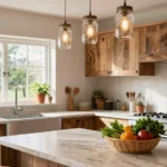
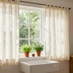
White paint transforms cramped quarters into bright, airy sanctuaries that feel twice their actual size. Pure white like Benjamin Moore’s Cloud White or Sherwin Williams’ Pure White bounces light throughout the room while creating seamless visual flow from wall to wall. Off-white alternatives such as Alabaster or Ivory provide subtle warmth without sacrificing the space-improving benefits of lighter tones.
Trim work painted in crisp white creates clean lines that draw the eye upward, making ceilings appear higher than their actual measurements. We recommend using semi-gloss or satin finishes on trim to maximize light reflection while maintaining durability in high-traffic areas.
Ceiling treatments in white or off-white shades eliminate visual barriers between walls and overhead surfaces. This continuous color flow tricks the brain into perceiving expanded vertical space, particularly effective in rooms with standard 8-foot ceilings.
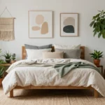
Consider Soft Beiges and Warm Grays
Beige paint colors like Accessible Beige or Balanced Beige provide neutral backdrops that don’t compete with furniture or artwork for attention. These warm undertones create cozy atmospheres while maintaining the space-expanding properties essential for compact living areas.
Greige combinations blend gray and beige elements to achieve sophisticated neutrals that work with both cool and warm lighting conditions. Popular options include Agreeable Gray, Repose Gray, and Natural Linen, which adapt beautifully to changing light throughout the day.
Warm gray selections such as Classic Gray or Mindful Gray offer contemporary appeal without the starkness of pure white. These colors provide enough depth to add visual interest while keeping the overall palette light enough to maintain spacious feelings.
Use Cool Tones Like Pale Blues and Soft Greens
Pale blue paint creates calming environments that psychologically expand space through color temperature effects. Shades like Sea Salt, Palladian Blue, or Cloudy Sky add tranquil energy while maintaining the light-reflective qualities necessary for small room success.
Soft green options such as Sea Foam, Pale Oak, or Misty Sage bring natural elements indoors without overwhelming compact spaces. These colors work particularly well in rooms with limited natural light, as they create fresh, outdoorsy feelings that counteract any claustrophobic tendencies.
Cool undertones in these color families recede visually, pushing walls outward and creating deeper sight lines. We’ve found that rooms painted in cool-toned neutrals consistently photograph larger and feel more spacious than those decorated with warmer, advancing colors.
Create Visual Height with Vertical Stripes and Patterns

When we’re working with limited square footage, drawing the eye upward becomes our most powerful tool for creating the illusion of spaciousness. Strategic vertical elements can transform a cramped living room into a space that feels dramatically taller and more open.
Paint Vertical Stripes on an Accent Wall
Painting vertical stripes on a single accent wall creates an immediate height boost that doesn’t overwhelm the entire room. We recommend starting with lighter colors at the top and gradually transitioning to darker shades at the bottom to maximize this upward visual pull. This technique works particularly well behind a sofa or entertainment center where the stripes can serve as a dramatic backdrop.
Alternating between two complementary neutral tones like Brilliant White and a soft gray creates subtle contrast without creating visual chaos. The key lies in keeping stripe widths consistent, typically between 6 to 8 inches, to maintain a sophisticated appearance rather than a busy pattern.
Use Wallpaper with Vertical Patterns
Wallpaper with vertical patterns offers more design flexibility than painted stripes while delivering the same height improving benefits. We suggest selecting patterns that incorporate thin vertical lines, elongated florals, or geometric designs that naturally guide the eye from floor to ceiling.
Subtle textures and tone on tone patterns work exceptionally well in small living rooms because they add visual interest without competing with furniture or artwork. Grasscloth wallpapers with natural vertical fibers create an organic upward movement that feels both sophisticated and calming.
Extend Paint Colors to the Ceiling
Extending your wall color onto the ceiling eliminates the visual break that traditional white ceilings create, making walls appear to continue infinitely upward. This seamless transition between walls and ceiling creates continuous visual flow that expands the perceived boundaries of your living space.
We find this technique particularly effective with lighter shades like Enduring Ice or Horseradish, which reflect natural light while maintaining the illusion of height. The monochromatic approach prevents the ceiling from feeling heavy or oppressive, instead creating a cocoon like effect that feels both intimate and spacious.
Use the Monochromatic Color Scheme Technique

Monochromatic color schemes offer a sophisticated approach to painting that creates visual continuity while maintaining design interest. We’ll explore how this technique can transform your small living room into a cohesive, spacious environment.
Select Different Shades of the Same Color
Choosing various shades of a single color forms the foundation of an effective monochromatic scheme. We recommend starting with a base color that complements your existing furniture and natural light conditions. Lighter shades work best on walls to maintain that airy feeling we’ve been building throughout your room design.
Darker variations can accent exact areas like built-in shelving or architectural details. Medium tones bridge the gap between your lightest and darkest selections, creating smooth transitions that guide the eye naturally around the room. This layered approach prevents the flat appearance that sometimes occurs with single-color applications.
Consider your room’s lighting when selecting shade variations. Natural light will reveal subtle differences between tones, while artificial lighting may require more pronounced contrasts to achieve the desired depth.
Layer Textures Instead of Colors
Texture becomes your primary tool for creating visual interest when working within a single color family. We suggest incorporating materials like velvet throw pillows, leather accent chairs, natural wood furniture, and woven rattan baskets to add dimension without disrupting your color harmony.
Fabric choices play a crucial role in this technique. Mixing smooth cotton curtains with nubby linen upholstery creates tactile contrast that engages viewers without overwhelming the space. Wall treatments like grasscloth wallpaper or textured paint finishes add subtle variation while maintaining your chosen color scheme.
Consider the scale of your textures as well. Large-scale patterns on smaller accessories prevent visual competition, while fine textures on larger surfaces maintain the calming effect that makes monochromatic schemes so effective in compact spaces.
Add Interest with Varied Finishes
Finish variations within your chosen color create depth and sophistication without adding visual complexity. We recommend mixing matte wall paint with glossy trim to establish clean architectural lines while maintaining color continuity. Metallic accents in your chosen color family can highlight exact features like picture frames or lighting fixtures.
Satin finishes work particularly well on furniture pieces, offering durability while reflecting light to enhance the spacious feeling you’re creating. Semi-gloss applications on doors and window frames provide practical benefits while contributing to the overall design scheme.
Different finish combinations create subtle light reflection patterns throughout the day. This natural variation prevents the monotony that can occur with identical finishes while supporting the timeless appeal that makes monochromatic schemes less likely to go out of fashion compared to more complex color approaches.
Paint an Accent Wall to Add Depth and Interest

Creating a focal point in your small living room becomes effortless when you strategically paint just one wall. We’ve found that accent walls serve as powerful design tools that add visual depth without overwhelming compact spaces.
Choose the Wall Behind Your Sofa
Positioning behind your sofa makes this wall the natural focal point of your small living room. We recommend this location because it’s where guests naturally direct their attention when entering the space. This wall receives optimal viewing angles from multiple seating positions throughout the room.
Strategic placement here creates a backdrop that frames your furniture beautifully. We’ve observed that this wall typically has fewer interruptions from windows or doorways. The wall behind your sofa also provides the largest unbroken surface area for maximum visual impact.
Select a Bold Color That Complements Your Decor
Bold colors like burgundy or brown are trending in 2025 and create stunning accent walls in small living rooms. We suggest choosing colors that complement rather than compete with your existing furniture and decor elements. These deeper shades add sophistication while maintaining the cozy atmosphere essential for intimate spaces.
Burgundy brings warmth and elegance that pairs beautifully with neutral sofas and metallic accents. Brown tones create earthy sophistication that works particularly well with leather furniture and natural wood elements. We’ve found that these bold choices prevent your small living room from feeling bland or generic.
Testing your chosen color in different lighting conditions ensures it complements your space throughout the day. We recommend painting large swatches on your selected wall and observing them during morning, afternoon, and evening hours.
Consider Geometric Patterns or Stencils
Geometric patterns transform plain accent walls into striking design statements that draw the eye upward. We suggest using stencils to create consistent, professional looking patterns without the expense of wallpaper. Triangle, hexagon, and diamond shapes work particularly well in small living rooms because they add movement without creating visual chaos.
Applying patterns sparingly prevents overwhelming your compact space while still achieving dramatic impact. We recommend limiting geometric designs to the upper two thirds of your accent wall for balanced proportions. This approach creates visual interest while maintaining the clean lines essential for small living room success.
Stenciling offers the flexibility to customize colors and scale patterns to fit your exact wall dimensions. We’ve found that metallic stencil paints add luxurious touches that reflect light beautifully in small spaces.
Incorporate Two-Tone Painting Methods

Two-tone painting creates visual interest while maintaining the spacious feel essential for small living rooms. These methods help define spaces and add depth without overwhelming compact areas.
Paint the Lower Half Darker Than the Upper Half
Lower half dark painting establishes visual weight at the bottom while keeping the upper portion bright and airy. We recommend dividing your wall at the halfway point and applying a deeper shade below while using a lighter color above. This technique creates depth by grounding the space with darker tones while the lighter upper half maintains the room’s brightness and prevents the ceiling from feeling low.
The contrast between dark and light sections adds visual appeal without sacrificing the expansive feeling we want in small spaces. Choose darker shades that complement your furniture and lighter tones that reflect natural light effectively. This method works particularly well when you want to add personality to your living room while keeping it feeling open and spacious.
Use Chair Rail Molding as a Natural Division
Chair rail molding provides the perfect architectural element to separate your two paint colors naturally. We suggest painting the area below the molding with deeper hues while applying lighter shades above for a harmonious and well-defined appearance. The molding creates a clean transition line that eliminates guesswork about where one color should end and another should begin.
Installing chair rail at about 36 inches from the floor gives you ideal proportions for most small living rooms. Below the rail, darker colors create a sophisticated foundation, while lighter colors above draw the eye upward and enhance ceiling height. This classic approach adds elegant detail while serving the practical purpose of color division.
Create Horizontal Color Blocking
Horizontal color blocking involves painting distinct sections of your walls with different colors to create visual expansion. We recommend using this technique on your main focal wall by dividing it into upper and lower sections with contrasting but complementary colors. The horizontal division creates a sense of continuity and flow that makes your small living room feel wider and more ever-changing.
Block your colors in roughly equal proportions or follow the golden ratio with two-thirds light color on top and one-third darker color below. This method works especially well when you choose colors from the same family but in different intensities. The horizontal lines created by this blocking technique guide the eye across the room rather than up and down, effectively expanding the perceived width of your space.
Apply the Ceiling Color Strategy

We can transform our small living room’s proportions by selecting the right ceiling color approach. These strategic ceiling painting techniques work together with our wall colors to enhance spaciousness and create visual cohesion.
Paint the Ceiling the Same Color as the Walls
Paint your ceiling the same color as your walls to create a seamless, cohesive look that eliminates visual boundaries. This strategy works particularly well with light colors like white or off-white, making the room feel more spacious by removing the harsh line where walls meet the ceiling. We recommend testing this approach with neutral shades such as Cloud White or Alabaster to maintain brightness while creating visual continuity.
Extend your wall color onto the ceiling when using soft beiges, warm grays, or greige combinations for maximum impact. This technique helps blur the room’s edges and creates an enveloping effect that makes spaces feel larger. Paint both surfaces with the same finish to maintain consistency, though we suggest using flat or eggshell finishes on ceilings to minimize imperfections.
Choose a Lighter Shade for the Ceiling
Choose a ceiling color that’s one to two shades lighter than your walls to create the illusion of higher ceilings. This classic approach draws the eye upward and makes our small living room feel more open and airy. We find this technique especially effective when paired with warm neutrals like Horseradish or soft grays that have subtle undertones.
Select ceiling colors with the same base as your wall color but with higher light reflectance values for optimal results. Paint contractors often recommend this 10-20% lighter rule when working with colors that have limited natural light exposure. This strategy works beautifully with both cool tones like pale blues and warm neutrals, maintaining color harmony while improving perceived height.
Use Bold Ceiling Colors for Drama
Use bold ceiling colors to create dramatic focal points that add personality to our small living room spaces. This approach works exceptionally well when we pair vibrant ceiling shades with neutral walls, creating striking contrast that draws attention upward. We recommend testing bold colors like deep blues, rich burgundies, or even Tricorn Black for cozy, intimate atmospheres.
Paint dramatic ceiling colors in rooms with adequate natural light to prevent the space from feeling too enclosed. Bold colors create visual weight that can make ceilings appear lower, so we balance this effect by keeping walls light and bright. Consider metallic finishes or glossy paints for bold ceiling colors to reflect light and add sophisticated shimmer to our small living areas.
Experiment with Color Temperature and Lighting Effects

Understanding color temperature becomes crucial when we’re working with limited square footage. Lighting effects can dramatically transform how our small living room feels and functions.
Understand Warm Versus Cool Color Temperatures
Warm color temperatures create cozy atmospheres that make our small living rooms feel inviting and comfortable. Beige, khaki, and warm neutrals with pink or purple tints work particularly well in spaces with limited natural light because they evoke feelings of warmth and intimacy. These colors can make our room feel smaller if we don’t balance them with lighter elements, so we’ll want to use them strategically on accent walls or in combination with brighter shades.
Cool color temperatures offer the opposite effect by making our living room feel larger and more airy. Whites, greiges, and blues excel at reflecting light and creating an illusion of expanded space. These colors work especially well when we want to counteract the cramped feeling that small rooms can create. Blues and cool whites help establish a sense of openness and calmness that psychologically expands our living area.
Consider How Natural Light Affects Paint Colors
Natural light significantly alters how our chosen paint colors appear throughout our living space. Colors appear more vibrant in well-lit areas and can look completely different in dimly lit corners of our room. We can use this natural variation to our advantage by selecting colors that complement the available light rather than fighting against it.
Different exposures create unique lighting conditions that affect our color choices. North-facing living rooms receive cooler, more consistent light that works well with warm color temperatures to balance the cooler natural light. South-facing rooms get abundant warm light that pairs beautifully with cool color temperatures to prevent the space from feeling overly heated or cramped.
Test Paint Colors at Different Times of Day
Sampling paint becomes essential when we’re making decisions for our small living room because colors can shift dramatically as light changes. We should apply paint samples to our walls and observe how they look during morning, afternoon, and evening hours to ensure our chosen color works under various lighting conditions.
Color variability throughout the day means our morning coffee might reveal a completely different shade than our evening relaxation time. Testing colors at multiple times helps us avoid surprises and ensures that our final choice maintains its appeal regardless of when we’re using our living room. We’ll want to live with our samples for at least 24 hours to see how they perform under both natural and artificial lighting conditions.
Add Personality with Creative Painting Techniques

Moving beyond traditional single-color applications, we can transform our small living rooms using artistic painting methods that add character while maintaining spaciousness. These creative approaches allow us to express our personal style without overwhelming the limited square footage.
Try Ombre or Gradient Effects
Ombre painting creates a stunning visual transition from one color to another, adding remarkable depth and interest to our walls. We can achieve this gradient effect by blending lighter colors near the ceiling into darker tones toward the baseboards, which naturally draws the eye upward and enhances our room’s vertical space.
Applying this technique requires us to work while the paint remains wet, using a dry brush or sponge to blend the colors seamlessly. Light gray transitioning to charcoal creates sophisticated drama, while soft blue fading to white maintains an airy atmosphere perfect for compact spaces.
Vertical ombre effects work particularly well on accent walls, allowing us to create focal points without making our rooms feel smaller. We should choose colors within the same family to ensure smooth transitions and avoid harsh contrasts that might visually fragment our space.
Use Sponge Painting for Texture
Sponge painting delivers a textured, mottled effect that adds natural organic appeal to our walls without requiring expensive materials. We can apply this technique using a natural sea sponge to dab paint over a base coat, creating subtle variations that catch light beautifully.
This method works exceptionally well with neutral color palettes, where we can layer warm beiges over cream bases or soft grays over white foundations. The irregular texture helps disguise wall imperfections while adding visual interest that makes our small living rooms feel more ever-changing.
Dabbing motions create the most authentic results, and we should rotate our sponge frequently to avoid repetitive patterns. Multiple thin layers produce better results than heavy applications, allowing us to build up texture gradually until we achieve our desired effect.
Create Faux Finishes Like Marble or Wood Grain
Faux finishing techniques allow us to mimic luxurious materials like marble or wood grain without the important cost of actual installation. These sophisticated finishes can add elegance to our small living rooms while creating the illusion of expensive materials.
Marble effects work particularly well in smaller spaces because they reflect light beautifully and create movement across our walls. We can achieve this look using glazing techniques with soft gray and white tones, applying veining with feathering brushes to replicate natural stone patterns.
Wood grain effects bring warmth and texture to our spaces, especially when applied to accent walls or architectural features. Dragging techniques with specialized combs create realistic wood patterns, and we can choose from various wood tones to complement our existing furniture and decor.
Both techniques require patience and practice, but the results can dramatically elevate our room’s perceived value and sophistication while maintaining the spacious feel essential in compact living areas.
Coordinate Paint Colors with Your Existing Furniture

Building on the foundation of color techniques we’ve explored, coordinating paint with your existing furniture creates a unified design that maximizes the impact of your small living room.
Match Paint to Your Largest Furniture Pieces
Your sofa or sectional serves as the anchor for your entire color scheme. We recommend selecting paint colors that complement rather than compete with your dominant furniture pieces. Neutral furniture in beige or gray opens up countless paint possibilities, while bold furniture requires more strategic color choices.
Consider the undertones in your furniture fabrics when choosing paint colors. Warm-toned furniture pairs beautifully with creamy whites and soft beiges, while cool-toned pieces work well with crisp whites and pale grays. We suggest pulling accent colors from patterned upholstery to create a cohesive palette that ties the room together.
Dark furniture benefits from lighter wall colors to prevent the space from feeling cramped. Light-colored furniture allows for more flexibility, giving you the option to go bold with accent walls or maintain an airy feel with consistent light tones throughout the room.
Use Color Wheel Principles for Harmony
Analogous color schemes create seamless transitions that enhance the spacious feel of small living rooms. We recommend choosing colors that sit next to each other on the color wheel, such as blue-green combinations or warm yellows with oranges. These harmonious relationships create visual flow without jarring contrasts.
Complementary colors offer dramatic appeal when used strategically in small spaces. Rather than painting entire walls in contrasting colors, we suggest using complementary pairs for accent elements like throw pillows or artwork while keeping walls neutral.
Triadic color schemes work well when one color dominates and the other two serve as accents. We often see success with a neutral base wall color enhanced by two accent colors distributed through accessories and smaller furniture pieces.
Consider Your Flooring and Window Treatments
Your flooring sets the foundation for your entire color palette. Dark hardwood floors provide rich contrast against light walls, while light floors allow for more color flexibility. We recommend ensuring your paint choice harmonizes with existing flooring rather than fighting against it.
Window treatments significantly impact how paint colors appear throughout the day. Heavy curtains in bold colors require careful paint coordination, while light, airy treatments give you more freedom with wall colors. Natural light filtering through different fabric colors can dramatically alter paint appearance.
Carpet colors demand special attention when choosing paint schemes. We suggest selecting paint colors that either complement or provide subtle contrast with carpeting, avoiding combinations that create visual competition. Neutral carpets offer the most flexibility, while patterned or bold carpets require more strategic paint selection to maintain visual balance.
Plan Your Small Living Room Painting Project

Successful painting projects require careful planning and preparation to achieve professional results. We’ll guide you through the essential steps to ensure your small living room transformation goes smoothly.
Calculate Paint Quantities Accurately
Measuring your wall area prevents costly mistakes and ensures you have enough paint to complete the project. Multiply the length and height of each wall to determine the total square footage you’ll need to cover.
Calculate additional surface areas if you’re painting ceilings or trim as part of your project. Account for doors and windows by subtracting their measurements from your total wall area calculations.
Purchase slightly more paint than your calculations suggest to allow for touch ups and future maintenance. Most paint manufacturers recommend buying an extra 10% beyond your calculated needs for optimal coverage.
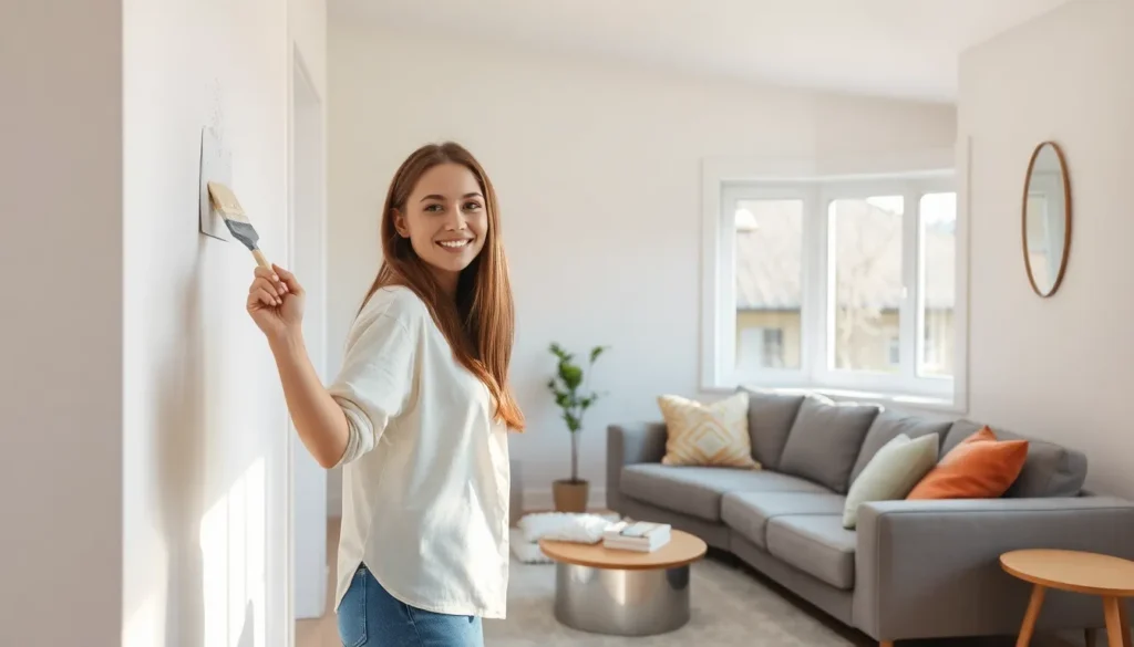
Prepare Your Space Properly
Removing furniture from the room creates the ideal workspace for painting your small living room. Cover remaining pieces with drop cloths to protect them from paint splatters and dust.
Clean the walls thoroughly using a mild detergent solution to remove dirt, grease, and grime that could interfere with paint adhesion. Allow walls to dry completely before beginning any painting work.
Fix holes, cracks, and imperfections in the wall surface using spackling compound or caulk. Sand rough spots smooth and wipe away dust to create the perfect foundation for your new paint.
Choose the Right Paint Finish for Each Surface
Flat finish works best for ceilings because it hides imperfections well and doesn’t create unwanted glare in your small space. This matte appearance helps ceilings blend seamlessly with your overall color scheme.
Eggshell finish provides the ideal balance for walls by offering a subtle sheen without appearing too glossy or reflective. This finish resists scuffs better than flat paint while maintaining a sophisticated appearance.
Satin or semi gloss finishes deliver superior durability for trim, doors, and high traffic areas that require frequent cleaning. These shinier finishes withstand moisture and wear while adding subtle definition to architectural details.
Conclusion
Transforming your small living room with the right paint choices doesn’t have to be overwhelming. We’ve explored many strategies from light neutrals and monochromatic schemes to creative techniques like vertical stripes and two-tone methods that can make your compact space feel significantly larger.
The key lies in understanding how color temperature lighting and strategic placement work together to enhance your room’s potential. Whether you choose soft blues for their space-expanding qualities or warm grays for cozy sophistication the success depends on proper planning and execution.
Remember that testing colors under different lighting conditions and coordinating with your existing furniture ensures the best results. With these proven techniques and careful preparation you’re well-equipped to create a beautiful inviting living room that maximizes every square foot while reflecting your personal style.
Frequently Asked Questions
What are the best paint colors for small living rooms?
Light and neutral colors work best for small living rooms. White and off-white shades like Benjamin Moore’s Cloud White or Sherwin Williams’ Pure White create bright, airy environments. Soft beiges, warm grays, and greige combinations provide cozy backdrops without overwhelming the space. Cool tones like pale blues and soft greens can also psychologically expand the room while maintaining a calming atmosphere.
How can paint make a small living room look bigger?
Use light colors that reflect natural light and avoid creating visual boundaries. Paint the ceiling the same color as walls or choose a shade 1-2 tones lighter to create height illusion. Consider vertical stripes on accent walls to draw the eye upward. Monochromatic color schemes create visual continuity, while eliminating contrast between walls and ceiling creates seamless flow.
Should I paint an accent wall in a small living room?
Yes, accent walls can add depth and interest without overwhelming small spaces. Choose the wall behind your sofa as a natural focal point. Use bold colors like burgundy or brown that complement existing decor. Consider geometric patterns or stencils for visual impact. Test colors in different lighting conditions before committing to ensure they enhance rather than shrink the space.
What painting techniques work best for small spaces?
Two-tone painting with darker lower halves and lighter upper sections creates visual weight while keeping rooms bright. Ombre or gradient effects enhance vertical space perception. Chair rail molding provides natural division for color blocking. Horizontal color blocking can create visual expansion. Avoid overwhelming patterns and stick to techniques that maintain the spacious feel.
How do I choose the right paint finish for small living rooms?
Select finishes based on function and light reflection. Use flat finishes for ceilings to minimize imperfections, eggshell for walls to provide subtle sheen and easy cleaning, and satin or semi-gloss for trim and high-traffic areas for durability. Glossier finishes reflect more light, which can help small rooms feel brighter and more spacious.
How much paint do I need for a small living room?
Measure wall areas accurately, subtracting space for doors and windows. Calculate square footage and divide by paint coverage per gallon (typically 350-400 square feet). Purchase an extra 10% for touch-ups and future maintenance. Consider that darker colors and textured walls may require additional coats, affecting total paint quantity needed.
How does lighting affect paint color choices in small rooms?
Natural light exposure significantly impacts how colors appear. North-facing rooms receive cooler light, while south-facing rooms get warmer light. Test paint samples at different times of day to see how they change. Warm colors create cozy atmospheres but may make spaces feel smaller, while cool colors can make rooms feel larger and more airy.
Can I use dark colors in a small living room?
Dark colors can work in small spaces when used strategically. Consider dark accent walls paired with light surrounding walls, or use dark colors on lower wall sections with lighter upper portions. Ensure adequate natural light and balance dark elements with light furnishings and reflective surfaces to prevent the room from feeling enclosed or cramped.