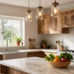
We’ve all stood on our weathered deck wondering how a fresh coat of paint could transform this outdoor space into something truly spectacular. Choosing the right deck paint color isn’t just about aesthetics – it’s about creating an extension of your home that reflects your style while standing up to the elements.
The perfect deck color can make your outdoor space feel larger boost your home’s curb appeal and even increase property value. Whether you’re drawn to classic neutrals that blend seamlessly with nature or bold statement colors that make your deck the neighborhood showstopper we’ll guide you through the most stunning options available.
From timeless grays and warm earth tones to vibrant blues and sophisticated charcoals the right color choice will turn your deck into an inviting retreat where you’ll love spending time. Let’s explore the most popular and practical deck paint colors that’ll give your outdoor space the makeover it deserves.
Classic Neutrals That Never Go Out of Style
Neutral deck colors provide the perfect foundation for any outdoor design vision. These versatile shades complement virtually every architectural style while maintaining their appeal year after year.
Warm Beige and Taupe Tones
Warm beige transforms your deck into a welcoming extension of your home’s interior. This color family includes soft sandy hues like Benjamin Moore’s “Coastal Beige” and Sherwin Williams’ “Accessible Beige” that blend seamlessly with natural wood railings and stone accents. Taupe offers slightly more depth while maintaining the same cozy appeal we love in neutral palettes.
Greige combinations work exceptionally well for homeowners seeking sophisticated warmth. These gray beige blends create visual interest without overwhelming your outdoor furniture or landscaping. Popular options include Behr’s “Perfect Taupe” and Benjamin Moore’s “Revere Pewter” which provide enough character to stand alone or serve as backdrops for colorful accessories.
Natural undertones in beige deck paint help bridge the gap between your home and garden. We recommend testing samples in different lighting conditions since these warm neutrals can shift from cream to tan depending on the time of day and surrounding elements.
Cool Gray and Charcoal Options
Cool gray deck colors offer modern sophistication that pairs beautifully with contemporary home designs. Light grays like Sherwin Williams’ “Agreeable Gray” and Benjamin Moore’s “Classic Gray” create clean lines while reflecting heat better than darker alternatives. These shades work particularly well with white trim and black accents.
Charcoal provides dramatic contrast without the maintenance concerns of pure black paint. Deep grays such as Behr’s “Cracked Pepper” and Benjamin Moore’s “Wrought Iron” hide dirt and wear patterns while creating stunning visual depth. Charcoal decks become striking platforms for bright outdoor furniture and colorful planters.
Medium gray tones strike the perfect balance between light and dark extremes. We often recommend colors like Benjamin Moore’s “Stonington Gray” for clients who want something more interesting than beige but less bold than charcoal. These versatile shades complement both warm and cool color schemes in your outdoor decor.
Timeless White and Off-White Choices
Pure white deck paint creates the ultimate clean slate for your outdoor entertaining space. Classic whites like Benjamin Moore’s “Simply White” and Sherwin Williams’ “Pure White” reflect maximum light and heat while providing crisp contrast against natural wood elements. White decks require more frequent cleaning but deliver unmatched brightness and spaciousness.
Off white options provide the freshness of white with added warmth and practicality. Creamy whites such as Benjamin Moore’s “White Dove” and Behr’s “Swiss Coffee” show less dirt while maintaining that coveted bright appearance. These subtle variations work especially well with traditional and farmhouse architectural styles.
Antique white brings vintage charm to deck spaces without looking dated. We recommend these slightly aged whites for homeowners who want character without committing to bold color choices. Popular selections include Sherwin Williams’ “Creamy” and Benjamin Moore’s “Cloud White” which complement both modern and traditional outdoor furniture styles.
Bold and Vibrant Colors for Statement Decks

Make your deck the focal point of your outdoor space with colors that command attention and showcase your personal style.
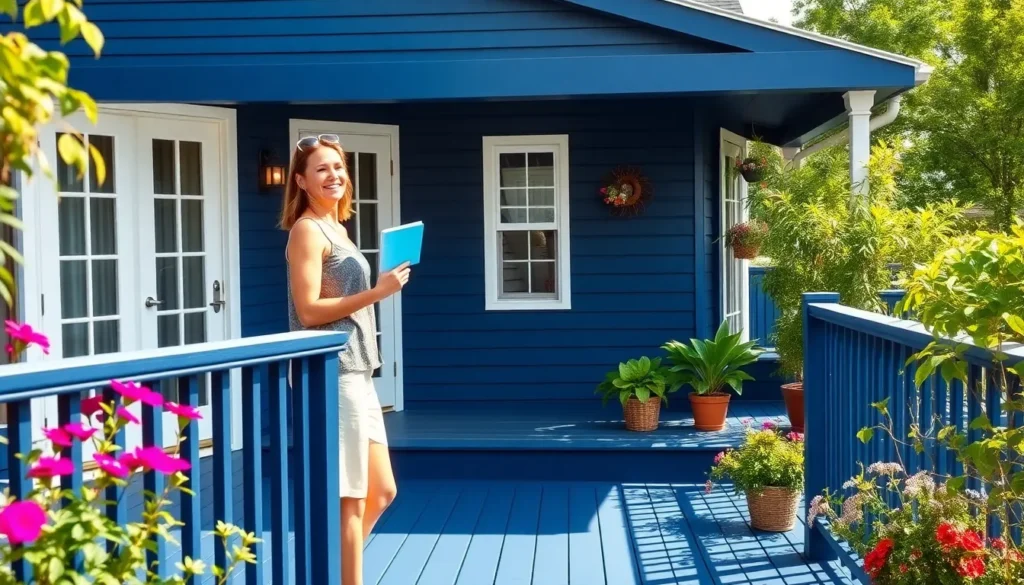
Rich Navy Blue for Sophisticated Appeal
Rich navy blue creates a dramatic contrast with lighter surroundings while maintaining an elegant, timeless appearance. This sophisticated color choice works exceptionally well with white trim and natural wood accents, creating a coastal inspired aesthetic that never goes out of style. Navy blue paint provides excellent coverage for older deck surfaces and helps conceal minor imperfections that might show through lighter colors. We recommend this bold choice for homeowners who want to make a statement without overwhelming their outdoor space.
Forest Green for Natural Harmony
Forest green blends seamlessly with natural surroundings, creating a harmonious connection between your deck and industry. This earthy tone helps conceal imperfections on existing deck surfaces while providing a rich backdrop for outdoor furniture and potted plants. Deep green paint colors work particularly well in wooded areas or gardens where you want your deck to feel like a natural extension of the environment. We find that forest green maintains its vibrancy longer than many other bold colors due to its ability to hide dirt and wear.
Deep Red for Dramatic Impact
Deep red offers warm tones that pair beautifully with brick homes and earthy materials, creating a welcoming yet striking outdoor space. This redwood inspired color choice provides excellent visual warmth during cooler months while maintaining its boldness throughout the seasons. Rich red paint creates an inviting atmosphere that complements both traditional and contemporary home styles. We suggest deep red for decks that receive good natural light, as this color showcases its full depth and richness when properly illuminated.
Earth-Tone Deck Paint Color Ideas for Natural Blending

Earth tone deck colors create a seamless connection between your outdoor space and the natural industry around your home. These versatile hues work beautifully with various architectural styles and outdoor elements.
Warm Brown and Chocolate Shades
Golden Oak brings classic warmth to your deck area while creating a welcoming atmosphere for outdoor gatherings. This rich tone complements natural wood elements and pairs beautifully with outdoor furniture in neutral or accent colors.
Dark Brown delivers rich elegance and effectively hides flaws on older wood surfaces, making it an excellent choice for deck refinishing projects. The deep color provides excellent coverage while creating a sophisticated foundation for your outdoor decor.
Chocolate Brown offers a luxurious depth that enhances outdoor spaces with its warm undertones. This versatile shade works exceptionally well with brick exteriors and stone accents, creating a cohesive look that flows naturally from your home to your deck.
Rustic Cedar and Redwood Hues
Cedar inspired tones capture the natural beauty of authentic wood while providing the durability of quality paint finishes. These warm, rustic shades blend effortlessly with outdoor environments and maintain their appeal through changing seasons.
Redwood replications deliver the classic appeal of natural redwood without the maintenance requirements of real wood. Paint formulations in these rich, reddish brown tones offer excellent weather resistance while creating that coveted rustic aesthetic.
Natural wood tone paints provide the warmth and character of authentic lumber with enhanced protection against the elements. These colors work particularly well in wooded settings where blending with the natural surroundings is a priority.
Stone Gray and Weathered Wood Colors
Slate Gray creates a modern, sophisticated look that works beautifully with various outdoor decor styles and color schemes. This versatile neutral provides an excellent backdrop for colorful outdoor furniture and landscaping elements.
Light Gray establishes a soothing, relaxing atmosphere that’s ideal for open deck spaces and contemporary home designs. The color reflects heat effectively, helping keep your deck cooler during hot summer months.
Weathered Wood finishes replicate the natural aging process of wood through specialized paint techniques and color formulations. These distressed looks blend seamlessly with outdoor surroundings while providing superior protection compared to naturally weathered surfaces.
Two-Tone Deck Paint Combinations for Visual Interest

Two-tone deck paint combinations create sophisticated outdoor spaces that add architectural depth and visual drama to your home’s exterior. We’ll explore strategic color pairings that transform ordinary decks into stunning focal points.
Light and Dark Contrasts
Light and dark contrasts deliver the most impactful visual transformation for deck surfaces. We recommend using warm earthy tones like honey or chocolate brown against light-colored homes to create striking contrast that draws the eye upward. These combinations work especially well because they highlight the deck’s architectural features while maintaining harmony with the home’s overall design.
Darker homes benefit from lighter deck paint combinations that soften harsh exterior lines. Sea salt gray or weathered oak colors create gentle contrast without overwhelming the home’s existing color palette. We’ve found these lighter shades reflect heat more effectively, keeping deck surfaces cooler during summer months.
Strategic placement of light and dark elements maximizes visual impact across different deck areas. Consider painting the main deck surface in lighter tones while using darker colors for stairs, railings, or trim work. This approach creates natural flow patterns that guide visitors through your outdoor space.
Complementary Color Pairings
Complementary color pairings use opposite color wheel positions to create captivating visual effects. Greige combinations with darker accents highlight deck features while maintaining balanced aesthetics that work year-round. We recommend pairing warm greige deck surfaces with charcoal or deep brown railings for sophisticated contrast.
Contrasting neutrals offer versatility for homeowners seeking subtle visual interest. Beige and gray combinations add depth without overpowering surrounding industry elements like gardens, trees, or outdoor furniture. These pairings work particularly well with natural stone or brick home exteriors.
Warm and cool tone combinations create harmonious contrasts that enhance deck appeal. Earth tones like toasted sand pair beautifully with lighter grays, especially on homes with neutral siding colors. We’ve seen these combinations increase curb appeal by creating cohesive outdoor living spaces that feel intentionally designed.
Accent Rail and Decking Combinations
Accent rail and decking combinations allow creative expression through strategic color placement. Neutral deck surfaces paired with bolder rail colors like black or redwood create modern aesthetics without overwhelming the space. We recommend this approach for homeowners wanting to add personality while maintaining resale value.
Contrasting deck and rail combinations offer sleek, contemporary appeal. Lighter deck colors paired with darker rails create clean lines that emphasize the deck’s structure and dimensions. This technique works exceptionally well on modern homes with minimalist architectural features.
Bold accent combinations can highlight exact deck features or create focal points. Consider using neutral decking with colorful rail systems that complement your home’s exterior trim or shutters. We’ve found these combinations work best when the accent color appears elsewhere in the home’s design scheme.
Weather-Resistant Color Options for Long-Lasting Beauty

When selecting deck paint colors, we must prioritize formulations that withstand environmental challenges while maintaining their visual appeal over time.
UV-Resistant Paint Formulations
UV inhibitors serve as the foundation of long-lasting deck paint, protecting wood from sun damage while preserving its natural beauty. Paints like Sherwin-Williams SuperDeck contain these protective compounds that extend the lifespan of your deck surface.
Multiple coat applications create a waterproof barrier that prevents rot and ensures your deck’s longevity. We recommend applying two to three coats of UV-resistant paint to achieve maximum protection against harsh sunlight.
Advanced formulations now incorporate specialized UV blockers that maintain color integrity even in intense sunlight conditions. These protective layers work continuously to shield your deck from harmful rays that cause wood degradation and color loss.
Fade-Resistant Color Choices
Earth tones like rich greens and browns resist noticeable fading because they blend naturally with outdoor surroundings. These colors maintain their vibrancy longer than bright or artificial hues that contrast sharply with natural elements.
Darker color options effectively conceal wear and weathering while providing practical benefits for high-traffic deck areas. Deep browns, charcoals, and forest greens hide scuff marks and dirt better than lighter alternatives.
Neutral shades including brown, tan, gray, and beige offer excellent fade resistance while complementing most outdoor environments. We’ve found these colors consistently perform well across different climate conditions and architectural styles.
Climate-Exact Color Considerations
Cooling effects from lighter colors like white and beige help maintain comfortable surface temperatures in sunny climates by reflecting sunlight away from the deck. These reflective properties reduce heat absorption and create more comfortable outdoor spaces.
Heat absorption benefits from darker colors can be advantageous in cooler climates where capturing warmth is desirable. But, these darker options require additional UV protection to prevent heat-related damage over time.
Regional weather patterns should guide your color selection, with slip-resistant formulations like those found in SuperDeck providing enhanced safety on wet surfaces. We recommend considering your area’s rainfall patterns and humidity levels when choosing between light and dark color options.
Deck Paint Colors That Complement Your Home’s Exterior

Creating a cohesive outdoor aesthetic requires thoughtful consideration of how deck colors work with existing architectural elements. We’ll explore strategic approaches to harmonizing your deck with your home’s exterior features.
Matching Siding and Trim Colors
Coordinating neutrals create seamless transitions between your deck and home’s existing color palette. Beige or tan deck colors blend beautifully with brick or stone siding materials, establishing a unified foundation for your outdoor space. Light gray shades pair exceptionally well with vinyl or metal siding, offering modern sophistication without overwhelming the architectural elements.
Trim colors provide excellent reference points for deck color selection. White or cream-colored trim creates versatile backdrops that accommodate various deck paint options, from warm earth tones to cool contemporary hues. We recommend selecting deck colors that echo your trim’s undertones while maintaining enough contrast to define separate architectural zones.
Natural Cedartone ES-45 by Benjamin Moore enhances wood’s inherent beauty while complementing earthy exterior materials. This warm brown shade creates visual continuity with cedar siding or stone accents, establishing a cohesive design narrative throughout your home’s exterior surfaces.
Contrasting Colors for Visual Balance
Black deck paint delivers modern drama while maintaining sophisticated appeal across various architectural styles. This bold choice creates striking contrast against light-colored siding, adding depth and definition to outdoor spaces. Pairing black decks with white railings amplifies the visual impact while maintaining balanced proportions.
Coastal colors like light blues or aqua greens provide refreshing alternatives that contrast beautifully with darker siding materials. These hues create vibrant focal points while maintaining harmony with natural surroundings, particularly effective for homes with charcoal or deep brown exteriors.
Strategic contrast prevents monotonous color schemes while highlighting your deck as a distinct outdoor living area. We recommend testing color combinations during different lighting conditions to ensure balanced visual appeal throughout the day.
Coordinating with Industry Elements
Nature-inspired deck colors create seamless connections between built and natural environments. Soft grays with green undertones complement existing vegetation while providing practical heat reflection benefits during warmer months. These sophisticated hues blend naturally with garden elements without competing for visual attention.
Warm earth tones like Revere Pewter maintain cooler deck surfaces while harmonizing with natural industry features. This versatile shade works particularly well with homes surrounded by mature trees or established garden beds, creating unified outdoor environments that feel intentionally designed.
Strategic industry coordination extends your living space into the natural environment. We suggest considering seasonal color changes in your industry when selecting deck paint, ensuring year-round visual harmony between hardscape and softscape elements.
Popular Trending Deck Paint Color Ideas for Modern Homes

Modern homeowners are embracing sophisticated color palettes that reflect contemporary design principles while maintaining functionality. These trending deck paint colors offer sleek aesthetics that complement today’s architectural styles.
Contemporary Charcoal and Black Finishes
Charcoal gray dominates modern deck design choices for its contemporary appeal and exceptional versatility. This sophisticated color creates stunning visual contrast when paired with white railings, allowing natural greenery to pop while providing an elegant backdrop for bold outdoor furniture pieces.
Black accents enhance the modern aesthetic by creating sleek, sophisticated appearances when combined strategically with gray or white elements. We recommend using black selectively on deck borders, railings, or exact sections to avoid overwhelming the space while maintaining that coveted contemporary edge.
Versatility benefits of charcoal finishes include:
- Timeless appeal that won’t look dated in five years
- Excellent compatibility with various architectural styles
- Superior ability to hide minor imperfections and wear patterns
- Enhanced outdoor furniture visibility against darker backgrounds
Sage Green and Muted Pastels
Sage green brings natural harmony to deck spaces by seamlessly blending with surrounding industry elements and outdoor environments. While traditionally used more in house exterior applications, this muted green tone influences deck color selections by creating cohesive transitions between built and natural spaces.
Muted pastels offer unique opportunities for homeowners seeking softer, more distinctive looks that break away from traditional deck color norms. These gentle hues work particularly well in cottage style settings or coastal environments where subtle color variations enhance rather than compete with natural surroundings.
Applications for sage and pastel tones:
- Accent elements like planters or deck furniture
- Complementary siding colors that influence deck selection
- Subtle trim work that connects deck to home exterior
- Surrounding industry elements that create color continuity
Industrial Gray and Metal Tones
Industrial gray delivers modern sophistication through its sleek appearance and excellent compatibility with metal railings and contemporary architectural accents. This color choice works exceptionally well in urban settings where clean lines and minimalist aesthetics dominate design preferences.
Metal tone influences extend beyond paint selection to cover railings and decorative elements that enhance the industrial aesthetic without overwhelming the deck surface itself. We see these elements working together to create cohesive outdoor spaces that feel both modern and functional.
- Stainless steel or powder coated metal railings
- Contemporary lighting fixtures with metallic finishes
- Modern outdoor furniture with clean geometric lines
- Architectural hardware that reinforces the industrial theme
Budget-Friendly Deck Paint Color Solutions

Creating a stunning deck doesn’t require very costly when you know which products deliver quality results at affordable prices. We’ve identified strategic approaches to maximize your investment while achieving professional-looking results.
High-Quality Paint Brands for Less
Benjamin Moore’s INSL-X Floor and Patio Paint stands out for its exceptional durability and fade resistance, offering five color options compared to typical deck paints that limit your choices. This premium formulation provides long-lasting protection while maintaining its vibrant appearance across various weather conditions.
KILZ Over Armor Textured Wood/Concrete Coating delivers outstanding value through its innovative textured finish that effectively conceals surface imperfections and aging. The coating creates a slip-resistant surface while extending the life of your deck investment.
Behr Premium Advanced DeckOver specializes in revitalizing weathered wood surfaces with its carefully curated color selection designed for maximum coverage. This budget-conscious option transforms older decks without requiring extensive preparation work.
Neutral color formulations from major brands typically start at $30 per gallon, making them accessible for most homeowners while offering excellent coverage rates. These colors include versatile whites, warm beiges, and sophisticated grays that complement various architectural styles.
DIY Application Techniques
Combination spraying and brushing ensures paint reaches every surface groove and wood gap for complete coverage. Start by spraying the main deck surface, then immediately follow with brushing to work paint into all crevices and textured areas.
Thorough deck preparation creates the foundation for paint adhesion and longevity by removing dirt, mildew, and loose wood fibers. Power washing followed by complete drying establishes the optimal surface for paint bonding.
Multiple thin coats provide better coverage and durability than single thick applications while using less paint overall. Each coat should dry completely before applying the next layer to prevent peeling and ensure maximum protection.
Strategic timing during mild weather conditions between 50-85°F optimizes paint flow and curing for professional results. Avoid painting during direct sunlight or high humidity periods that can affect finish quality.
Long-Term Value Color Choices
Earth tone selections like browns, beiges, and forest greens blend naturally with outdoor surroundings while maintaining their visual appeal over extended periods. These colors resist fading better than bright alternatives and require fewer touch-ups throughout their lifespan.
Classic neutral shades offer timeless appeal that won’t become outdated as design trends change, protecting your investment value. Gray and beige tones provide versatile backdrops that complement various outdoor furniture and décor choices.
Pastel color options create cheerful outdoor spaces but may require more frequent maintenance due to their tendency to show fading and wear. Consider these choices for accent areas rather than entire deck surfaces to minimize upkeep costs.
Medium-toned colors strike the perfect balance between hiding dirt and wear while maintaining color vibrancy longer than lighter alternatives. These shades provide excellent coverage for imperfections while requiring minimal maintenance between recoating cycles.
Conclusion
We’ve covered a comprehensive range of deck paint color options that can transform your outdoor space into a stunning retreat. Whether you’re drawn to timeless neutrals that offer versatility or bold colors that make a statement your choice should reflect both your personal style and practical needs.
Remember that the best deck color is one that harmonizes with your home’s architecture while providing the durability you need for your climate. From UV-resistant formulations to fade-resistant earth tones we’ve shown you how to make smart choices that deliver long-term value.
Your deck is an investment in your home’s beauty and functionality. With the right color selection and proper application techniques you’ll create an outdoor space that serves as the perfect backdrop for years of memorable gatherings and relaxation.
Frequently Asked Questions
What are the best neutral colors for deck paint?
Classic neutral colors include warm beige, taupe, greige combinations, cool gray, charcoal, and timeless white or off-white. These colors provide a sophisticated foundation that complements natural elements and architectural styles. Light grays reflect heat effectively, while deep grays offer dramatic contrast. Off-whites add warmth while maintaining the clean, fresh appearance of traditional white.
Which deck paint colors are most weather-resistant?
Earth tones like rich greens and browns offer excellent fade resistance and durability. UV-resistant formulations from brands like Sherwin-Williams SuperDeck protect against sun damage. Neutral shades perform well across various climates, while lighter colors work best in sunny areas and darker colors suit cooler climates. Multiple coats provide maximum protection.
How do I choose deck colors that match my home’s exterior?
Match your deck color to existing siding and trim colors for seamless transitions. Use neutrals like beige or tan for harmony, or create contrast with darker deck colors against light siding. Coastal colors like light blues offer refreshing alternatives. Consider your trim colors as reference points for deck selection.
What are the most popular trending deck paint colors?
Current trends favor sophisticated palettes including charcoal gray, sage green, and muted pastels. Charcoal gray offers versatility and modern appeal, especially with white railings. Industrial gray and metal tones work well for urban settings. These colors reflect contemporary design principles while maintaining timeless appeal.
Can I paint my deck on a budget without sacrificing quality?
Yes, high-quality affordable options include Benjamin Moore’s INSL-X Floor and Patio Paint, KILZ Over Armor, and Behr Premium Advanced DeckOver. Use DIY application techniques like combination spraying and brushing. Proper deck preparation and applying multiple thin coats ensure durability while keeping costs down.
What deck colors work best for small outdoor spaces?
Light colors like white, off-white, and light gray can make small decks appear larger by reflecting light and creating an open feel. Warm beige and taupe also work well as they blend seamlessly with surroundings. Avoid dark colors on small decks as they can make the space feel more confined.
Should I choose bold or neutral colors for my deck?
Choose based on your style preference and home’s architecture. Neutral colors offer timeless appeal and easier resale value, while bold colors like navy blue, forest green, and deep red create dramatic statements. Bold colors work well for making older surfaces look refreshed but may require more frequent updates.
How do two-tone deck combinations work?
Two-tone combinations add architectural depth using light and dark contrasts. Pair warm earthy tones against light-colored homes for striking results, or use lighter deck colors to soften darker home exteriors. Greige with darker accents creates balanced aesthetics, while warm and cool tone combinations enhance overall curb appeal.