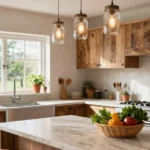
Picture-perfect walls don’t happen by accident. We’ve all stood in our living rooms with a hammer in one hand and a frame in the other wondering where exactly these beautiful pieces should go. The truth is there’s both an art and science to hanging pictures that can transform your space from ordinary to extraordinary.
Whether you’re working with family photos treasured artwork or a mix of both we know the struggle of creating that magazine-worthy gallery wall. The placement height spacing and arrangement of your pictures can make or break your room’s entire aesthetic. Get it right and your living room becomes a stunning focal point that reflects your personality and style.
We’re here to share the insider secrets that interior designers use to create those jaw-dropping picture displays you see in home magazines. From the classic gallery wall to unexpected arrangements that’ll have your guests asking “how did you do that?” – we’ve got the ideas that’ll elevate your living room walls.
Create a Gallery Wall for Maximum Visual Impact
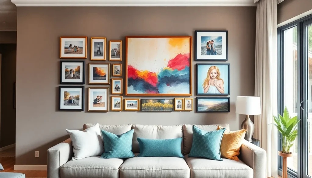
Gallery walls transform ordinary living room spaces into stunning focal points that showcase your personality and style. We’ll explore three essential strategies that interior designers use to create cohesive and visually striking picture arrangements.
Choose a Cohesive Color Scheme
Select two to three dominant colors that appear throughout your living room decor to create visual harmony in your gallery wall. We recommend pulling colors from existing furniture pieces like throw pillows, rugs, or artwork to establish this foundation.
Incorporate neutral tones such as black, white, or gray frames to balance bolder accent colors and prevent visual overwhelm. These neutral elements serve as breathing space between more vibrant pieces and help tie disparate artwork together.
Repeat your chosen colors in at least three different pieces within the gallery arrangement to create rhythm and flow. For example, if you select navy blue and gold as accent colors, ensure these hues appear in multiple frames, mats, or artwork throughout the display.
Mix Different Frame Sizes and Styles
Combine large statement pieces measuring 16×20 inches or larger with smaller 8×10 inch prints to create ever-changing visual weight distribution. This size variation prevents the gallery wall from appearing flat or monotonous.
Blend frame materials such as wood, metal, and acrylic to add textural interest while maintaining your color scheme. We suggest using no more than three different frame materials to avoid creating visual chaos.
Include various frame shapes like rectangular, square, and circular options to break up rigid geometric patterns. Round frames work particularly well as accent pieces that soften angular arrangements and draw the eye through the composition.
Plan Your Layout Before Hanging
Create paper templates by tracing each frame onto kraft paper and cutting out the shapes to test arrangements on your wall. This method allows you to experiment with different configurations without creating unnecessary nail holes.
Maintain 2 to 3 inches of spacing between each frame to provide adequate breathing room while keeping the grouping cohesive. Consistent spacing creates a professional, intentional appearance that elevates the overall design.
Start with your largest piece as the anchor point and build outward, ensuring the center of your gallery wall sits at eye level, approximately 57 to 60 inches from the floor. This approach creates a balanced composition that feels natural and properly proportioned in your living space.
Position Pictures at Eye Level for Optimal Viewing

Getting the height right transforms your living room’s visual impact dramatically. We’ll explore proven techniques that interior designers use to achieve perfect picture placement every time.
Follow the 57-Inch Rule for Standard Height
Measuring from the center of your picture to the floor creates the foundation for professional-looking displays. The 57 to 60 inch rule serves as our starting point because it represents the average eye level for most adults. We recommend placing the center of your artwork at exactly 57 inches from the ground in rooms with standard 8 to 9 foot ceilings.
Consistency becomes crucial when hanging multiple pictures throughout your living room. Using this measurement ensures all your artwork aligns at the same visual level, creating a cohesive flow from wall to wall. We find that maintaining this standard height works exceptionally well for hallways, entryways, and open wall spaces where furniture doesn’t interfere with the viewing angle.
Adjust for Furniture and Room Proportions
Positioning artwork above sofas requires a different approach than bare wall installations. We place pictures 4 to 8 inches above the top of furniture pieces like couches, console tables, or credenzas to maintain proper visual balance. This spacing prevents the artwork from appearing to float disconnected from the furniture below.
Room proportions influence our hanging decisions significantly when dealing with varying ceiling heights. In rooms with high ceilings above 10 feet, we often raise artwork slightly higher than the standard 57 inch rule to prevent pieces from appearing lost on expansive walls. We divide wall space into thirds vertically and position art in the middle third for optimal visual weight distribution.
Consider the Average Height of Your Household
Customizing picture height based on your family’s stature ensures everyone enjoys comfortable viewing. We adjust the standard 57 inch measurement up or down by 2 to 4 inches depending on whether household members are generally taller or shorter than average. This personalized approach makes your living room feel more customized to your exact needs.
Accommodating different viewing scenarios helps us create inclusive picture arrangements. We consider both standing and seated viewing positions, especially in living rooms where people spend time on sofas or chairs. This dual perspective approach ensures your carefully chosen artwork remains visible and impactful regardless of how guests experience your space.
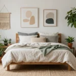
Use the Sofa as Your Anchor Point

Placing artwork above your sofa transforms it into a powerful focal point that anchors your entire living room design. We’ve found that using your sofa as the central reference point creates visual harmony and makes your space feel intentionally curated.
Hang Pictures 6-8 Inches Above the Sofa
Measuring from the top of your sofa cushions, we recommend leaving a 6 to 8 inch gap before hanging your artwork. This spacing creates comfortable visual breathing room between your furniture and art without making the pieces feel disconnected from each other.
Professional interior designers consistently use this measurement because it allows artwork to feel integrated with the seating area while maintaining proper proportion. We’ve noticed that hanging pictures too high creates awkward empty space, while placing them too low makes the room feel cramped and visually heavy.
Scale Artwork to Match Furniture Width
Selecting artwork that’s approximately two-thirds the width of your sofa ensures perfect visual balance in your living space. We recommend measuring your sofa’s total width and choosing pieces that collectively span about 60-65% of that dimension.
Single large pieces work beautifully when they match this proportion, while gallery walls should collectively fill this same width requirement. We’ve seen how properly scaled artwork creates a cohesive look that feels neither overwhelming nor underwhelming in relation to your furniture.
Create Balance with Multiple Pieces
Arranging multiple pieces above your sofa opens up exciting possibilities for creating ever-changing visual displays. We suggest using symmetrical arrangements for classic elegance or asymmetrical layouts to add contemporary visual interest and depth.
Consider mixing different sized frames and artwork types while maintaining your established color scheme from earlier sections. We recommend starting with your largest piece as the central anchor, then building outward with complementary smaller pieces that create rhythm and movement across your wall space.
Experiment with Asymmetrical Arrangements

Breaking away from perfectly symmetrical layouts can transform our living room walls into captivating focal points. Asymmetrical arrangements create visual interest through intentional imbalance that feels naturally ever-changing.
Try the Triangle Method for Three Pictures
Place one picture at the apex of an imaginary triangle and position the other two at the base points. This triangle method guides the viewer’s eye in a natural flow across our wall display. We can vary the sizes of these three pieces while maintaining the triangular composition for added visual appeal.
Position the top picture slightly higher than we’d normally hang a single piece. The two base pictures should align at the same height, creating a stable foundation for our triangular arrangement. This technique works particularly well above sofas where we have ample wall space to showcase the full composition.
Adjust the triangle’s proportions based on our available wall space. Wider walls accommodate broader triangular arrangements, while narrower spaces benefit from taller, more vertical triangle configurations. We can experiment with different angles and spacing until the arrangement feels balanced to our eye.
Use Odd Numbers for Ever-changing Compositions
Hang three or five pieces to create more ever-changing compositions compared to even numbered groupings. Odd numbers naturally prevent our eyes from creating rigid pairs, resulting in more captivating visual movement across the wall. This principle applies whether we’re arranging small family photos or large statement pieces.
Start with three pieces as our foundation before expanding to five or seven. Three piece arrangements offer the perfect introduction to asymmetrical hanging without overwhelming our space. We can always add more pieces later as we become comfortable with the ever-changing energy odd numbers create.
Vary the sizes within our odd numbered groupings for maximum impact. Combining different frame dimensions prevents monotony while maintaining the energetic feel that odd numbers naturally provide. This approach works exceptionally well in living rooms where we want to add personality without formal constraints.
Balance Visual Weight Across the Wall
Distribute the size and color of frames so neither side feels heavier than the other. Visual weight depends on factors like frame thickness, artwork colors, and picture dimensions rather than just physical weight. We achieve balance by considering how these elements work together across our entire arrangement.
Consider the texture and finish of our frames when balancing visual weight. Glossy frames appear lighter and more reflective, while matte or textured frames carry more visual heft. We can use these characteristics strategically to balance asymmetrical arrangements without making them feel top heavy or lopsided.
Step back frequently to assess how our arrangement feels from different viewing angles. What appears balanced from directly in front might feel uneven from our sofa or entryway. We should walk around our living room to ensure the visual weight distribution works from all the spaces where we’ll typically view our pictures.
Incorporate Different Picture Sizes and Orientations

We’ll transform your living room walls by strategically mixing different picture dimensions and orientations. This approach creates visual rhythm while preventing the monotonous look that identical frames produce.
Mix Horizontal and Vertical Orientations
Alternating between industry and portrait orientations adds ever-changing movement to your picture arrangement. We recommend positioning vertical pieces alongside horizontal ones to break up predictable patterns and guide the eye naturally across your display.
Creating visual flow becomes effortless when you vary orientations throughout your gallery wall. Start with your largest horizontal piece as an anchor, then surround it with vertical accents to establish a balanced composition that feels intentional rather than random.
Breaking monotony happens instantly when you avoid hanging all pictures in the same orientation. We suggest using a 60-40 ratio, with slightly more horizontal pieces than vertical ones, as this mirrors how our eyes naturally scan a room.
Combine Large Statement Pieces with Smaller Accents
Using a large piece of art or bold print as your focal point establishes visual hierarchy in your living room arrangement. We position these statement pieces at eye level first, then build outward with complementary smaller frames to create depth and interest.
Surrounding your statement piece with smaller frames prevents overwhelming the space while adding intricate detail that invites closer inspection. Place these accent pieces 2 to 4 inches away from your main artwork to maintain breathing room without losing connection.
Adding depth through size variation occurs when you layer different scale artwork strategically around your room. We recommend choosing smaller accents that echo colors or themes from your statement piece, creating a cohesive narrative that ties your entire display together.
Use Varying Depths for Dimensional Interest
Hanging frames at different depths creates a sophisticated layered look that adds architectural interest to flat wall surfaces. We achieve this by using picture ledges, floating shelves, or simply varying the distance each frame extends from the wall.
Layered hanging techniques involve positioning some frames slightly overlapping others or mounting them at staggered distances from the wall. This approach works particularly well above sofas or console tables where you can incorporate both wall mounted and shelf displayed pieces.
Floating shelves combined with wall art offer the perfect opportunity to mix framed pictures with three dimensional objects like small plants or decorative items. We place these shelves at varying heights to create multiple viewing levels that make your living room feel more ever-changing and personally curated.
Consider Lighting to Enhance Your Display

Proper lighting transforms ordinary picture arrangements into captivating focal points that command attention. Strategic illumination brings out the true colors and details in our artwork while creating the perfect ambiance for viewing.
Install Picture Lights for Dramatic Effect
Picture lights create stunning visual drama that elevates our living room’s aesthetic appeal. We can install adjustable LED picture lights directly above each frame to cast focused illumination downward onto the artwork. These specialized fixtures work particularly well when we dim the main room lights, creating an intimate gallery atmosphere that draws guests’ attention to exact pieces.
Battery-operated picture lights offer flexibility for renters or spaces without nearby electrical outlets. Hardwired options provide consistent power and cleaner aesthetics without visible cords. We should position these lights approximately 12 to 18 inches above the artwork to minimize shadows and ensure even coverage across the entire piece.
Position Near Natural Light Sources
Natural light beautifully illuminates our picture displays during daylight hours without additional electricity costs. We can strategically place artwork near windows or glass doors to take advantage of this free lighting source. East-facing walls receive gentle morning light that enhances warm tones in our photographs and paintings.
Side lighting from nearby windows creates depth and dimension in textured artwork or oil paintings. We should consider the direction and intensity of natural light throughout different times of day to optimize our display. North-facing walls provide consistent, diffused lighting that works well for delicate watercolors or photographs with subtle details.
Avoid Direct Sunlight to Prevent Fading
Direct sunlight causes irreversible damage to our cherished photographs and artwork over time. UV rays break down pigments and cause colors to fade, particularly in prints, watercolors, and fabric-based pieces. We must position valuable artwork away from windows that receive direct sunbeams during peak hours.
UV-filtering glass or acrylic glazing protects our pictures when natural light exposure is unavoidable. Museum-quality framing materials include UV protection that blocks up to 99% of harmful rays while maintaining clarity. We can also use window films or sheer curtains to diffuse harsh sunlight while still allowing beneficial ambient light to reach our displays.
Group Pictures by Theme or Style

Organizing our pictures by theme or style creates powerful visual cohesion that transforms scattered artwork into purposeful displays. This strategic approach helps establish clear focal points while maintaining the sophisticated flow we’ve built with proper spacing and lighting.
Create Family Photo Clusters
We recommend dedicating exact wall areas to family photographs, which creates intimate storytelling spaces that guests naturally gravitate toward. Family photo walls work exceptionally well above seating areas or near entryways, where we can use frames of varying sizes and shapes to add depth and visual appeal.
Yearly photo galleries offer another compelling approach, allowing us to hang photos from different years to create meaningful timelines of family memories. This chronological arrangement becomes particularly powerful when we track changes over time, showing the evolution of our loved ones in a visually captivating format.
We suggest mixing portrait and industry orientations within family clusters to maintain visual interest while keeping the emotional connection strong. The key lies in selecting frames that complement each other while allowing each photograph to shine individually.
Organize by Color Palette
Monochromatic schemes create unified looks that tie seamlessly into our room’s existing decor, establishing continuity that feels both intentional and sophisticated. We can achieve this by using frames in a single color that echoes our furniture or wall tones.
Multi-colored displays work beautifully when we want to add vibrancy and diversity, particularly effective when mixing art and photos together. This approach requires careful balance, ensuring that frame colors complement rather than compete with our artwork.
We recommend selecting two to three dominant colors from our existing room palette, then incorporating neutral tones to balance any bolder choices. This strategy prevents color chaos while maintaining the visual rhythm we’ve established through proper spacing and arrangement techniques.
Arrange by Subject Matter or Era
Subject-based clusters help us group pictures by content such as landscapes, portraits, or still-life compositions, creating themed displays that feel curated and intentional. This organization method works particularly well when we have diverse artwork collections that need cohesive presentation.
Era-based arrangements showcase the evolution of art and photography over time, allowing us to organize pieces by periods such as vintage prints or modern photography. This chronological approach creates fascinating visual narratives that spark conversation.
We find that combining both approaches often yields the most ever-changing results, where we might group vintage family portraits together while keeping contemporary industry photography in a separate cluster. This dual organization maintains thematic coherence while honoring the distinct character of different artistic periods.
Leave Adequate Spacing Between Pictures

Proper spacing transforms a chaotic wall into a cohesive gallery that draws viewers in rather than overwhelming them. We’ve discovered that the space between pictures is just as important as the artwork itself.
Maintain 2-3 Inches Between Frames
Maintain 2-3 Inches Between Frames to create the perfect visual balance in your living room display. This exact measurement prevents pictures from competing for attention while maintaining their individual impact. We recommend using a ruler or measuring tape to ensure consistency across your entire arrangement.
Smaller frames benefit from the 2-inch spacing rule since they need less breathing room to make their statement. Larger pieces often require the full 3-inch spacing to prevent visual crowding. We’ve found that consistent spacing creates a professional gallery look that elevates any living room.
Test your spacing using paper templates before committing to nail holes in your wall. Cut paper to match your frame sizes and tape them to the wall with your chosen spacing. We suggest viewing the arrangement from multiple angles to ensure the spacing feels balanced throughout the room.
Ensure Proper Breathing Room Around Each Piece
Ensure Proper Breathing Room Around Each Piece by leaving adequate space on all sides of your picture arrangements. Each artwork needs sufficient space to be appreciated individually while contributing to the overall composition. We’ve observed that cramped arrangements lose their visual impact and can make rooms feel smaller.
Create breathing room by considering your wall’s proportions when planning your picture layout. A large wall can accommodate more generous spacing while smaller walls require more strategic placement. We recommend leaving at least 12 inches between your picture arrangement and adjacent walls or furniture.
Visual breathing room extends beyond physical spacing to include the relationship between your pictures and surrounding decor elements. Busy wallpaper or heavily patterned furniture requires more space around artwork to prevent visual competition. We suggest simplifying nearby elements when creating dense picture arrangements.
Avoid Overcrowding Your Wall Space
Avoid Overcrowding Your Wall Space by following the rule that less is often more in picture hanging. Overcrowded walls create visual chaos that prevents viewers from appreciating individual pieces. We’ve seen countless living rooms transformed simply by removing excess artwork and allowing remaining pieces to shine.
Plan your wall coverage to use approximately 60-70% of available space rather than filling every inch. This approach creates natural focal points while preventing the cluttered appearance that makes rooms feel chaotic. We recommend stepping back frequently during installation to assess overall balance.
Resist the temptation to fill empty wall space immediately after hanging your initial arrangement. Living rooms benefit from strategic empty space that allows the eye to rest between viewing different pieces. We suggest living with your arrangement for a week before adding additional pictures to avoid overcrowding mistakes.
Use Picture Ledges for Flexible Arrangements

Picture ledges transform our living room displays by offering unmatched versatility that traditional hanging methods simply can’t match. We can easily rearrange our artwork collection without creating new holes in the wall or dealing with complicated measuring tools.
Layer Pictures at Different Heights
Layering creates visual depth that makes our gallery displays more captivating and ever-changing. We position larger frames at the back of the ledge and smaller pieces in front to establish natural focal points. Different frame heights work together to guide the eye across the arrangement in a pleasing flow.
Sculptures and decorative mirrors add three dimensional interest when placed between our framed pieces. We mix portrait and industry orientations to prevent monotony while maintaining visual balance. The layered approach allows us to showcase more artwork in the same wall space without overwhelming the room.
Easily Swap Out Seasonal Displays
Seasonal swapping becomes effortless when we use picture ledges instead of permanent wall mounting. We simply lift pieces off the shelf and replace them with new artwork that matches our current decor theme. Holiday decorations integrate seamlessly with our existing picture collection throughout the year.
Removable adhesive strips secure lightweight frames to the ledge surface without causing damage. We can rotate family photos quarterly to keep our displays fresh and interesting for both residents and guests. Spring florals transition to autumn landscapes with minimal effort and maximum visual impact.
Add Decorative Objects for Visual Interest
Decorative objects break up the repetition of rectangular frames and create conversation starting focal points. We incorporate mini instruments like vintage cameras or small plants to add personality to our ledge arrangements. Vases with dried flowers or sculptural pieces provide textural contrast against smooth picture frames.
Small books create height variation when stacked horizontally beneath certain frames. We use brass candlesticks or ceramic figurines to fill gaps and maintain visual weight distribution across the ledge. These objects should complement our room’s color palette while adding unique character that reflects our personal style.
Conclusion
We’ve covered the essential elements that transform ordinary wall space into stunning visual displays. From mastering the 57-inch rule to creating cohesive color schemes these strategies will help you achieve professional-looking results in your living room.
Remember that successful picture hanging combines both technical precision and creative vision. Whether you’re anchoring artwork above your sofa or experimenting with asymmetrical arrangements the key lies in planning your layout and maintaining proper spacing.
The flexibility of picture ledges and the impact of strategic lighting can elevate your displays even further. By organizing your pictures thoughtfully and leaving adequate breathing room you’ll create an inviting space that reflects your personal style while impressing every guest who enters your home.
Frequently Asked Questions
What is the 57-inch rule for hanging pictures?
The 57-inch rule places the center of artwork at 57 inches from the floor, which is eye level for most adults. This standard height creates a cohesive flow when hanging multiple pieces and works particularly well in hallways and open spaces. It ensures comfortable viewing for most people and maintains visual consistency throughout your home.
How far should pictures be hung above a sofa?
Pictures should be hung 6 to 8 inches above the sofa to maintain visual harmony. The artwork should be approximately two-thirds the width of the sofa for proper proportion. This spacing creates a strong visual connection between the furniture and wall art while preventing the arrangement from appearing disconnected.
What’s the proper spacing between multiple pictures on a wall?
Maintain 2-3 inches between frames to achieve visual balance and prevent overcrowding. Use paper templates to test arrangements before hanging, and ensure adequate breathing room around each piece. This spacing allows each artwork to be appreciated individually while contributing to the overall composition.
How do I create a cohesive gallery wall?
Choose a cohesive color scheme with 2-3 dominant colors from your existing decor. Mix different frame sizes and styles for visual interest, but limit the variety to avoid chaos. Plan your layout using paper templates before hanging, and position the largest piece at eye level as an anchor point.
What’s the Triangle Method for arranging three pictures?
The Triangle Method involves arranging three pictures to guide the viewer’s eye in a natural flow pattern. Place one larger piece as the focal point, then position two smaller pieces to create an invisible triangle shape. This asymmetrical arrangement creates visual interest and prevents static, boring displays.
How much wall space should be covered with pictures?
Only cover 60-70% of available wall space to create natural focal points and allow the eye to rest. Avoid overcrowding by leaving adequate breathing room around each piece. Live with your arrangement for a week before adding more pictures to prevent clutter and maintain visual balance.
Should I use picture lights or natural light for displays?
Both work well when used properly. Position picture lights 12-18 inches above artwork for dramatic illumination. For natural light, place artwork near windows but avoid direct sunlight to prevent fading. Use UV-filtering materials for protection and consider light direction throughout the day for optimal displays.
How do I arrange pictures of different sizes effectively?
Mix horizontal and vertical orientations using a 60-40 ratio, starting with a large horizontal piece as an anchor. Combine large statement pieces with smaller accents to establish visual hierarchy. Smaller frames should echo colors or themes from the main artwork to maintain cohesion.
What are picture ledges and how do I use them?
Picture ledges are shelves that allow flexible arrangements without wall damage. Layer pictures at different heights for visual depth and incorporate decorative objects for added interest. They’re perfect for seasonal displays and easy rearrangement, making them ideal for renters or frequent redecorators.
How do I organize pictures by theme or style?
Create visual cohesion by grouping similar subjects, colors, or time periods together. Use family photo clusters in dedicated areas with varying frame sizes for depth. Consider yearly photo galleries or monochromatic color schemes for unified looks, ensuring balance across your display.