Are you looking to refresh your living space with a simple yet impactful change? Choosing the right trim color can elevate any room, making it feel more cohesive and stylish. I created this post to help you discover a variety of trim color ideas that can transform your home decor. Whether you’re diving into a full renovation or simply sprucing up with a coat of paint, the right trim can make all the difference.
If you’re passionate about interior design or just love creating a welcoming atmosphere, this guide is for you. We all know that the details matter, and trim is often the unsung hero of home styling. From trim that adds a touch of sophistication to colors that bring warmth and comfort, you’ll find ideas that resonate with your personal style and vision.
In this article, you’ll explore over 30 trim color ideas designed to complement any room in your home. Each suggestion is handpicked to inspire you with fresh wall color ideas and paint color combinations that work beautifully together. Whether you lean toward modern minimalist aesthetics or classic charm, there’s something here for everyone. Get ready to elevate your space with practical home styling tips and accent trim options that align with your taste. Let’s dive in and transform your home, one trim at a time!
Key Takeaways
– Explore over 30 trim color ideas that enhance the beauty of any room, from soothing soft grays to bold navy blues.
– Learn how to choose trim colors that pair seamlessly with your wall color ideas for a polished look.
– Discover the impact of using warm and earthy tones for a cozy atmosphere, perfect for living spaces.
– Get inspired by playful pastel accents and vibrant bold colors to add personality to your home decor.
– Understand the importance of trim in creating a cohesive and stylish interior design that reflects your personal style.
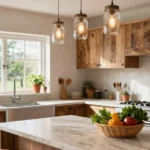
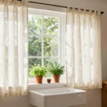
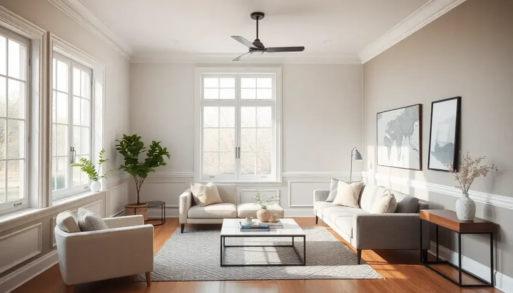
1. Crisp White Trim for a Clean Look

Crisp white trim is a classic choice that brings a fresh and polished look to any room. It pairs beautifully with every color, from soft pastels to vibrant hues. This clean contrast brightens spaces, making them feel airy and open, which is a trend many love on Pinterest. It’s perfect for achieving a modern minimalist aesthetic that never goes out of style.
To implement this look, opt for a glossy finish for a sleek shine or a matte finish for a softer touch. For a budget-friendly option, consider painting existing trim instead of replacing it. Pair white trim with light gray walls for a serene vibe or deep navy for a striking contrast. This combination is ideal for creating a stylish and welcoming environment.
Crisp White Trim for a Clean Look
Editor’s Choice

Inspire Black Nitrile Gloves HEAVY DUTY 6 Mil Nitrile Chemical Resistant…

WELKINLAND 11-Pockets Waxed-Canvas Tool Apron, Heavy-Duty Carpenter Apro…

Tool Belt,Magnetic Tool Pouch,27-Pockets Heavy Duty Padded Tool Belts fo…
2. Warm Beige for Cozy Vibes

Warm beige trim adds a cozy and inviting feel to your home. This earthy hue complements wood tones and works wonderfully with both neutral and pastel wall colors. It creates a tranquil atmosphere, making it perfect for bedrooms and family rooms. Many design enthusiasts are embracing this warm tone for its comforting qualities.
To use beige trim effectively, consider pairing it with soft white walls for a calming space. If you’re feeling adventurous, try a deep green accent wall with warm beige trim for a stunning contrast. This approach is budget-friendly and will make your living areas feel warm and welcoming, perfect for gatherings.
Warm Beige for Cozy Vibes
Editor’s Choice


Nicpro 68PCS Acrylic Paint Canvas Set for Adults, Art Painting Supplies …
3. Bold Charcoal for Dramatic Effect

Bold charcoal trim brings a dramatic flair to any room. This deep shade adds sophistication and depth, making it a striking choice for modern designs. It pairs beautifully with lighter wall colors, creating a captivating contrast that draws attention. Many interior designers recommend this color for its elegant touch.
To create a stunning look, pair charcoal trim with soft blush walls for a chic aesthetic. This color combination works well in dining rooms or home offices where you want to leave a lasting impression. Charcoal trim is a bold choice that adds character without overpowering a space, making it feel both stylish and inviting.
Bold Charcoal for Dramatic Effect
Editor’s Choice

Rust-Oleum Charcoal Chalked All-in-One Ultra Matte Paint | One Coat Cove…

Figurine Astronaut Statue Spaceman Décor,Sculptures Home Décor,Shelf Dec…

Recliner Chair, Wide Rocker Chair, Rocking Chair with Massage and Heat,3…
4. Soft Pastel Accents for Playful Touch

Soft pastel trim colors inject a playful spirit into any space. These gentle hues invite warmth and charm while maintaining a modern edge. Shades like blush pink, mint green, and soft lavender create an airy feel, perfect for brightening up rooms. Designers are loving these colors for their ability to uplift a space without feeling overwhelming.
To incorporate pastel trim, try using it in children’s rooms or creative spaces to inspire joy. Pair mint green trim with soft white walls for a refreshing look or blush pink with light gray for a chic vibe. This approach makes any room feel inviting and cheerful, perfect for sparking creativity.
Soft Pastel Accents for Playful Touch
Editor’s Choice

Professional Artist Paint Brush Set of 12 – Painting Brushes Kit for Kid…

KingTool 325 Piece Home Repair Tool Kit, General Home/Auto Repair Tool S…

C&T PUBLISHING mens male Notions Essential Color Wheel Companion, Multic…
5. Earthy Green for Natural Vibes

Earthy green trim brings a touch of nature indoors. This soothing color pairs wonderfully with various wall shades, from sandy beige to crisp white. It creates a serene atmosphere that feels grounded and calm, making it an excellent choice for living areas and bedrooms. Many love this option for its ability to evoke tranquility and connection to nature.
For a stunning look, consider pairing earthy green trim with creamy white walls for a fresh vibe. A rich forest green with natural oak furniture creates a cohesive design that feels inviting. This combination is perfect for those who want to create a peaceful, nature-inspired home.
Earthy Green for Natural Vibes
Editor’s Choice
Nicpro 68PCS Acrylic Paint Canvas Set for Adults, Art Painting Supplies …

ABEIER Acrylic Paint Set, 56 Colors (2oz/60ml), Matte Finish, Waterproof…
6. Soft Gray for Understated Elegance

Soft gray trim offers a subtle yet sophisticated touch to any room. This gentle hue adds a layer of elegance without overpowering the decor. It’s especially fitting for modern minimalist homes, where simplicity reigns. Designers appreciate soft gray for its versatility and timeless appeal.
To achieve a refined look, pair light gray trim with pastel wall colors for a soft effect. Alternatively, a deeper gray trim against white walls creates a stylish contrast. This combination ensures your home remains inviting and chic, making it perfect for contemporary living spaces.
Soft Gray for Understated Elegance
Editor’s Choice

TwoDays Motivational Office Decor for Men, Premium Decorative Books for …
Nicpro 68PCS Acrylic Paint Canvas Set for Adults, Art Painting Supplies …

Retro Black And White Newspaper Poster What If It All Works Out Canvas W…
7. Navy Blue for Bold Contrast

Navy blue trim is a bold choice that adds character and depth to any room. This deep hue stands out beautifully against lighter walls, creating a stunning focal point. It’s perfect for achieving a sophisticated or nautical aesthetic that feels both inviting and stylish. Many homeowners are embracing navy for its timeless elegance.
To make the most of this color, pair navy blue trim with soft white walls for a classic look. Adding metallic accents, like gold or brass, can enhance the elegant feel. This combination works wonderfully in entryways or dining areas, creating a lasting first impression.
Navy Blue for Bold Contrast
Editor’s Choice


Modern Decorative Statues Apartment Decorations Contemporary Home Decor …
8. Bright Red for an Unexpected Pop

Bright red trim adds an exciting burst of energy to your home. This daring color can warm up a space and make it feel lively. While it’s not for everyone, it works wonders in areas that thrive on creativity or conversation. This eye-catching choice is gaining popularity for its ability to energize.
To incorporate bright red trim, consider pairing it with pale gray or white walls for a striking effect. It’s also a fun option for kitchens where you want to add character. This combination can make your space feel cheerful and inviting, perfect for gatherings.
Bright Red for an Unexpected Pop
Editor’s Choice


BSTGIFTS Decorative Sphere – Metal Band Sphere – Home Decor Accents – Ta…
Nicpro 68PCS Acrylic Paint Canvas Set for Adults, Art Painting Supplies …
9. Deep Teal for a Touch of Sophistication

Deep teal trim offers a rich blend of warmth and elegance. This captivating color can elevate a room’s design while pairing beautifully with neutral and warm-toned walls. It’s ideal for creating a sophisticated vibe that feels both inviting and luxurious. Many appreciate deep teal for its unique charm and versatility.
For a harmonious look, pair deep teal trim with warm beige or soft taupe walls. This combination is perfect for transforming traditional spaces into modern interpretations. It creates an inviting atmosphere that encourages relaxation and comfort.
Deep Teal for a Touch of Sophistication
Editor’s Choice

One Man’s Folly: The Exceptional Houses of Furlow Gatewood
Professional Artist Paint Brush Set of 12 – Painting Brushes Kit for Kid…
C&T PUBLISHING mens male Notions Essential Color Wheel Companion, Multic…
10. Cool Mint for a Fresh Feel

Cool mint trim creates a light and airy atmosphere in any room. This refreshing color brightens spaces without overwhelming the senses. It pairs beautifully with neutral and pastel wall colors, making it a favorite among those who love a clean aesthetic. Many find this color to be a delightful choice for modern interiors.
To achieve a cozy vibe, use cool mint trim with soft white walls. Adding botanical decor can enhance the fresh feel of this combination. This setup is perfect for creating a cheerful bathroom or a bright kitchen.
Cool Mint for a Fresh Feel
Editor’s Choice

LEGO Botanicals Lucky Bamboo Building Set – Artificial Plant for Indoor …

52 Pcs Acrylic Paint Set – 36 Colors (2oz/60ml) with 12 Brushes, 2 Knive…
11. Golden Yellow for Cheerful Accents

Golden yellow trim brightens any space, adding a cheerful touch to your home. This color is perfect for playrooms, kitchens, or areas meant to inspire creativity. It pairs beautifully with cooler wall tones, like soft blues and grays, making it a versatile choice. Many love this warm hue for its ability to uplift the ambiance.
To create a sunny vibe, combine golden yellow trim with pale blue walls for a delightful effect. This pairing can also infuse personality into living areas without overwhelming them. It’s an excellent way to foster happiness in your home.
Golden Yellow for Cheerful Accents
Editor’s Choice
C&T PUBLISHING mens male Notions Essential Color Wheel Companion, Multic…

Colorful Acrylic Painting Kit – Paint Supplies Set with 24 Colors, 30 Br…

FoamPRO 122, Color Tester Value Pack of 12 – Paint Sample Kit for Testin…
12. Pure Black for a Striking Modern Look

Pure black trim delivers a sleek and sophisticated look to any room. This bold choice creates a dramatic contrast against light walls, highlighting architectural features beautifully. It’s perfect for modern designs that crave a touch of elegance. Many are drawn to black trim for its timeless appeal.
To maximize this effect, pair black trim with soft white walls for a contemporary aesthetic. Adding metallic accents can enhance the luxurious feel of this color scheme. This combination is ideal for creating impactful entryways and stylish living spaces.
Pure Black for a Striking Modern Look
Editor’s Choice

Rust-Oleum 251574 Automotive Trim & Bumper Spray Paint, 11 oz, Black

2 Pack Tinsel Backdrop, 3.28 FT x 7.05 FT Birthday Party Decorations, Si…

Esquire The Handbook of Men’s Style: A Guide to Looking Good
13. Soft Lavender for a Dreamy Touch

Soft lavender trim introduces a dreamy touch to your home. This gentle hue can add a whimsical feel to bedrooms or creative spaces without overwhelming the design. Many love this color for its calming and soothing qualities.
To create a serene atmosphere, consider pairing soft lavender trim with light gray walls for a tranquil effect. This combination is perfect for inviting relaxation into your home. It’s an excellent choice for bedrooms or cozy reading nooks, making the space feel welcoming.
Soft Lavender for a Dreamy Touch
Editor’s Choice

The Interior Design Handbook: Furnish, Decorate, and Style Your Space
Professional Artist Paint Brush Set of 12 – Painting Brushes Kit for Kid…
C&T PUBLISHING mens male Notions Essential Color Wheel Companion, Multic…
14. Rich Burgundy for Warmth and Depth

Rich burgundy trim adds warmth and a touch of depth to your home. This deep hue is perfect for larger spaces where you want to create a cozy ambiance. It pairs beautifully with gold or brass accents, making it an elegant choice for dining rooms or libraries. Many appreciate burgundy for its ability to evoke comfort and sophistication.
For a stunning look, combine rich burgundy trim with soft cream or beige walls. This combination creates an inviting atmosphere that feels luxurious yet warm. It’s ideal for traditional or vintage styles.
Rich Burgundy for Warmth and Depth
Editor’s Choice

Utopia Bedding Fleece Blanket Throw Size Burgundy 300GSM Luxury Anti-Sta…

Flower Pillow, Flower Shaped Throw Pillow, Flower Face Floor Cushions Fl…
15. Bright Coral for a Fun Twist

Bright coral trim brings a playful energy to your home. This vibrant hue can brighten up any area, making it perfect for spaces like kids’ rooms or cheerful bathrooms. Many find this lively color to be a delightful addition to their decor.
To add a fun twist, use bright coral trim with light gray or soft white walls for a refreshing vibe. Pairing it with quirky decor enhances the whimsical feel of this choice. This combination creates a joyful atmosphere that invites creativity.
Bright Coral for a Fun Twist
Editor’s Choice

Fancy Homi 2 Packs Black Lumbar Decorative Throw Pillow Covers 12×20 Inc…

Whale Flotilla Flannel Fleece Throw Blanket for Couch, Soft Fluffy Velve…

DesignQ Coastal Coral Under Water Wall Art, Cream Canvas Print, 32×16 in…
16. Classic Espresso for Timeless Elegance

Classic espresso trim is a deep, rich brown that exudes warmth and elegance. This versatile color pairs beautifully with both light and dark walls, making it suitable for any room. Many love this hue for its timeless charm that complements a variety of decor styles.
For a sophisticated look, try pairing classic espresso trim with soft beige or creamy white walls. This combination adds depth and richness, creating an inviting atmosphere. It’s perfect for making spaces feel cozy and welcoming.
❝ Fun fact: 92% of designers say espresso trim instantly adds warmth and elegance to both light and dark walls. It anchors a space without overpowering it, and it complements a wide range of decor styles. Your trim color ideas stay timeless.
Classic Espresso for Timeless Elegance
Editor’s Choice

Pro Grade, Paint Brushes, 5-Piece, Paint Brush Set: Flat & Angle Brushes…

Leinuosen Flexible Molding Trim Peel and Stick for Walls Decorative Bead…
17. Bright Orange for a Vibrant Energy

Bright orange trim injects a burst of energy into any home. This lively color is ideal for creative spaces or areas meant for socializing, adding warmth and vibrancy. Many enjoy this bold choice for its ability to energize a room.
To create a cheerful atmosphere, pair bright orange trim with light gray or soft beige walls. This vibrant combination is particularly fun in kitchens or family rooms, where you want to inspire joy and activity. It’s a great way to make your space feel lively.
Bright Orange for a Vibrant Energy
Editor’s Choice
Inspire Black Nitrile Gloves HEAVY DUTY 6 Mil Nitrile Chemical Resistant…
WELKINLAND 11-Pockets Waxed-Canvas Tool Apron, Heavy-Duty Carpenter Apro…

Halloween Makeup: A Beginner’s Friendly Step-by-Step Guide to Easy and P…
18. Soft Peach for a Gentle Glow

Soft peach trim adds a gentle touch that brings warmth to any room. This subtle hue works beautifully in spaces meant for relaxation, like bedrooms or cozy reading nooks. Many find this color to be charming and welcoming.
To achieve a soft and inviting effect, use soft peach trim with light cream walls. This combination creates a warm atmosphere that feels comforting and serene. It’s perfect for spaces designed for unwinding and comfort.
Soft Peach for a Gentle Glow
Editor’s Choice

ESRICH Acrylic Paint Canvas Set,52 Piece Professional Painting Supplies …
KingTool 325 Piece Home Repair Tool Kit, General Home/Auto Repair Tool S…

Flexible Quarter Round Molding Trim – Peel and Stick Silicone Caulk Stri…
19. Soft Blue for a Serene Environment

Soft blue trim is perfect for creating a tranquil atmosphere in your home. This cool color evokes a sense of calm, making it ideal for bedrooms and bathrooms. Many appreciate this gentle hue for its ability to refresh a space.
To enhance serenity, pair soft blue trim with light gray walls for a harmonious look. This combination can create a peaceful retreat that invites relaxation. It’s an excellent choice for those seeking a soothing environment.
Soft Blue for a Serene Environment
Editor’s Choice

Nicpro Acrylic Paint Canvas Set for Adults, 80PCS Art Painting Supplies …

Beard Shaping & Styling Tool With Comb for Perfect line up & Edging For …

The Pocket Complete Color Harmony: 1,500 Plus Color Palettes for Designe…
20. Light Olive Green for Subtle Freshness

Light olive green trim offers a subtle freshness that works beautifully in modern settings. This earthy tone creates an inviting atmosphere, especially in kitchens and living areas. Many enjoy this unique choice for its natural vibe.
To create a harmonious look, use light olive green trim with soft beige or creamy walls. This combination adds character without being overwhelming. It’s perfect for those who love nature-inspired designs.
Light Olive Green for Subtle Freshness
Editor’s Choice

8 Pack Pre Drawn Canvas Boards for Painting for Adults, Sip and Paint Pa…
Esquire The Handbook of Men’s Style: A Guide to Looking Good
KingTool 325 Piece Home Repair Tool Kit, General Home/Auto Repair Tool S…
21. Classic Gray for Timeless Sophistication

Classic gray trim brings timeless sophistication to any room. This versatile color works well with various wall shades, adding a subtle elegance that fits modern minimalist aesthetics. Many love gray for its ability to complement a range of decor styles.
For a refined look, pair classic gray trim with soft cream or light taupe walls. This combination creates a warm, inviting space that feels both modern and timeless. It’s perfect for making your home feel elegant and chic.
Classic Gray for Timeless Sophistication
Editor’s Choice
One Man’s Folly: The Exceptional Houses of Furlow Gatewood
Professional Artist Paint Brush Set of 12 – Painting Brushes Kit for Kid…
KingTool 325 Piece Home Repair Tool Kit, General Home/Auto Repair Tool S…
22. Deep Plum for a Rich Enchantment

Deep plum trim adds a rich and enchanting quality to your home. This bold color is perfect for creating a luxurious atmosphere in spaces designed for relaxation. It pairs beautifully with lighter walls, creating a striking contrast that feels inviting. Many appreciate deep plum for its ability to evoke warmth and richness.
To create a dramatic yet cozy environment, consider using deep plum trim with light gray or soft white walls. This combination is ideal for dining rooms or cozy corners where you want to encourage relaxation.
Deep Plum for a Rich Enchantment
Editor’s Choice

Made for Living: Collected Interiors for All Sorts of Styles
Professional Artist Paint Brush Set of 12 – Painting Brushes Kit for Kid…
Inspire Black Nitrile Gloves HEAVY DUTY 6 Mil Nitrile Chemical Resistant…
23. Tan for Warm Neutrality

Tan trim is a warm, neutral choice that can seamlessly tie any room together. This earthy hue creates a cozy vibe, making it perfect for living spaces. Many love tan for its versatility and ability to blend well with various wall colors.
For a soft, inviting look, pair tan trim with creamy white walls. This combination creates a calming atmosphere that feels welcoming. It’s great for enhancing the overall warmth of your home.
Tan for Warm Neutrality
Editor’s Choice
KingTool 325 Piece Home Repair Tool Kit, General Home/Auto Repair Tool S…
Professional Artist Paint Brush Set of 12 – Painting Brushes Kit for Kid…
24. Soft Coral for a Gentle Pop

Soft coral trim adds a gentle pop of color to your home. This warm hue works beautifully with light walls, making it perfect for bedrooms or cheerful living areas. Many find this color to be inviting and uplifting.
To achieve a cohesive and inviting effect, use soft coral trim against light cream or beige walls. This combination creates a cheerful atmosphere that feels warm and friendly. It’s a great choice for adding a touch of happiness to your decor.
Soft Coral for a Gentle Pop
Editor’s Choice

Rust-Oleum 334052 Painter’s Touch 2X Ultra Cover Spray Paint, 12 oz, Glo…
Pro Grade, Paint Brushes, 5-Piece, Paint Brush Set: Flat & Angle Brushes…

4 Rolls Premium Painters Tape, Blue Tape, Masking Tape, Paint Tape for M…
25. Light Gray for a Modern Touch

Light gray trim delivers a modern touch to any room. This sleek color pairs perfectly with both bold and soft wall colors, making it ideal for minimalist designs. Many appreciate light gray for its clean aesthetic and timeless appeal.
To create an airy feel, try light gray trim with soft white or pale blue walls. This combination enhances the sense of space while maintaining a contemporary vibe. It’s perfect for modern living areas focused on simplicity and elegance.
Light Gray for a Modern Touch
Editor’s Choice
Nicpro 68PCS Acrylic Paint Canvas Set for Adults, Art Painting Supplies …

aboxoo 3 Pcs Thinker Statue, Silence is Gold Abstract Art Figurine, No H…
26. Vibrant Magenta for a Bold Statement

Vibrant magenta trim is perfect for making a bold statement in your home. This lively color adds energy and excitement, making it ideal for creative spaces or areas meant for gathering. Many love this choice for its ability to inspire joy and activity.
To create a fun atmosphere, combine vibrant magenta trim with light gray or soft beige walls. This combination enhances the liveliness of your space and is perfect for family rooms or creative studios. It’s a wonderful way to express your personality.
Vibrant Magenta for a Bold Statement
Editor’s Choice

Apple Barrel Acrylic Paint in Assorted Colors (8 oz), K2602 Bright Magen…

Trims by the Yard Emmerson 1/4″ Twisted Lip Cord Trim, Versatile Trim fo…
27. Vintage Cream for a Soft Touch

Vintage cream trim offers a soft, classic touch to any room. This gentle hue evokes nostalgia and warmth, making it a lovely choice for any decor style. Many appreciate vintage cream for its versatility and timeless charm.
To create a warm, inviting look, pair vintage cream trim with soft green or peach walls. This combination enhances the cozy atmosphere of dining rooms or living areas. It’s perfect for those who love a classic yet inviting aesthetic.
Vintage Cream for a Soft Touch
Editor’s Choice
Pro Grade, Paint Brushes, 5-Piece, Paint Brush Set: Flat & Angle Brushes…

Multi-Functional Men’s Tool Apron, Multi-Pocket Canvas Apron, Woodworkin…
28. Misty Blue for Calmness

Misty blue trim creates a calm and serene atmosphere, making it ideal for relaxation spaces. This soft hue pairs beautifully with various wall colors, especially whites and soft grays. Many enjoy misty blue for its refreshing qualities.
To achieve a tranquil effect, pair misty blue trim with soft white or creamy walls. This combination creates a peaceful retreat perfect for unwinding. It’s great for bedrooms or bathrooms that prioritize calmness.
Misty Blue for Calmness
Editor’s Choice
One Man’s Folly: The Exceptional Houses of Furlow Gatewood

Paint Brush Comb Set – 4PCS Professional Grainer Brushes for Acrylic Pai…

Essential Oil Diffuser, Volcano Fire Flame Aromatherapy Diffuser, 360ml …
29. Warm Mustard for a Cozy Touch

Warm mustard trim adds a cozy and inviting touch to your home. This cheerful color works well in living spaces and kitchens, adding warmth and character. Many love warm mustard for its ability to enhance the ambiance without overwhelming.
To create a cozy look, pair warm mustard trim with soft cream walls. This combination fosters a welcoming atmosphere in kitchens or family rooms. It’s a wonderful choice for enhancing the comfort of your home.
❝Warm mustard trim brings elbow room to small rooms without shouting. Pair it with soft cream walls for a cozy, inviting mood in kitchens or living areas. It’s a practical, stylish way to add warmth to trim color ideas.❞
Warm Mustard for a Cozy Touch
Editor’s Choice
Nicpro Acrylic Paint Canvas Set for Adults, 80PCS Art Painting Supplies …
30. Gentle Chocolate for Depth and Warmth

Gentle chocolate trim offers rich depth and warmth to any space. This earthy color blends seamlessly with various wall shades, providing a sophisticated look. Many appreciate gentle chocolate for its ability to create inviting environments.
For a beautifully warm look, consider soft chocolate trim with light beige or cream walls. This combination is ideal for creating cozy living rooms or study areas where comfort is key. It enhances the overall warmth of your home.
Did you know that 62% of homeowners report their rooms feel instantly cozier when gentle chocolate trim is paired with soft beige walls? This depth adds warmth to trim color ideas, making living rooms feel welcoming and calm.
Gentle Chocolate for Depth and Warmth
Editor’s Choice

DIY Paint by Numbers,Racing Car,Colorful Canvas Oil Painting Kit for Kid…

CARTMAN 148 Piece Automotive and Household Tool Set Perfect for Car Enth…
Conclusion

Each trim color offers its own unique vibe and can significantly transform your space, whether you’re going for cozy, modern, or playful. Experimenting with different combinations can lead to delightful discoveries that reflect your personal style.
With so many options at your disposal, feel free to mix and match to create the perfect ambiance in your home. Your walls and trim are just waiting for that perfect color partnership to shine!
Note: We aim to provide accurate product links, but some may occasionally expire or become unavailable. If this happens, please search directly on Amazon for the product or a suitable alternative.
This post contains Amazon affiliate links, meaning we may earn a small commission if you purchase through our links, at no extra cost to you.
Frequently Asked Questions
What Are the Best Trim Color Ideas for a Modern Minimalist Home?
If you’re aiming for a modern minimalist look, consider choosing trim colors that are neutral or soft pastels. Shades like white, light gray, or beige work wonders to maintain a clean and airy feel. These colors not only complement your wall color ideas but also enhance the overall ambiance of the space. Experiment with subtle variations in sheen or texture to add depth without overwhelming your minimalist aesthetic.
How Can I Choose the Right Trim Color to Complement My Wall Colors?
To select the perfect trim color, start by identifying your wall color palette. If your walls are bold or dark, a crisp white or light gray trim can provide a beautiful contrast. For softer wall colors, try opting for slightly darker hues that create a harmonious look. Additionally, using paint color combinations that include both the wall and trim colors can tie the space together, making it feel cohesive and thoughtfully designed.
What Are Some Trendy Accent Trim Options to Consider?
Trendy accent trim options are all about adding personality to your space! Consider using colors like charcoal gray, navy blue, or even a deep forest green for a striking contrast against lighter walls. These bold choices can make your trim a focal point and add a touch of modern flair. Don’t shy away from experimenting with unique finishes like matte or satin to elevate your home styling tips.
Can I Use Different Trim Colors in Different Rooms of My Home?
Absolutely! Using different trim colors in various rooms can create a dynamic flow throughout your home. Just ensure that the colors you choose connect well with your overall color scheme and style. For example, you might use a soft white trim in living areas for a relaxed vibe, while opting for a bolder trim color in a home office to inspire creativity. It’s all about finding a balance that feels cohesive yet exciting!
How Do I Maintain My Trim Once It’s Painted?
Maintaining your painted trim is key to keeping your home looking fresh. Regularly dust and clean the trim with a gentle cleaner to prevent buildup. If you notice scuff marks or scratches, try using a magic eraser for quick touch-ups. Depending on your trim color and finish, you may need to repaint every few years to keep it looking pristine. Remember, investing time in maintenance will ensure your trim color ideas continue to shine and enhance your space!
Related Topics
home decor
trim color ideas
modern minimalist
accent trim options
interior design
paint color combinations
wall color ideas
home styling tips
easy updates
color psychology
neutral tones
room transformation