Your living room’s color palette sets the entire mood for your home’s most important gathering space. We’ve all walked into rooms that instantly made us feel energized, calm, or inspired – and that’s the power of choosing the right colors for your walls, furniture, and decor.
Whether you’re dreaming of a cozy neutral sanctuary, a bold statement wall, or a fresh modern vibe, we’re here to guide you through the most stunning color combinations that’ll transform your space. From timeless classics that never go out of style to trending hues that’ll make your guests stop and stare, the perfect color scheme is waiting for you.
We’ll explore everything from warm earth tones that create intimate conversations to cool blues that open up smaller spaces. Get ready to discover color ideas that’ll make your living room the heart of your home – and the envy of everyone who visits.
Neutral Color Palettes That Create Timeless Appeal
Neutral living room colors provide the perfect foundation for any design style while ensuring your space remains stylish for years to come. These versatile hues offer endless decorating possibilities and create a calming atmosphere that welcomes both family and guests.
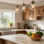
Warm Beiges and Creams for Cozy Comfort
Warm beiges transform your living room into an inviting retreat that feels like a gentle embrace. We love how mushroom beige paired with cream accents creates depth without overwhelming the space. These earthy tones work beautifully with natural wood furniture, woven textures, and brass hardware.
Creamy whites add brightness while maintaining the cozy factor that makes beige so appealing. Layering different shades of cream from ivory to buttercream prevents the room from feeling flat. Rich textures like linen curtains, wool rugs, and velvet pillows enhance the warmth these colors naturally provide.
Natural lighting enhances warm neutral palettes throughout the day. Morning sunlight makes cream walls glow softly while evening lamps cast a golden ambiance across beige upholstery. We recommend testing paint colors at different times to see how they respond to your room’s unique lighting conditions.
Cool Grays for Modern Sophistication
Cool grays deliver contemporary elegance that works with both minimalist and maximalist design approaches. Charcoal gray accent walls create dramatic focal points while lighter dove gray keeps the overall feel airy and spacious. These sophisticated hues pair exceptionally well with crisp white trim and black metal fixtures.
Silver undertones in gray paint reflect light beautifully and make small living rooms appear larger. We suggest combining multiple gray shades to add visual interest without introducing competing colors. Cool grays also serve as perfect backdrops for colorful artwork and bold accent pieces.
Metal finishes shine against gray backgrounds, making this palette ideal for showcasing chrome, steel, or platinum decor elements. Glass coffee tables, sleek leather furniture, and geometric patterns complement the clean aesthetic that cool grays naturally create.
Off-White Combinations for Bright Elegance
Off-white living room colors create an airy foundation that makes any space feel larger and more luxurious. Ivory walls combined with soft white furniture establish a serene environment that never goes out of style. These subtle variations prevent the stark look that pure white sometimes creates while maintaining brightness.
Antique white brings warmth to off-white palettes without sacrificing the clean, elegant appearance. We find this combination works particularly well in rooms with limited natural light since these colors reflect and amplify available illumination. Adding touches of pearl gray or champagne creates subtle depth and sophistication.
Texture becomes crucial when working with off-white combinations since color contrast is minimal. Mixing materials like rough jute rugs, smooth marble surfaces, and plush fabric upholstery adds visual interest while keeping the palette cohesive and refined.
Bold Statement Colors That Transform Your Space

Moving beyond neutral palettes, we’ll explore how powerful statement colors can completely transform your living room’s atmosphere. These dramatic hues create focal points that express personality and make unforgettable impressions.
Deep Navy Blues for Dramatic Impact
Deep navy blues instantly create dramatic sophistication in any living room space. We recommend using this rich color as a statement wall behind your sofa or entertainment center to establish a commanding presence without overwhelming the entire room.
Navy works exceptionally well when paired with crisp whites and warm brass accents. Consider incorporating this bold hue through a velvet sectional sofa or built-in bookshelves for maximum visual impact. The depth of navy blue adds elegance while maintaining versatility across different lighting conditions throughout the day.
Furniture pieces in deep navy, such as accent chairs or ottomans, anchor the room beautifully. Accessories like throw pillows, artwork, and table lamps in this dramatic shade provide flexibility to adjust the color’s intensity based on your preferences.
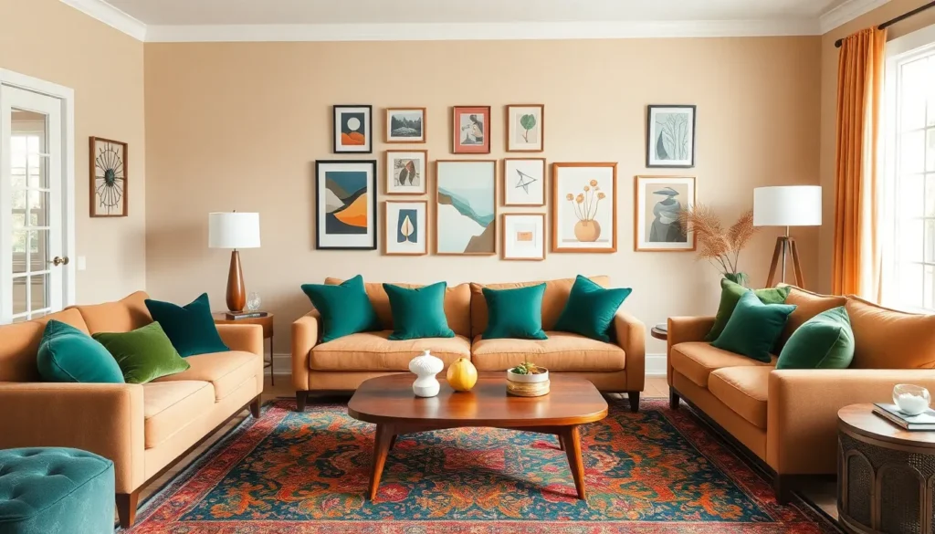
Rich Emerald Greens for Natural Luxury
Emerald green brings vibrant natural luxury that transforms ordinary living spaces into lush retreats. This jewel tone works magnificently as an accent wall, creating a stunning backdrop that feels both sophisticated and refreshing.
We love incorporating emerald through upholstered furniture pieces like wingback chairs or chaise lounges. The color’s richness adds depth while connecting your indoor space to nature’s beauty. Velvet fabrics in emerald green particularly enhance the luxurious feel of this bold choice.
Textiles offer another excellent way to introduce this striking color. Think emerald curtains, area rugs, or decorative pillows that create visual interest without permanent commitment. Plants and natural materials complement emerald green perfectly, improving its organic appeal.
Burgundy and Wine Tones for Warmth
Burgundy and wine tones deliver exceptional warmth that makes living rooms feel immediately welcoming and cozy. These deep, rich colors excel at creating intimate gathering spaces where family and friends naturally want to spend time.
We suggest using burgundy as an accent wall in rooms with ample natural light to prevent the space from feeling too enclosed. Leather furniture in wine tones adds both comfort and sophistication while maintaining the color’s cozy appeal.
Layering different burgundy shades through textiles creates depth and visual interest. Wine-colored throw blankets, decorative pillows, and window treatments work together to establish a cohesive warmth. When paired with neutral backgrounds like cream or beige, these rich hues create the perfect balance between bold statement and comfortable living.
Monochromatic Schemes That Add Depth and Interest

Monochromatic color schemes use different shades of a single color to create depth and prevent your living room from feeling flat or monotonous. We’ll show you how these single-color approaches can transform your space through strategic layering and texture variation.
All-White Layers with Varying Textures
All-white rooms can be stunning when texture becomes the star of your design story. We recommend incorporating smooth paint finishes alongside matte surfaces to create visual contrast that keeps the eye engaged. Glossy surfaces like lacquered coffee tables or mirrors reflect light beautifully while woven fabrics add warmth through throws and pillows.
Texture variety prevents your all-white living room from feeling sterile or hospital-like. Consider mixing materials like chunky knit blankets with sleek ceramic vases or rough-hewn wood furniture with polished marble accents. Different fabric weights from sheer curtains to heavy upholstery create layers that add depth without introducing new colors.
Shades of Blue from Powder to Midnight
Powder blue creates a soft and serene atmosphere that works beautifully as your primary wall color. We love pairing this gentle shade with white trim and natural wood elements to maintain a fresh coastal feeling. Light blue tones like powder blue can make smaller living rooms feel more spacious and airy.
Midnight blue adds dramatic sophistication when used strategically as accent walls or statement furniture pieces. Deep blue creates a cozy evening ambiance that’s perfect for relaxation and entertaining. We suggest combining powder blue walls with midnight blue sofas or artwork to create a stunning gradient effect throughout your space.
Gray Gradients from Light to Charcoal
Light gray creates a bright and airy foundation that works with virtually any accent color you choose. We recommend starting with pale gray walls that can transition beautifully into darker tones through your furniture selections. This approach gives you flexibility to change accessories seasonally while maintaining a cohesive base.
Charcoal gray adds depth and sophistication that makes your living room feel more mature and refined. Dark gray works exceptionally well for accent walls behind your sofa or entertainment center. Gradually transitioning from light gray paint to charcoal furniture creates a visually appealing gradient that guides the eye naturally around your room.
Complementary Color Combinations That Create Visual Harmony

Complementary colors sit opposite each other on the color wheel and create stunning visual contrast that energizes any living space. We’ll explore three powerful combinations that transform rooms into ever-changing yet balanced environments.
Blue and Orange for Vibrant Energy
Blue and orange deliver the most energetic complementary pairing you can choose for your living room. Navy walls paired with coral throw pillows create a sophisticated yet lively atmosphere that feels both calming and invigorating. Sky blue paint transforms into a perfect backdrop when you add tangerine accent chairs or vibrant orange artwork.
Consider using deep ocean blue as your dominant color across 60% of the room through wall paint or a large sectional sofa. Orange accents should occupy about 30% through cushions, curtains, or a statement coffee table. Neutral whites and creams fill the remaining 10% to prevent visual overwhelm while maintaining the combination’s natural vibrancy.
Purple and Yellow for Creative Flair
Purple and yellow combinations spark creativity while maintaining elegant sophistication in your living space. Rich plum walls provide a luxurious foundation that makes golden yellow accessories pop with dramatic effect. Lavender paint creates a softer approach when paired with mustard yellow furniture or bright lemon accents.
Deep eggplant purple works beautifully as an accent wall behind your sofa when balanced with sunny yellow throw blankets and decorative vases. Lighter violet tones across larger surfaces allow you to incorporate bolder yellow statement pieces like an upholstered ottoman or vibrant area rug without overwhelming the space.
Red and Green for Classic Contrast
Red and green create the most timeless complementary combination that feels both cozy and naturally balanced. Burgundy accent walls paired with sage green furniture establish a warm yet tranquil environment perfect for family gatherings. Forest green paint provides an excellent backdrop for coral red cushions or crimson decorative accessories.
Use deep hunter green across 70% of your color scheme through wall paint and major furniture pieces. Warm brick red should appear in 20% of the space via throw pillows, artwork, or a plush area rug. Incorporate cream or beige neutrals in the remaining 10% through lampshades, picture frames, or window treatments to soften the bold contrast and create visual breathing room.
Earth Tone Palettes That Bring Nature Indoors

Bringing the outdoors inside creates a sense of tranquility and connection to nature. Earth tone palettes offer the perfect solution for transforming your living room into a warm and inviting sanctuary.
Terracotta and Clay Inspirations
Terracotta shades evoke images of natural landscapes and create an instantly cozy atmosphere in any living room. Pairing these warm, earthy tones with neutral beige or cream provides the perfect foundation for a welcoming space. We recommend incorporating complementary warm reds or oranges to add depth and visual interest to your color scheme.
Consider using terracotta as an accent wall behind your sofa, then layering in cream colored throw pillows and beige upholstery to balance the intensity. Adding pottery pieces and natural wood furniture enhances the organic feel while maintaining sophistication. This palette works exceptionally well in rooms with plenty of natural light, where the terracotta tones can truly shine.
Forest Greens with Warm Browns
Forest greens combined with warm browns create the ultimate natural and inviting living space for those wanting to bring outdoor serenity indoors. This rich palette immediately establishes a connection to nature while maintaining elegant sophistication. Adding crisp ivory or off white accents provides the perfect balance to prevent the space from feeling too dark or heavy.
We suggest using deep forest green on a statement wall, then incorporating warm brown leather furniture or wooden coffee tables for grounding elements. Ivory colored curtains and cream throw blankets soften the overall look while maintaining the natural theme. This combination works beautifully with brass hardware and natural fiber rugs to complete the organic aesthetic.
Sage and Stone Color Schemes
Sage green offers a softer, more muted version of traditional forest greens that creates instant calm in your living room environment. Pairing sage with stone gray or beige delivers a serene and natural look that promotes relaxation. This gentle palette works perfectly for creating a peaceful retreat where you can unwind after busy days.
Stone gray provides the ideal neutral backdrop when used on larger surfaces like walls or sectional sofas. We recommend layering in sage green through accent chairs, throw pillows, and artwork to introduce color without overwhelming the space. Beige accessories and natural textures like jute rugs complete this calming color scheme while maintaining visual interest throughout the room.
Seasonal Color Ideas That Refresh Your Living Room

Seasonal color schemes allow you to transform your living room’s atmosphere throughout the year. Each season brings unique opportunities to refresh your space with colors that reflect nature’s changing palette.
Spring Pastels for Light and Airy Feels
Spring pastels create a light and airy atmosphere that perfectly captures the season’s fresh energy. Soft pink walls paired with lavender throw pillows bring gentle warmth without overwhelming your space. Mint green accents through plants and decorative objects add natural freshness that complements the pastel palette. Baby blue accessories like vases and artwork introduce cool undertones that balance the warmer pastels.
Combining these soft pastel shades with natural wood furniture creates a harmonious look that feels both sophisticated and welcoming. Plants become essential elements in spring palettes, as their green foliage bridges the gap between your indoor colors and outdoor nature. Textural elements like woven baskets and linen curtains enhance the organic feel while maintaining the light, breezy atmosphere.
Summer Brights for Energetic Vibes
Summer brights deliver energetic and lively vibes that make your living room perfect for gatherings and entertaining. Coral accent walls create vibrant focal points when balanced with neutral backgrounds like crisp white or cream. Yellow accessories such as throw pillows and artwork inject sunshine into your space without overwhelming the overall design. Lime green plants and decorative objects add natural energy that complements the bright color scheme.
Sky blue elements through rugs or curtains provide cooling contrast against warmer bright tones. Balancing these vibrant colors requires strategic placement, using them as accent pieces rather than dominant features throughout the room. Natural textures like rattan furniture and jute rugs ground the bright palette while maintaining the summer’s carefree spirit.
Autumn Warmth with Burnt Orange and Gold
Autumn warmth transforms your living room into an inviting retreat perfect for cozy evenings and intimate gatherings. Burnt orange accent walls create dramatic focal points that capture the season’s rich beauty. Golden amber accessories like table lamps and decorative bowls add luxurious touches that enhance the warm atmosphere. Cozy brown furniture pieces ground the palette while providing comfortable seating for autumn relaxation.
Natural textiles become crucial in autumn palettes, with wool throws and leather cushions adding both texture and warmth. Wood accents through coffee tables and shelving units reinforce the connection to nature’s autumn display. Layering different warm tones creates depth and visual interest while maintaining the season’s comfortable, welcoming feel.
Winter Cool Tones with Icy Blues and Silvers
Winter cool tones create a serene and calming atmosphere that reflects the season’s peaceful beauty. Icy blue walls establish a cool foundation that feels both modern and timeless. Silver metallic accents through lighting fixtures and decorative objects add sleek sophistication to the winter palette. Frosty white furniture and accessories brighten the space while maintaining the cool color scheme’s integrity.
Deep gray elements provide grounding contrast against lighter cool tones, preventing the space from feeling too stark. Metallic finishes in chrome or brushed nickel enhance the modern aesthetic while reflecting light throughout the room. Combining these cool tones with plush textures like velvet cushions and faux fur throws creates comfort without sacrificing the palette’s sophisticated edge.
Color Psychology Tips for Living Room Atmosphere

Understanding how colors affect our emotions helps us create the perfect atmosphere for each area of our living room. We’ll explore strategic color choices that enhance exact activities and moods throughout your space.
Calming Colors for Relaxation Zones
Blue tones promote calmness and serenity, making them ideal for creating peaceful corners where you unwind after long days. Soft powder blues evoke feelings of tranquility and contentment, transforming your relaxation zones into serene retreats.
Green shades like sage or light green bring mental clarity and serenity to spaces designed for rest. These nature-inspired hues create harmony while reducing stress levels in your favorite reading nook or meditation area.
Neutral colors such as beige and cream establish soothing backgrounds that don’t compete for attention. Warm beiges create cozy atmospheres without overwhelming the senses, allowing your mind to naturally settle into relaxation mode.
Energizing Hues for Social Spaces
Red accents stimulate energy and encourage lively conversations, making this intense color perfect for areas where friends and family gather. Incorporating red through pillows or artwork boosts social interaction without dominating your entire living space.
Orange elements promote enthusiasm and spark creativity during social gatherings. Coral throws or burnt orange accessories inject warmth and vitality into conversation areas, encouraging guests to feel more animated and engaged.
Yellow touches brighten spaces and create feelings of happiness that naturally draw people together. Sunny yellow cushions or lampshades make rooms feel larger and more cheerful, setting an upbeat tone for entertaining.
Focus Colors for Reading Areas
Muted greens provide balanced environments that enhance concentration without creating distractions. Soft sage walls or olive green furniture help maintain steady focus during extended reading sessions while promoting eye comfort.
Soft blues create peaceful atmospheres that support deep concentration and mental clarity. Powder blue accents or pale blue textiles establish calming backdrops that help you stay engaged with your favorite books.
Neutral grays offer stable foundations that don’t compete with printed text or screen content. Light gray walls or charcoal furniture provide consistent backgrounds that help maintain focus without drawing attention away from your reading material.
Accent Wall Ideas That Make Colors Pop

Creating a focal point through accent walls elevates your living room’s design while maintaining the foundation of your existing color palette. Strategic placement and color selection transform ordinary spaces into ever-changing environments that capture attention and enhance your room’s overall aesthetic.
Feature Wall Color Selection
Navy blue creates stunning visual impact when paired with white or light-colored furniture, delivering the sophisticated contrast that modern living rooms demand. This deep hue works particularly well behind entertainment centers or seating areas where you want to establish a dramatic backdrop.
Raspberry red adds vibrant energy to your space, especially when balanced with neutral colors like cream or beige throughout the rest of the room. Consider this bold choice for walls behind artwork or bookshelves where the color can enhance displayed items.
Deep plum transforms any corner into a luxurious retreat, creating the perfect atmosphere for cozy reading nooks or intimate conversation areas. This rich color works beautifully with metallic accents and warm lighting to enhance its sophisticated appeal.
Black delivers unexpected depth and sophistication, particularly effective in well-lit rooms where natural light prevents the color from overwhelming the space. Use this dramatic choice strategically on walls with large windows or in rooms with abundant artificial lighting.
Wallpaper Alternatives for Color Impact
Painted patterns offer creative freedom through stencils or freehand techniques, allowing you to customize designs that perfectly match your living room’s personality. These hand-painted elements cost significantly less than wallpaper while providing unique artistic touches.
Wall decals provide easy application and removal options, making them perfect for renters or anyone who enjoys changing their decor seasonally. These versatile additions come in countless colors and patterns, from geometric shapes to botanical designs.
Textured paint creates three-dimensional effects without requiring wallpaper installation, adding visual interest through raised patterns or subtle variations in surface texture. This technique works especially well for accent walls where you want tactile appeal alongside visual impact.
Paint Techniques for Textural Interest
Ombre effects gradually blend colors from light to dark, creating sophisticated transitions that add depth without overwhelming your living room’s existing color scheme. This technique works beautifully on accent walls where you want gentle color progression.
Stenciling introduces patterns and designs that create visual interest through repeated motifs, from simple geometric shapes to intricate floral designs. Choose stencils that complement your furniture and decor for cohesive results.
Ragging applies paint with cloth materials to achieve textured finishes that catch light differently throughout the day, creating ever-changing surfaces that change appearance with lighting conditions. This technique adds subtle sophistication to any accent wall while maintaining your chosen color’s integrity.
Furniture and Decor Color Coordination Strategies

Creating a cohesive color scheme requires strategic coordination between your furniture, paint choices, and decorative accessories. These proven techniques help transform any living room into a professionally designed space that feels both intentional and inviting.
Matching Paint Colors to Existing Furniture
Identifying the dominant colors in your existing furniture pieces becomes the foundation for selecting complementary paint shades. We recommend examining your sofa, coffee table, and major seating pieces to determine whether warm or cool undertones dominate your space. Neutral bases like white, off-white, or greige work exceptionally well as wall colors when you want your furniture to remain the focal point.
Understanding undertones prevents costly color clashes that can make even expensive furniture look mismatched. Brown leather sofas with red undertones pair beautifully with warm paint colors like cream or soft gold, while gray upholstery with blue undertones complements cool wall shades like sage or soft blue. Testing paint samples directly on your walls next to existing furniture reveals how natural light affects the color relationship throughout different times of day.
Monochromatic themes using different shades of a single color create sophisticated coordination without overwhelming your space. We’ve seen dramatic results when homeowners choose varying depths of blue throughout their room, from powder blue walls to navy accent pieces, adding visual depth through textures and patterns rather than competing colors.
Using Throw Pillows and Accessories for Color Pops
Throw pillows serve as the perfect vehicle for introducing bold accent colors that can instantly refresh your living room’s energy. We recommend starting with a neutral sofa base and layering in vibrant pillows like coral, emerald, or sunny yellow to create immediate visual interest. Rugs and vases offer additional opportunities to echo these accent colors throughout the space without committing to permanent changes.
Layered neutrals create sophisticated depth when you combine different tones of beige, cream, and soft gray in your pillow collection. Adding one bold accent color through a single statement pillow or throw blanket prevents the neutral palette from feeling flat while maintaining an elegant, cohesive look. Rotating these colorful accessories seasonally keeps your living room feeling fresh and current.
Strategic placement of colorful accessories draws the eye around the room and creates natural conversation areas. We position bright throw pillows at opposite ends of sectional sofas and echo those colors in artwork or decorative bowls on coffee tables, creating a balanced visual triangle that feels intentional rather than random.
Balancing Bold and Neutral Elements
Offsetting bold statement colors with generous amounts of neutral elements prevents your living room from feeling overwhelming or chaotic. We typically follow the 60-30-10 rule, where neutral tones comprise 60% of the room, secondary colors make up 30%, and bold accents account for just 10% of the overall color scheme. This proven formula ensures dramatic colors enhance rather than dominate your space.
Textural contrast between materials like smooth leather, rough jute, and soft fabric creates visual interest while helping bold colors feel grounded and sophisticated. Combining a navy velvet sofa with a cream wool rug and brass coffee table introduces multiple textures that prevent any single color from becoming too intense. Natural wood elements serve as neutral anchors that bridge the gap between bold and subtle tones.
Warm and cool color combinations require careful balance to create harmony rather than visual tension. We achieve this by pairing warm brown leather furniture with cool blue walls, then adding cream or beige accessories that contain both warm and cool undertones, creating a cohesive bridge between the contrasting temperatures.
Conclusion
We’ve explored countless ways color can transform your living room from ordinary to extraordinary. Whether you’re drawn to timeless neutrals that create lasting appeal or bold statement colors that showcase your personality there’s a perfect palette waiting for you.
Remember that creating your ideal living space isn’t about following rigid rules—it’s about understanding how different colors work together to achieve the mood you want. From seasonal refreshes to strategic accent walls the possibilities are endless when you know how to use color effectively.
Your living room should reflect who you are while welcoming everyone who enters. With these color ideas and techniques you’re now equipped to create a space that’s both beautiful and functional—one that truly feels like home.
Frequently Asked Questions
What colors make a living room feel more spacious?
Light colors like off-white, pale gray, and soft blues create an airy feel that makes rooms appear larger. Cool tones naturally recede, giving the illusion of more space. Pairing these with crisp whites and minimal contrast helps maintain an open, uncluttered atmosphere that enhances the sense of spaciousness.
How do I choose between warm and cool colors for my living room?
Consider your room’s natural light and desired mood. Warm colors (reds, oranges, earth tones) create cozy, intimate spaces perfect for gathering. Cool colors (blues, greens, grays) promote relaxation and openness. North-facing rooms benefit from warm tones, while south-facing rooms can handle cooler palettes effectively.
What is the 60-30-10 color rule for living rooms?
The 60-30-10 rule creates balanced color schemes: 60% dominant color (walls, large furniture), 30% secondary color (upholstery, curtains), and 10% accent color (pillows, artwork). This proportion prevents overwhelming the space while ensuring visual interest and cohesion throughout your living room design.
Can I use bold colors in a small living room?
Yes, but use them strategically. Consider one accent wall in a bold color like navy or emerald green, while keeping other walls neutral. Bold colors work well in small doses through furniture, artwork, or accessories. This approach adds personality without making the space feel cramped or overwhelming.
How often should I change my living room color scheme?
There’s no set timeline, but seasonal updates through accessories are practical. Major color changes (paint, large furniture) typically happen every 5-7 years. However, you can refresh your space seasonally by swapping throw pillows, artwork, and decorative accessories to reflect different color palettes and moods.
What colors promote relaxation in a living room?
Soft blues, sage greens, and warm neutrals like beige and cream are naturally calming. These colors reduce stress and create peaceful environments. Avoid bright, stimulating colors like red or orange in relaxation zones. Layer different shades of your chosen calming color for depth while maintaining tranquility.
How do I incorporate trending colors without major renovations?
Use trending colors through easily changeable elements: throw pillows, blankets, artwork, plants, and decorative accessories. This allows you to experiment with current color trends without committing to permanent changes. Consider one accent wall if you want more impact while keeping the flexibility to update easily.
What’s the best way to test paint colors before committing?
Paint large swatches (at least 2×2 feet) on different walls to see how colors look in various lighting conditions throughout the day. Observe them for several days before deciding. Many paint companies offer sample sizes, and some provide peel-and-stick samples for easier testing without permanent application.