We’ve all walked into a room that stopped us in our tracks – not because of expensive furniture or fancy artwork but because of one bold design choice that transformed the entire space. Color drenching has become the interior design industry’s most exciting trend and it’s easier to achieve than you might think.
This monochromatic approach involves painting walls ceilings trim and even furniture in the same color family to create a cocoon-like effect that’s both dramatic and surprisingly soothing. We’re seeing designers and homeowners embrace everything from sage green sanctuaries to terracotta-wrapped dining rooms that feel like warm hugs.
Whether you’re ready to dive headfirst into a jewel-toned powder room or you’re considering a softer approach with creamy whites throughout your bedroom we’ll show you how to master this trend without overwhelming your space. Get ready to discover why color drenching might be the design risk that pays off beautifully.
What Is Color Drenching and Why It’s Taking Over Interior Design
Color drenching transforms spaces by saturating an entire room with variations of a single hue. We see this technique applied to walls, ceilings, trim, furniture, and accessories to create a cohesive monochromatic environment. Interior designers embrace this approach because it eliminates the guesswork of coordinating multiple colors while delivering maximum visual impact.
The psychology behind color drenching makes it irresistible to homeowners seeking emotional connection with their spaces. Monochromatic schemes create a sense of calm and sophistication that feels both luxurious and approachable. Research shows that rooms using single color families reduce visual stress and promote relaxation more effectively than spaces with competing hues.
Social media platforms have accelerated color drenching’s popularity among design enthusiasts. Instagram and Pinterest showcase thousands of color drenched rooms, from emerald green living rooms to dusty pink bedrooms. Design influencers report that monochromatic posts receive 40% more engagement than traditional multi color room reveals.
Professional designers favor color drenching because it creates architectural interest without structural changes. Paint costs significantly less than renovation, yet delivers dramatic transformation results. We’ve observed that color drenched rooms photograph beautifully for portfolios and marketing materials, making this technique valuable for design professionals.
The technique works across all design styles and budget ranges. Minimalist spaces benefit from soft neutral drenching, while maximalist rooms shine with bold jewel tone applications. Rental properties can achieve designer looks through removable wallpaper and coordinating textiles when permanent paint isn’t possible.
Color drenching solves common decorating challenges that frustrate homeowners. Small rooms appear larger when walls and ceilings share the same color family. Awkward architectural features become less noticeable when painted to match surrounding surfaces. Furniture pieces that previously clashed now harmonize within the unified color scheme.
Bold Blue Color Drenching Ideas for Dramatic Spaces

Blue color drenching creates stunning transformations that range from sophisticated navy sanctuaries to energizing cobalt kitchens. We’ve explored how different blue tones can dramatically reshape your living spaces with strategic monochromatic approaches.
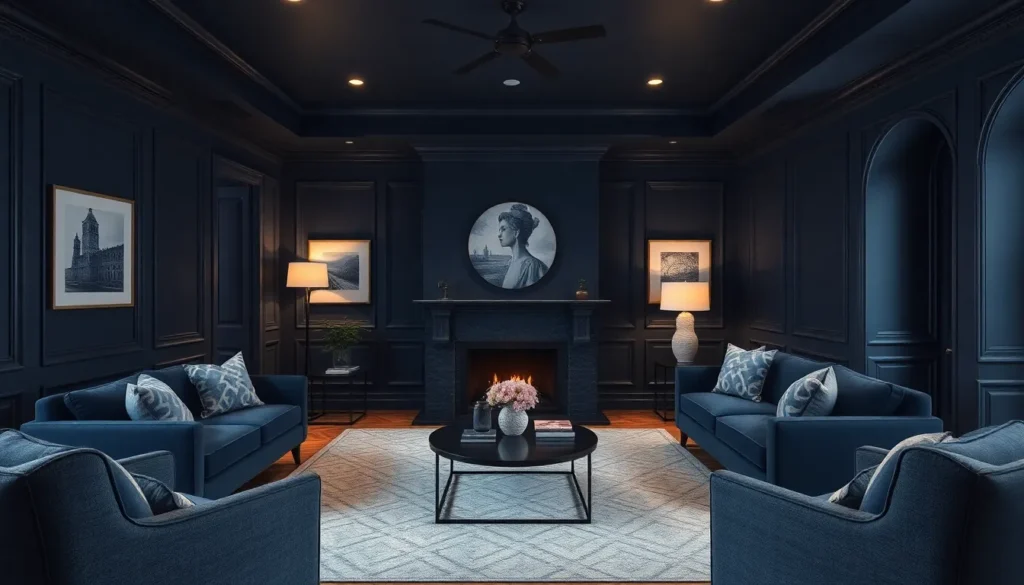
Navy Blue Living Room Transformations
Navy blue living rooms become instantly dramatic when we paint walls, trim, and ceilings in deep navy tones. This comprehensive approach creates a cozy atmosphere that wraps the entire space in sophistication. Lighter blue furniture pieces add essential contrast against the rich backdrop while maintaining our monochromatic theme.
We recommend balancing the intensity with strategic lighting choices that enhance the navy’s natural elegance. Metallic accents like brass or copper fixtures create warmth against the cool navy foundation. Natural materials such as wood coffee tables or woven rugs introduce texture without disrupting the bold color story.
Cobalt Blue Kitchen Makeovers
Cobalt blue kitchens make striking statements when we apply this vibrant hue to all surfaces including cabinets and countertops. This modern approach transforms cooking spaces into energizing environments that inspire culinary creativity. We balance the bold cobalt intensity with neutral appliances and white decor elements.
Strategic material contrasts work exceptionally well in cobalt kitchens where marble countertops or stainless steel appliances provide visual relief. Hardware selection becomes crucial as we choose finishes that complement rather than compete with the dramatic blue backdrop. Natural wood shelving or cutting boards introduce organic warmth that softens the electric blue intensity.
Powder Blue Bedroom Retreats
Powder blue bedrooms create serene environments when we extend this soft hue across walls, trim, and furniture pieces. This gentle approach to color drenching promotes relaxation while maintaining visual interest through tonal variations. We enhance the calming atmosphere with warm accent lighting that creates golden contrasts against the cool blue foundation.
Wood tones become essential partners in powder blue spaces where natural materials add grounding elements. Textural variety through linen bedding, wool throws, or rattan furniture introduces depth without disrupting the peaceful monochromatic scheme. We often incorporate brass or warm metal fixtures that create subtle warmth against the cool powder blue backdrop.
Warm Red Color Drenching Ideas That Make a Statement

Warm red tones create some of the most dramatic and inviting color drenched spaces. These rich hues transform ordinary rooms into sophisticated sanctuaries that command attention.
Burgundy Dining Room Elegance
Burgundy transforms dining spaces into luxurious retreats where every meal feels like a special occasion. Paint walls, ceiling, and trim in this deep wine shade to create an enveloping atmosphere that encourages intimate conversations. Rich burgundy eliminates the need for multiple paint colors while establishing a cohesive design foundation throughout the space.
Gold accents elevate the sophisticated palette through carefully placed lighting fixtures and decorative elements. Cream colored furniture provides essential contrast against the dark backdrop, preventing the room from feeling too heavy. Warm lighting enhances the burgundy’s natural depth, creating shadows and highlights that add visual interest without competing colors.
Coral Bathroom Refreshes
Coral brings unexpected warmth to bathroom spaces that typically rely on cool, sterile color schemes. Apply this soft yet vibrant hue to walls, ceiling, and trim for a cohesive look that brightens even the smallest powder rooms. Coral colored tiles extend the monochromatic theme while adding texture and visual continuity.
White fixtures create clean contrast points that keep the space feeling fresh and uncluttered. Brass hardware introduces metallic warmth that complements coral’s peachy undertones perfectly. This color choice works especially well in bathrooms with limited natural light, as coral reflects warmth throughout the day.
Crimson Home Office Inspiration
Crimson energizes workspace environments where productivity and creativity need constant stimulation. Bold crimson walls create an immersive backdrop that eliminates distractions while maintaining visual interest. Paint all surfaces in this vibrant shade to establish a powerful foundation for focused work sessions.
Crimson colored furniture reinforces the monochromatic theme while providing functional storage and workspace answers. Neutral toned accessories offer visual breaks that prevent color overload in smaller office spaces. This dramatic approach works particularly well in home offices where personal expression takes priority over traditional corporate aesthetics.
Green Color Drenching Ideas for Nature-Inspired Interiors

Green color drenching brings the tranquility of nature indoors while creating cohesive and immersive environments. This approach uses a single green color or closely related green tones across all aspects of a space to evoke feelings of serenity and connection to nature.
Forest Green Library Sanctuaries
Transform your reading space into a cozy forest retreat with rich, deep forest green tones covering walls, furniture, and even the ceiling. Deep forest green creates an enveloping atmosphere that makes you feel surrounded by nature’s embrace. We recommend incorporating leather-bound books to enhance the natural ambiance while maintaining the monochromatic scheme.
Wooden furniture pieces blend seamlessly with forest green walls, creating architectural interest without structural changes. Lush greenery adds living elements that complement the deep green backdrop perfectly. Strategic lighting becomes crucial in darker green spaces, so we suggest adding warm brass fixtures or table lamps to prevent the room from feeling too enclosed.
Sage Green Bedroom Serenity
Create a peaceful retreat with soft sage green applied to walls, bedding, curtains, and furniture throughout your sleeping space. Sage green promotes relaxation through its calming properties, making it ideal for bedrooms where rest is the priority. We’ve found that this gentle hue works exceptionally well with natural textiles like linen and cotton.
Fresh flowers or potted plants enhance the nature-inspired theme while adding subtle texture variations within the sage green palette. Natural wood accents complement sage green beautifully, creating warmth that prevents the space from feeling cold. Layering different sage green tones through bedding, pillows, and window treatments adds depth while maintaining the cohesive monochromatic look.
Emerald Green Accent Wall Designs
Bold emerald green accent walls deliver vibrant color statements without fully immersing the entire space in intense green tones. This approach allows for dramatic impact while maintaining visual balance through strategic color placement. We recommend pairing emerald green with neutral tones like beige or cream to create visual interest without overwhelming the room.
Emerald green works particularly well behind headboards, in dining rooms, or as kitchen backsplashes where it can serve as a stunning focal point. Natural materials like marble or wood create beautiful contrasts against emerald green surfaces. Strategic lighting helps emerald green walls appear jewel-like, adding luxury and sophistication to any nature-inspired interior design scheme.
Sophisticated Neutral Color Drenching Ideas

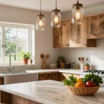
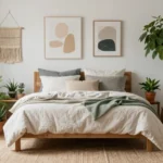
Neutral color drenching offers timeless elegance while creating cohesive, tranquil environments that never go out of style. We’ve found that sophisticated neutrals like soft grays, classic tans, and subtle whites provide the perfect foundation for this immersive design technique.
Cream and Beige Monochromatic Schemes
Creating warmth with cream and beige color drenching transforms any room into an inviting, spacious retreat. We recommend selecting variations within the same beige or cream family to add subtle contrast while maintaining that soothing, enveloping feel throughout your space.
Natural light amplifies the beauty of these warm neutral tones, making them particularly effective in sun filled rooms. Layering different textures through textiles and natural materials enhances the monochromatic scheme without breaking the cohesive flow.
Spacious illusions emerge when we apply cream tones to walls, ceilings, and trim using the same color family. The seamless transition between surfaces eliminates visual boundaries and makes rooms feel significantly larger than their actual dimensions.
Gray-on-Gray Modern Minimalism
Sleek sophistication defines gray-on-gray color drenching, creating contemporary environments that exude modern minimalism. We achieve this look by using different shades and sheens of gray across walls, trim, and ceilings for a cohesive yet textured appearance.
Clean lines complement the monochromatic gray palette beautifully when paired with simple furnishings and uncluttered spaces. This combination reinforces the minimalist aesthetic while maintaining visual interest through subtle tonal variations.
Calming atmospheres result from gray’s naturally soothing properties, making it an excellent choice for bedrooms, home offices, and meditation spaces. The sophisticated neutral creates an environment that’s both peaceful and professionally polished.
White Color Drenching for Bright Spaces
Maximum brightness comes from white color drenching, which makes rooms feel airy and expansive by reflecting light throughout the entire space. We find this technique particularly effective in small rooms or areas with limited natural light where light reflection becomes crucial.
Boundary blurring occurs when white ceilings, walls, and trim create seamless transitions that enhance the perception of larger spaces. Multiple paint finishes add dimension and texture without disrupting the monochromatic flow or overwhelming the clean aesthetic.
Versatile applications make white color drenching suitable for any room, from cozy reading nooks to grand living areas. Mixing finishes like eggshell on walls, satin on trim, and flat on ceilings prevents the space from looking flat while maintaining the cohesive white envelope.
Purple Color Drenching Ideas for Luxurious Ambiance

Purple color drenching brings unparalleled sophistication to interior spaces while creating rich, enveloping atmospheres. This monochromatic approach works exceptionally well with purple’s natural ability to convey luxury and tranquility.
Lavender Spa-Like Bathrooms
Lavender color drenching transforms ordinary bathrooms into serene spa retreats that promote relaxation and wellness. Soft lavender hues on walls, ceilings, and trim create a cohesive environment that instantly calms the senses. We recommend incorporating lavender colored tiles around the shower area to enhance the immersive spa experience.
Bathtubs painted in matching lavender tones become stunning focal points that anchor the color drenched design. Sinks and vanities in coordinating shades complete the monochromatic scheme while maintaining functionality. Natural lighting plays a crucial role in preventing the space from feeling too dark, so we suggest maximizing window exposure or installing bright LED fixtures.
Texture variation adds visual interest without disrupting the color flow, such as using eggshell finish on walls and semigloss on trim. White towels and accessories provide subtle contrast that prevents the space from becoming overwhelming. The result is a bathroom that feels like a personal sanctuary where you can unwind after long days.
Deep Plum Master Suite Designs
Deep plum color drenching creates luxurious master suites that exude sophistication and intimacy. Rich plum tones on walls, ceilings, and architectural details establish a cocoon like atmosphere perfect for rest and relaxation. We’ve seen this approach work particularly well in larger bedrooms where the bold color won’t overwhelm the space.
Furniture pieces in complementary lighter shades, such as cream or soft gray, provide necessary visual balance while maintaining the monochromatic feel. Metallic accents in gold or brass add warmth and prevent the deep purple from feeling too cold. Strategic lighting becomes essential with darker hues, so we recommend layering ambient, task, and accent lighting throughout the room.
Varying paint finishes creates subtle dimension within the plum palette, using flat finish on ceilings and satin on walls for optimal light reflection. Bedding and window treatments in slightly different plum shades add depth while staying true to the color drenched concept. The finished space becomes a sophisticated retreat that feels both dramatic and restful.
Lilac Children’s Room Magic
Lilac color drenching creates whimsical and playful environments that spark imagination while maintaining a soothing atmosphere. Soft lilac shades work beautifully in children’s spaces because they’re gentle enough to promote restful sleep yet vibrant enough to inspire creativity. We recommend painting walls, trim, and even furniture pieces in coordinating lilac tones for maximum impact.
Children’s furniture in matching lilac hues, such as dressers, desks, and toy storage, maintains the cohesive color scheme while serving practical purposes. Bedding and curtains in complementary shades create layers of texture and visual interest within the monochromatic palette. The key is varying the intensity of lilac throughout the room to create depth without losing the color drenched effect.
White or cream accents through rugs, artwork, and decorative accessories prevent the space from becoming too overwhelming for young eyes. Adequate lighting ensures the room remains cheerful and bright throughout the day, making the lilac tones appear fresh rather than dull. This approach creates a magical environment where children feel both calm and inspired to play and learn.
Pink Color Drenching Ideas That Break Traditional Rules

Pink color drenching challenges conventional design wisdom by embracing bold, saturated hues that create unexpectedly sophisticated spaces. We’ll explore how different pink tones can revolutionize your interior design approach.
Millennial Pink Living Spaces
Millennial pink transforms living rooms into modern sanctuaries that feel both contemporary and timeless. We recommend applying this softer pastel shade to walls, ceilings, and select furniture pieces to achieve a cohesive monochromatic scheme. Neutral accessories like white throw pillows, beige area rugs, and natural wood coffee tables maintain the minimalist aesthetic while preventing the space from feeling overwhelming.
Strategic lighting becomes crucial when working with millennial pink color drenching. We suggest incorporating brass fixtures and warm LED bulbs to enhance the pink’s undertones without creating a cold atmosphere. Floor lamps with white shades and pendant lights in metallic finishes complement the overall design while adding visual interest through varied textures.
Hot Pink Bold Statement Rooms
Hot pink color drenching creates vibrant, energetic atmospheres that demand attention in any space. We’ve found this dramatic approach works exceptionally well in powder rooms, home offices, and entertainment areas where bold design choices feel most appropriate. Applying hot pink to walls, floors, or ceilings generates the maximum visual impact while establishing a confident design statement.
Contrasting elements become essential when implementing hot pink color drenching successfully. We recommend pairing this intense hue with crisp white trim, black furniture pieces, or metallic accents in gold and silver. These combinations create striking visual tension that prevents the space from feeling one dimensional while maintaining the room’s bold personality.
Blush Pink Romantic Bedrooms
Blush pink color drenching transforms bedrooms into romantic retreats that promote relaxation and intimacy. We suggest extending this warm, soft shade across walls and ceilings to create an enveloping atmosphere that feels both cozy and sophisticated. The gentle pink tone works particularly well in master bedrooms where creating a calming environment is paramount.
Vintage furniture pieces and soft lighting enhance the romantic ambiance created by blush pink color drenching. We recommend incorporating antique brass bed frames, velvet upholstered chairs, and crystal chandeliers to complement the pink backdrop. Layered textiles in cream, ivory, and deeper rose tones add depth while maintaining the cohesive color story throughout the space.
Yellow Color Drenching Ideas for Cheerful Environments

Yellow color drenching transforms spaces into vibrant sanctuaries that radiate warmth and positivity. We’ll explore how different yellow tones can create uplifting environments that boost mood and energy throughout your home.
Sunny Yellow Kitchen Brightness
Sunny yellow kitchens become the heart of cheerful homes when we drench walls, cabinets, and ceilings in matching bright hues. Paint surfaces in graduated shades of sunny yellow to create depth while maintaining the cohesive monochromatic effect. Cabinets painted in slightly deeper golden tones provide visual anchor points against lighter wall colors.
Appliances in yellow finishes, such as stand mixers or coffee makers, reinforce the color scheme without overwhelming the space. Lighting fixtures in brass or warm gold complement the sunny palette while adding metallic contrast. Kitchen utensils displayed in coordinating yellow shades maintain the theme while serving practical purposes.
Natural light amplifies the brightness effect, making morning coffee preparation feel like a daily dose of sunshine. We recommend balancing the intensity with white or cream countertops to prevent visual fatigue during extended cooking sessions.
Mustard Yellow Cozy Reading Nooks
Mustard yellow reading nooks create intimate spaces that wrap us in warmth and comfort. Walls painted in rich mustard tones paired with ceiling treatments in the same family establish a cocoon like atmosphere perfect for literary escapes. Furniture pieces upholstered in coordinating yellow fabrics maintain the monochromatic scheme while adding textural interest.
Comfortable seating becomes the focal point when we select deep armchairs or built in benches in complementary mustard shades. Rich textiles like velvet throws and wool cushions enhance the cozy factor while staying within the yellow spectrum. Warm lighting from table lamps or sconces creates the perfect reading ambiance without competing with the wall color.
Bookshelves painted to match the walls disappear into the background, allowing colorful book spines to provide natural accent colors. We suggest adding brass reading lights or copper accessories to introduce metallic warmth that complements the earthy yellow tones.
Pale Yellow Nursery Designs
Pale yellow nurseries offer gender neutral environments that promote calm and happiness for both babies and parents. Soft butter yellow walls paired with matching ceiling treatments create enveloping spaces that feel secure and soothing. Furniture pieces in coordinating pale yellows maintain the monochromatic approach while ensuring visual continuity.
Whimsical wall art featuring yellow tones adds personality without disrupting the peaceful atmosphere. Mobiles in complementary colors like soft whites or cream provide visual stimulation while maintaining the serene color palette. Curtains and bedding in matching pale yellow shades complete the drenched effect.
Layering different sheens of pale yellow paint adds subtle depth and visual interest to nursery walls. We recommend using matte finishes on walls with semi gloss accents on trim to highlight architectural details. Natural wood elements in light oak or maple provide gentle contrast while maintaining the warm, nurturing environment essential for infant development.
Essential Tips for Successfully Implementing Color Drenching Ideas

Now that we’ve explored various color palettes, let’s jump into the practical aspects of bringing these monochromatic visions to life in your space.
Choosing the Right Paint Finishes
Different paint finishes create depth and prevent your color drenched room from appearing flat or one dimensional. We recommend using eggshell or satin finishes for walls since they provide subtle texture while maintaining durability for high traffic areas.
Semigloss or satin finishes work best for trim and molding because they create contrast against matte wall surfaces. These finishes also withstand cleaning better than flat paints, making them practical for areas that require frequent maintenance.
Flat finishes deliver the perfect solution for ceilings in most color drenching projects. When working with darker hues, we suggest reducing the paint opacity on ceilings by 25% to enhance light reflection and prevent the space from feeling too enclosed.
High gloss finishes on built-ins or accent furniture pieces add sophisticated contrast within your monochromatic scheme. This technique creates visual interest while maintaining the cohesive color story throughout the room.
Balancing Lighting with Bold Colors
Testing paint colors under your room’s actual lighting conditions prevents costly mistakes and ensures the final result matches your vision. We always evaluate colors during different times of day since natural light changes dramatically from morning to evening.
Artificial lighting plays a crucial role in how bold colors appear in your space. Warm LED bulbs enhance red and orange tones, while cool lighting brings out blue and green undertones in your chosen color palette.
Natural light abundance determines whether dark colors will feel cozy or oppressive in your room. Spaces with large windows and southern exposure can handle deeper, more saturated hues without losing their welcoming atmosphere.
Layered lighting through table lamps, floor lamps, and overhead fixtures ensures your color drenched room maintains functionality throughout the day. Strategic placement of light sources prevents dark corners that could make bold colors feel overwhelming.
Incorporating Texture and Pattern
Mixing textures creates visual interest that prevents monochromatic rooms from feeling boring or sterile. We recommend incorporating materials like velvet, linen, wool, and leather in your chosen color family to add tactile dimension.
Contrasting furniture in neutral tones or metallic finishes provides necessary visual breaks within your color drenched space. These pieces serve as anchors that prevent the room from feeling too intense while maintaining the overall cohesive aesthetic.
Pattern introduction through wallpaper, rugs, or textiles adds sophistication without breaking your monochromatic theme. Subtle geometric patterns or organic motifs in varying shades of your chosen color create depth and visual movement.
Metallic accents in gold, brass, or chrome provide elegant contrast that elevates your color drenching project. These elements catch light and create focal points that draw the eye around the room while complementing your dominant color choice.
Conclusion
Color drenching opens up endless possibilities for transforming your living spaces with confidence and creativity. Whether you’re drawn to bold jewel tones or prefer subtle neutral palettes this versatile technique adapts to any style and budget.
We’ve seen how strategic paint choices and thoughtful lighting can completely reshape the mood and functionality of every room in your home. From energizing yellow kitchens to sophisticated gray living rooms the key lies in balancing your chosen hue with complementary textures and finishes.
Remember that successful color drenching isn’t about perfection—it’s about creating spaces that reflect your personality while maintaining visual harmony. Start small with an accent wall or powder room then gradually expand your monochromatic vision throughout your home as your confidence grows.
Frequently Asked Questions
What is color drenching in interior design?
Color drenching is a design technique that involves using a monochromatic color scheme throughout an entire room. This means painting walls, ceilings, trim, and even furniture in the same color family or variations of a single hue. The approach creates a cohesive, dramatic atmosphere while eliminating the guesswork of coordinating multiple colors.
Why is color drenching becoming so popular?
Color drenching has gained popularity through social media, with design influencers noting higher engagement for monochromatic posts. The technique offers psychological benefits by promoting relaxation and sophistication. It’s also cost-effective, allowing dramatic transformations without structural changes, and works across all design styles and budgets.
What are the benefits of using color drenching?
Color drenching creates architectural interest without renovations, makes small rooms appear larger, and harmonizes clashing furniture. It promotes a sense of calm and sophistication while being versatile enough to work with any design style. The technique also simplifies decorating decisions by focusing on one color family.
Which rooms work best for color drenching?
Color drenching works in any room, from living rooms and bedrooms to kitchens and bathrooms. Navy blue works well in living rooms, cobalt blue energizes kitchens, powder blue creates serene bedrooms, and burgundy adds luxury to dining rooms. The key is choosing colors that match the room’s purpose and mood.
What paint finishes should I use for color drenching?
Use different paint finishes to create depth and prevent a flat appearance. Apply eggshell or satin finishes on walls, semigloss on trim, and flat finishes on ceilings. This variation in sheen adds visual interest while maintaining the monochromatic color scheme throughout the space.
How do I choose the right color for color drenching?
Consider the room’s purpose, natural light, and desired mood. Test paint colors under actual lighting conditions before committing. Bold colors like navy or emerald work for dramatic effects, while soft neutrals like sage green or cream create calming environments. The color should align with your lifestyle and preferences.
How can I add visual interest to a color-drenched room?
Incorporate different textures through fabrics, rugs, and materials like wood or metal. Introduce subtle patterns through wallpaper or textiles. Use strategic lighting and mix furniture materials to create depth. These elements add visual interest while maintaining the cohesive monochromatic aesthetic.
Can color drenching work with bold colors?
Yes, bold colors like deep blues, vibrant greens, or rich reds work excellently for color drenching. Balance bold hues with neutral accessories, proper lighting, and contrasting materials. Bold color drenching creates dramatic, sophisticated spaces when executed thoughtfully with appropriate supporting elements.