Are you looking to breathe new life into your living room? With the right paint colors, you can transform your space into a cozy haven or a lively gathering place. That’s why I’ve put together this collection of 25+ Dulux paint ideas for living room color inspiration. These ideas are not just about choosing colors; they reflect current interior design trends and embrace eco-friendly options for a sustainable home.
This post is perfect for anyone passionate about home decor, whether you’re a seasoned design enthusiast or just starting your decorating journey. If you care about creating a beautiful and sustainable living room, you’ll find inspiration that speaks to your style and values. From warm terracottas to tranquil greens, these paint color combinations cater to various tastes and preferences.
In this guide, you’ll discover a wide range of color schemes designed to spark your creativity. Each idea is carefully curated to help you visualize how different hues can affect your space. You’ll gain practical tips for selecting the best wall colors that align with your lifestyle and elevate your home’s ambiance. So, roll up your sleeves and let’s dive into this colorful journey! Your dream living room is just a brushstroke away.
Key Takeaways
– Explore over 25 eco-friendly Dulux paint ideas to create a living room that reflects your style while being sustainable.
– Discover color schemes ranging from tranquil greens to bold blues that cater to various design preferences.
– Learn how to choose the right paint color combinations to enhance the mood and functionality of your living space.
– Get practical tips on current interior design trends that can impact your color choices and overall decor style.
– Find inspiration in paint colors that create inviting atmospheres, from cozy retreats to vibrant social spaces.
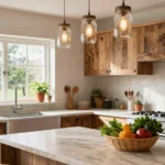
1. Tranquil Greens for Serenity

Tranquil greens bring a sense of calm to your living room, perfect for creating a serene atmosphere. Choose shades like soft sage or deep forest to evoke nature’s tranquility. Pair these greens with natural wood accents to enhance the eco-friendly vibe, as seen in many popular design trends on Pinterest. This combination invites warmth and comfort into your space, making it feel like a peaceful retreat.
To implement this look, consider using plants like ferns or peace lilies that complement the green walls. Balance the greenery with white or beige furniture for a fresh, clean appearance. Add texture with natural fiber throw pillows to enhance the inviting feel, connecting everything with nature.
• Use soft sage or forest green for a calming effect
• Balance with white or beige furniture for freshness
• Add natural fiber pillows for texture
• Use indoor plants for color and life
With these tips, your living room can become a cozy sanctuary where you can unwind and relax.
Tranquil Greens for Serenity
Editor’s Choice

Costa Farms Boston Fern Live Plant, Outdoors or Indoor Houseplant in 10-…

Boho Living Jada Premium Woven Design, Living Room Décor, Decorative Thr…

249094 Painter’s Touch 2X Ultra Cover Spray Paint, 12 oz, Gloss Sage Green
2. Soft Neutrals for Elegance

Soft neutrals create an elegant and sophisticated living room that feels timeless. Think warm beiges, soft taupes, and cool greys that allow for endless design possibilities. These shades blend beautifully with various furniture styles, from sleek modern to rustic charm, creating a cohesive backdrop for vibrant art and decor. Pinterest showcases this trend, emphasizing how neutrals can elevate a space.
For a beautiful look, layer different shades of neutrals to add depth and interest. Incorporate textures like velvet or linen to create warmth and comfort. Accent your space with bright cushions or vibrant curtains to introduce pops of color, making it perfect for expressing your personality.
• Layer different neutral shades for depth
• Incorporate velvet or linen textures for warmth
• Choose bright cushions for pops of color
• Use colorful art pieces for personality
This approach not only pleases the eye but also ensures a welcoming environment for family and friends.
Soft Neutrals for Elegance
Editor’s Choice

MIULEE Velvet Throw Pillow Covers 18×18 Inch, Pack of 2 – Dark Blue, Sup…

Saro Lifestyle Poly and Linen Blend Hemstitched Table Runner with Hemsti…

Framed Colorful Abstract Wall Art for Living Room, 3 Piece Mid-century M…
3. Bold Blues for a Dramatic Statement

Bold blues add a dramatic flair to your living room, making a strong impact. Shades like navy or cobalt can transform your space into something truly sophisticated. Pair these deep tones with white or light wood furniture to create contrast and elegance. This trend, popular in modern decor, encourages artistic choices like colorful artwork and striking accessories that stand out against the blue.
To achieve this look, combine blue with gold or brass accents for a luxurious touch. Introduce textiles in contrasting colors like mustard yellow or soft pink for warmth, balancing the coolness of the blue. Layered lighting can further enhance the richness of the blue, creating an inviting glow.
• Combine navy or cobalt for drama
• Add gold or brass accents for luxury
• Use contrasting textiles for warmth
• Incorporate layered lighting for ambiance
This bold scheme is perfect for those who want to make a statement while maintaining a sense of style.
Bold blues in your living room show-stopping drama, and it’s surprisingly practical. With dulux ideas for living room, pair navy with white or light wood, then add gold accents for a luxe touch that stays timeless.
Bold Blues for a Dramatic Statement
Editor’s Choice

JIAHANNHA Velvet Navy Blue Throw Pillow Covers 18×18 Inches Pack of 2 So…

UME 3 Pack Cordless Table Lamp, Battery Operated Lamp – Portable Waterpr…

19.7″ Wide Bohemian Farmhouse Rattan Chandelier – Plug-in Double Layer L…
4. Warm Terracotta for Earthy Comfort

Warm terracotta colors bring an earthy feel to your living room, creating a cozy and inviting environment. This hue resonates with natural materials like clay and pottery, making your space feel grounded. Dulux provides various terracotta shades that pair beautifully with neutral furniture and green plants for a harmonious look. This trend emphasizes comfort and warmth, ideal for family gatherings.
To implement this style, mix terracotta walls with wooden beams or furniture for rustic charm. Lighter textiles, like cream or beige sofas, can balance the warmth effectively. Don’t forget to add art pieces in complementary colors to tie the room together, creating a unified atmosphere.
• Mix terracotta walls with wooden accents
• Use lighter textiles for balance
• Incorporate complementary art pieces for cohesion
• Add green plants for liveliness
This combination creates an inviting space, perfect for gathering with loved ones.
Did you know terracotta tones can boost warmth perception by up to 40% in a living room? With dulux ideas for living room in mind, pairing terracotta walls with neutral furniture and green plants creates an inviting, eco-friendly space perfect for family gatherings.
Warm Terracotta for Earthy Comfort
Editor’s Choice

Ceramcoat Acrylic Paint in Assorted Colors (2 oz), 2071, Terra Cotta

Round Side Table, Small Drink Table for Small Spaces, Modern Accent Nigh…

Costa Farms Live Plants (3 Pack), Easy to Grow Real Indoor Houseplants, …
5. Stylish Gray for Modern Minimalism

Stylish gray is a versatile choice that fits perfectly with modern minimalism. Dulux offers a variety of gray shades, from cool to warm tones, that work well with sleek furniture. Gray serves as a sophisticated backdrop, allowing your colorful accessories to shine. This trend is celebrated for its ability to create a chic and contemporary atmosphere.
To achieve this look, pair gray with black or white for a classic monochrome effect. Bright art pieces can add vibrancy and personality, making your living room feel inviting. Incorporate geometric patterns in decor to enhance the modern feel, creating an engaging environment.
• Pair gray with black or white for contrast
• Add bright art pieces for vibrancy
• Use geometric patterns in decor for interest
• Incorporate varied textures for depth
This approach ensures your living room remains chic while being eco-friendly with low-VOC paint options.
Stylish Gray for Modern Minimalism
Editor’s Choice

DWIL White Paint for Wall, Water-Based Ceiling Paint with Roller Kit – I…

Boho Pillow Covers 18×18 Set of 2 Sage Green Geometric Pattern Throw Pil…

Colorful Abstract Wall Art Multi Color Graffiti Canvas Pictures Bedroom …
6. Cheerful Yellows for a Bright Vibe

Cheerful yellows can instantly brighten your living room, creating a lively and energetic atmosphere. Dulux offers a range of yellows, from soft buttery shades to vibrant lemon hues. This color works beautifully as an accent wall or when paired with whites and light greys, enhancing the natural light and creating an inviting space.
For practical application, combine yellow with gray or white for a trendy palette. Incorporate playful patterns in your decor, like stripes or polka dots, to add character. Natural wood accents can help ground the bright color, making the space feel balanced and warm.
• Use yellow for accent walls for energy
• Combine with gray or white for a trendy look
• Include playful patterns for fun
• Add natural wood accents for grounding
This cheerful combination radiates warmth, making it ideal for a family-friendly living area.
Cheerful Yellows for a Bright Vibe
Editor’s Choice

Acrylic Paint in Assorted Colors (8 oz), K20711 Canary Yellow- Pack of 1

Decorative Boho Throw Pillow Covers, Farmhouse Textured Pillow Case, 18 …

Apicizon 2 Tier End Table, Small Side Table with Solid Wood Legs, Boho B…
7. Earthy Browns for a Cozy Retreat

Earthy brown tones create a cozy and inviting living room that feels grounded. Dulux offers a spectrum of browns, from soft taupes to rich chocolates, enhancing the overall warmth of your space. These earthy shades pair beautifully with natural materials like jute and wood, making your room feel snug and welcoming.
To create this ambiance, combine warm browns with bright accent colors like turquoise or coral for a striking contrast. Layer in textures with heavy drapes or soft throws for added comfort. Natural fiber rugs can enhance the earthy feel, tying the room together beautifully.
• Combine warm browns with bright accents
• Layer in heavy drapes for comfort
• Use natural fiber rugs for warmth
• Add soft throws for coziness
This color palette works wonderfully to create a snug retreat that promotes relaxation.
Earthy Browns for a Cozy Retreat
Editor’s Choice

SAFAVIEH Area Rug 9×12 – Natural Fiber Collection – Large – Natural Brow…

NICETOWN Grey Full Shade Curtain Panels, Pair of Energy Smart & Noise Bl…

Bedsure GentleSoft White Throw Blanket for Couch – Cozy Blanket for Wome…
8. Playful Pastels for a Lighthearted Touch

Playful pastels can add a whimsical and lighthearted feel to your living room. Shades like soft pink, mint green, and baby blue from Dulux create a soothing space that feels airy and fresh. These colors work beautifully in small doses, such as on an accent wall, while the rest of the room maintains a neutral palette, inviting joy and comfort.
To implement this look, combine pastels with white furniture for a crisp, clean appearance. Fun patterned decor items, like cushions or throws, can add character and personality. Light woods can keep the space feeling open and bright, enhancing the overall lighthearted vibe.
• Combine pastels with white furniture for freshness
• Use patterned decor for character
• Incorporate light woods for openness
• Use soft textiles for comfort
This design approach is perfect for creating a cheerful yet calming living area.
Playful Pastels for a Lighthearted Touch
Editor’s Choice

8Pcs 18 x 18 Inch Decorative Throw Pillow Covers Pastel Mix Color Pillow…

Wnutrees 43″ Farmhouse Solid Wood Coffee Table, Rustic Rectangular Cente…

BEDELITE Fleece Throw Blanket for Couch – 3D Ribbed Jacquard Soft and Wa…
9. Rich Burgundy for a Luxurious Feel

Rich burgundy exudes luxury and elegance, making it an excellent choice for a sophisticated living room. This deep hue from Dulux can be used on an accent wall or throughout the entire space for a dramatic effect. Pair burgundy with gold or brass accents to enhance its opulence, creating an inviting atmosphere for entertaining.
For practical tips, balance the dark color with light furniture to keep the space from feeling heavy. Layer textiles in complementary colors, such as velvet or silk pillows, to add luxury. Incorporate artwork with gold frames to tie the look together, creating a cohesive and stylish environment.
• Use burgundy on accent walls for drama
• Balance with light furniture to avoid heaviness
• Layer in luxurious textiles for comfort
• Incorporate artwork with gold frames for elegance
This combination can create an inviting yet lavish atmosphere, perfect for hosting guests.
Rich Burgundy for a Luxurious Feel
Editor’s Choice

MIULEE Velvet Throw Pillow Covers 18×18 Inch, Pack of 2 – Dark Blue, Sup…

upsimples 11×14 Picture Frame Set of 5, Display Pictures 8×10 with Mat o…

3 Seater Sofa Couch with Deep Seats, 89″ Mid Century Modern Upholstered …
10. Subtle Peach for Warmth and Comfort

Subtle peach is a soft, inviting color that brings warmth and comfort to your living room. Dulux offers beautiful peach tones that create a cozy atmosphere while remaining fresh and modern. This hue pairs wonderfully with cream or light gray furniture, allowing for a harmonious look that feels uplifting.
To enhance this color scheme, add earthy tones in decor pieces to keep the palette grounded. Colorful art pieces can provide contrast—consider blues or greens to balance the warmth of peach. Layer in soft textiles for an inviting touch, making the space feel cozy and welcoming.
• Use peach tones for warmth
• Add earthy decor for grounding
• Incorporate colorful art for contrast
• Layer in soft textiles for comfort
This color scheme is perfect for creating a welcoming environment where comfort reigns supreme.
Subtle Peach for Warmth and Comfort
Editor’s Choice

Fancy Homi 2 Packs Coral Decorative Throw Pillow Covers 18×18 Inch for L…

Vintage Floral Living Room Rug 8×10, Gold Brown Washable Area Rugs for B…
Framed Colorful Abstract Wall Art for Living Room, 3 Piece Mid-century M…
11. Refreshing Aqua for a Coastal Vibe

Refreshing aqua brings a coastal feel into your living room, reminiscent of the sea. This color is perfect for those wanting to create a light and airy space, evoking tranquility. Pair aqua with whites, sandy beiges, and natural textures for a seamless, beachy atmosphere, ideal for relaxing and unwinding.
To implement this look, incorporate nautical elements like driftwood or seashells in your decor. Soft linens in light colors can emphasize comfort while layering textures creates visual interest, such as knitted throws or woven baskets. This combination enhances the overall coastal vibe, making your living room a serene escape.
• Use aqua for a coastal feel in your decor
• Incorporate nautical elements for charm
• Use soft linens for comfort
• Layer in textures for visual interest
This color scheme fosters a tranquil environment, perfect for relaxation.
Refreshing Aqua for a Coastal Vibe
Editor’s Choice

AELS 3D Anchor & Lifebuoy Nautical Throw Pillows, 19.6″& 15.7″ Set of 2,…

DecorLovee Summer Beach Storage Basket Waterproof Cube Storage Bin Organ…

L’AGRATY Chunky Knit Blanket Throw,Soft Chenille Yarn Throw 50×60,Handma…
12. Vibrant Coral for Energy and Joy

Vibrant coral adds energy and joy to your living room, making it feel lively and bright. Dulux’s coral tones are perfect for an accent wall or as an overall color scheme that invigorates your space. Pair coral with turquoise or navy for a fun contrast, enhancing the room’s visual appeal.
For practical tips, use white or light-colored furniture to balance the vibrancy of coral. Adding greenery brings life and freshness, making the space more inviting. Playful patterns in cushions or drapes can accentuate the joyful vibe, making the room feel cheerful and welcoming.
• Use coral for an accent wall for energy
• Balance with light-colored furniture for contrast
• Incorporate greenery for freshness
• Use playful patterns for joy
This combination creates a space that feels alive and bursting with character.
Vibrant Coral for Energy and Joy
Editor’s Choice
3 Seater Sofa Couch with Deep Seats, 89″ Mid Century Modern Upholstered …
Costa Farms Live Plants (3 Pack), Easy to Grow Real Indoor Houseplants, …

YIcabinet Pillow Covers Set of 2, Embroidered Branch Pattern Throw Pillo…
13. Soft Lilac for a Dreamy Ambiance

Soft lilac is a gentle color that creates a dreamy ambiance in your living room. Dulux offers beautiful lilac shades that work wonderfully with whites and creams, promoting a calming space. This color is perfect for anyone desiring a serene environment that feels inviting and relaxing.
To achieve this look, balance lilac with deeper shades like navy or charcoal in decor items for added depth. Layer textures with soft fabrics to enhance the cozy feel. Light wood or white furniture can keep the space open and airy, making it a perfect retreat.
• Use soft lilac for a calming effect
• Balance with deeper shades for depth
• Layer in soft fabrics for comfort
• Choose light wood or white furniture for brightness
This soothing color palette creates a retreat where relaxation is prioritized.
Soft Lilac for a Dreamy Ambiance
Editor’s Choice
Bedsure GentleSoft White Throw Blanket for Couch – Cozy Blanket for Wome…
Wnutrees 43″ Farmhouse Solid Wood Coffee Table, Rustic Rectangular Cente…

Lush Decor Round Pleated Soft Velvet Decorative Throw Pillow, 1 Count, 1…
14. Bold Black for Chic Sophistication

Bold black is a striking choice that can create a chic and sophisticated living room. Dulux’s black paints can be used effectively on an accent wall or combined with lighter colors for contrast. Pair black with bright whites or metallics to create a modern, sleek look that feels elegant.
For practical tips, use large art pieces to draw the eye away from the darkness, adding focus to the room. Incorporate gold or silver accents to introduce a touch of luxury. Keeping furniture light balances the heaviness of black paint, making the space feel inviting.
• Use black on accent walls for boldness
• Incorporate large art pieces for focus
• Add gold or silver accents for luxury
• Keep furniture light for balance
This scheme can elevate your living room’s style to new heights.
Bold black walls fit perfectly in dulux ideas for living room projects, anchoring a space with instant chic. Pair them with bright whites and metallic accents, and your living room reads modern, elegant, and effortlessly stylish.
Bold Black for Chic Sophistication
Editor’s Choice

3D Textured Framed Abstract Wall Art, 3 Piece Modern Paintings Artwork f…

Gold Sphere Decor, Metal Gold Starburst Tabletop Sculpture Decor, Modern…
3 Seater Sofa Couch with Deep Seats, 89″ Mid Century Modern Upholstered …
15. Soft Mint for a Refreshing Touch

Soft mint is a gentle, refreshing color that can brighten up your living room. Dulux’s mint shades create a calm and inviting atmosphere that feels lively yet serene. Pair it with whites and grays for a modern look that feels cheerful and fresh.
To implement this look, use mint in combination with wood accents to ground the space. Colorful cushions and art can provide contrast, enhancing the overall appeal. Layer in various textures, like knitted throws and soft pillows, to create added comfort.
• Use mint for freshness in your decor
• Combine with wood accents for grounding
• Incorporate colorful cushions for contrast
• Layer in knitted throws for comfort
This color palette fosters a stylish and refreshing environment that feels open and airy.
Soft Mint for a Refreshing Touch
Editor’s Choice

Exclusivo Mezcla Fleece Throw Blanket Extra Large, Super Soft and Warm B…

Multicolored Rainbow Abstract Throw Pillow Covers 18×18 in Set of 2, Dec…

NIRMAN Acacia Wood Bird Statues Set Home Décor Bird Sculpture for Living…
16. Earthy Olive for a Natural Feel

Earthy olive green creates a rich connection to nature, enhancing your living room’s atmosphere. Dulux offers beautiful olive shades that pair nicely with warm neutrals and wooden elements. This color scheme promotes a calm and grounded environment, perfect for cozy evenings at home.
To achieve this look, blend olive with beige or cream to soften the overall appearance. Natural wood furniture can accentuate the eco-friendliness of the space, making it feel inviting. Incorporating plants of varying heights adds layers and depth, creating a more dynamic look.
• Blend olive with beige or cream for softness
• Use natural wood furniture for warmth
• Incorporate plants for added layers
• Aim for varied plant heights for interest
This combination not only looks great but also fosters a sense of well-being.
Earthy Olive for a Natural Feel
Editor’s Choice

Natural Wood Coffee Tables for Living Room, Rectangle Cocktail Table Woo…
Costa Farms Live Plants (3 Pack), Easy to Grow Real Indoor Houseplants, …

MIULEE Pack of 2 Corduroy Decorative Throw Pillow Covers 18×18 Inch Soft…
17. Golden Yellow for Warmth and Sunshine

Golden yellow is an uplifting color that can instantly brighten your living room, reminiscent of sunshine. Dulux offers rich golden shades that create a warm and inviting atmosphere. Pair this vibrant hue with dark woods or soft whites to balance its brilliance and warmth.
To make the most of this color, use colorful rugs to ground the bright wall color effectively. Introducing plants can enhance the lively atmosphere, adding freshness to the space. Layering in textures, like woven baskets or soft throws, can create a cozy feel that invites relaxation.
• Use golden yellow for warmth
• Ground with colorful rugs for balance
• Add plants for liveliness
• Layer in textures for coziness
This color scheme radiates positivity and warmth, ideal for family gatherings.
Golden Yellow for Warmth and Sunshine
Editor’s Choice

Lahome Modern Abstract Washable 5×7 Area Rugs for Living Room, Colorful …

Costa Farms Live Plants (Pack of 2), Easy to Grow Live Indoor Houseplant…

4 Pack Storage Baskets for Organizing, Woven Baskets for Shelves – Perfe…
18. Soft Sky Blue for Calmness

Soft sky blue is a wonderful choice for creating a calm and peaceful living room. Dulux’s sky blue shades mimic the outdoors, bringing tranquility into your home. Pair this color with whites and natural fabrics to enhance the serene atmosphere, making your space feel airy and spacious.
To create this calming look, use sky blue in combination with natural wood elements for a refreshing appearance. Textured fabrics, like linen or cotton, can add comfort to the environment. Subtle artwork can tie the colors together, making the room feel cohesive and inviting.
• Use sky blue for tranquility
• Combine with natural wood elements for freshness
• Incorporate textured fabrics for comfort
• Use subtle artwork to tie colors
This calming palette is perfect for creating a restful space that promotes relaxation.
Soft Sky Blue for Calmness
Editor’s Choice

PHF 100% Cotton Waffle Weave Throw Blanket, Soft Lightweight Breathable …
Natural Wood Coffee Tables for Living Room, Rectangle Cocktail Table Woo…

SIGNFORD Large Framed Canvas Print Wall Art Subtle Abstract in Soft Tone…
19. Warm Gray for a Cozy Modern Space

Warm gray is a versatile color that can create a cozy, modern living room. Dulux offers various warm gray shades that feel inviting while maintaining an elegant edge. This color pairs beautifully with earthy tones and bright accents, allowing for creative decor possibilities that make your space feel complete.
For a stylish approach, combine warm gray with mustard yellow or burnt orange for a trendy look. Layered lighting can enhance the warmth of gray tones, creating an inviting ambiance. Incorporate various textures to keep the room feeling cozy and welcoming.
• Combine warm gray with vibrant accents
• Use layered lighting for warmth
• Incorporate varied textures for comfort
• Aim for earthy tones for balance
This combination creates a stylish yet comfortable environment that you’ll love to relax in.
Warm Gray for a Cozy Modern Space
Editor’s Choice
19.7″ Wide Bohemian Farmhouse Rattan Chandelier – Plug-in Double Layer L…
MIULEE Pack of 2 Corduroy Decorative Throw Pillow Covers 18×18 Inch Soft…
Vintage Floral Living Room Rug 8×10, Gold Brown Washable Area Rugs for B…
20. Classic White for Timeless Impact

Classic white is a timeless choice that can make any living room feel spacious and fresh. Using Dulux’s white shades allows you to create a clean canvas that can easily be transformed with colorful decor. This color pairs perfectly with any style, from minimalist to boho, making it incredibly versatile and easy to work with.
To fully utilize this look, use white as a canvas and add colorful furniture or decor to create a lasting impact. Layer in textures with throws and cushions to add warmth and comfort. Incorporating plants can bring a touch of nature indoors, making your living room feel lively.
• Use white as a canvas for versatility
• Add colorful furniture for impact
• Layer in textured throws for warmth
• Incorporate plants for liveliness
This classic scheme allows for effortless style in your living room.
Classic White for Timeless Impact
Editor’s Choice

BEDELITE Fleece Throw Blanket for Couch – 300GSM Soft & Warm Fluffy Crea…

Utopia Bedding Throw Pillows (Set of 4, White), 18 x 18 Inches Pillows f…

Easy to Grow Houseplants (12 Pack) Live House Plants in Plant Containers…
21. Electric Blue for a Bold Statement

Electric blue is a striking choice for those who want to make a bold statement in their living room. This vibrant color from Dulux can energize your space, creating an atmosphere that is both lively and captivating. When using electric blue, balance it with neutral or softer tones to avoid overwhelming the room.
To achieve this look, combine electric blue with bright white or light gray furniture for contrast. Use art pieces with complementary colors to tie everything together while maintaining an exciting vibe. Layer in textures with cushions and rugs to soften the boldness, creating a welcoming environment.
• Use electric blue for boldness
• Combine with bright white for contrast
• Use complementary art pieces for cohesion
• Layer in textures for warmth
This daring choice can create a dynamic space that sparks conversation.
Electric Blue for a Bold Statement
Editor’s Choice

vctops Farmhouse Bird Print Chair Cushions with Ties U-Shaped Soft Comfo…

nuLOOM 7’6″ x 9’6″ Elfriede Jute & Cotton Hand Woven Area Rug, Natural, …

JINYO Blue Wall Art Decor, Vintage Blue and White Striped Floral Wall Ar…
22. Sunset Orange for Vibrancy

Sunset orange adds vibrancy to your living room, warming up the space with its rich hue. Dulux offers beautiful orange shades that can invigorate your area, making it feel alive and energetic. Pair sunset orange with complementary colors like deep blues or soft grays to create balance and harmony in the design.
For practical tips, use sunset orange as an accent wall to create focus and depth. Incorporate natural textures like wood and plants to soften the brightness, making the space feel welcoming. Adding patterned textiles in neutral tones can help ground the overall look, creating a well-rounded atmosphere.
• Use sunset orange for vibrant accents
• Pair with deep blues for balance
• Incorporate natural textures for warmth
• Add patterned textiles for grounding
This fiery color scheme invites warmth and excitement, ideal for energetic spaces.
Sunset Orange for Vibrancy
Editor’s Choice

ALL-IN-ONE Paint, Durable cabinet and furniture paint. Built in primer a…
MIULEE Pack of 2 Corduroy Decorative Throw Pillow Covers 18×18 Inch Soft…

MUXSAM Wood Carved Appliques Furniture Decorative Onlays, 1Pc Unpainted …
23. Deep Teal for a Unique Touch

Deep teal is a unique color that can add depth and richness to your living room. This versatile shade works well with various decor styles, from bohemian to modern, allowing for creative expression. When paired with brass or gold accents, it creates a luxurious and inviting atmosphere that feels comfortable and sophisticated.
To implement this look, use deep teal in combination with lighter colors to maintain balance and harmony. Incorporate bold prints in textiles to add visual interest, enhancing the overall style. Layered rugs can further enhance warmth and texture, making your space feel cozy.
• Use deep teal for a unique touch
• Combine with lighter colors for balance
• Incorporate bold prints in textiles
• Use layered rugs for warmth
This combination not only elevates your living room’s style but also contributes to a sophisticated environment.
Deep Teal for a Unique Touch
Editor’s Choice

Rust-Oleum 331185 Painter’s Touch 2X Ultra Cover Spray Paint, 12 oz, Ult…

KILOCOCO Brown Striped Rug 4×6 Indoor Outdoor Rugs Hand Woven Cotton Was…

William Morris Vintage Floral Velvet Throw Pillow Covers Home Art Deco P…
24. Soft Lavender for a Subtle Touch

Soft lavender adds a gentle touch of color to your living room, creating a romantic and calming environment. Dulux’s lavender shades work seamlessly with whites and pale grays, promoting a tranquil look that feels refreshing. This color is particularly well-suited for softer decor themes, providing a soothing effect throughout the space.
To enhance this design, use white accents to enhance the softness of lavender. Combine with gold or silver decor items for a touch of elegance that invites warmth. Soft textiles can further enhance the cozy atmosphere, making your living room feel inviting and comforting.
• Use soft lavender for a calming effect
• Balance with white accents for brightness
• Incorporate gold or silver decor for elegance
• Add soft textiles for comfort
This color scheme fosters a serene space perfect for relaxation.
Soft Lavender for a Subtle Touch
Editor’s Choice

Bedsure GentleSoft Lavender Fog Fleece Blanket for Couch – Cozy Soft Bla…

NordECO HOME Luxury Soft Faux Fur Fleece Cushion Cover Pillowcase Spring…

Small Silver Knot Decor, Chain Link Decor, Coffee Table Decor, Book Shel…
25. Burnt Sienna for Rich Warmth

Burnt sienna is a rich, warm color that adds depth and comfort to your living room. This hue creates a welcoming atmosphere, perfect for family gatherings and cozy evenings. Dulux’s burnt sienna pairs beautifully with warm neutrals and natural materials, enhancing the cozy environment that feels inviting.
To create this look, mix burnt sienna with textured fabrics like wool or cotton for added warmth. Light wood furniture can balance the richness of burnt sienna, making the room feel airy. Incorporate artwork with warm colors to tie the look together, creating a cohesive feel.
• Use burnt sienna for warmth
• Mix with textured fabrics for comfort
• Use light wood furniture for balance
• Incorporate warm artwork for cohesion
This color scheme can create a warm and inviting space for both everyday living and special occasions.
Burnt Sienna for Rich Warmth
Editor’s Choice

Bedsure 100% Wool Blanket for Women Gift – GentleSoft and Cozy, Lightwei…
Wnutrees 43″ Farmhouse Solid Wood Coffee Table, Rustic Rectangular Cente…

Colorful Spices Put on Each Spoon Warm Color Large Artwork for Kitchen D…
Conclusion

Choosing the right color for your living room can significantly impact the ambiance and overall feel of your space. With these 25+ eco-friendly Dulux paint ideas, you can create a beautiful, sustainable living room that reflects your style while being kind to the planet.
Don’t hesitate to mix and match colors to find the perfect scheme that resonates with your aesthetic. Consider bringing in natural materials and textures for a harmonious finish!
Note: We aim to provide accurate product links, but some may occasionally expire or become unavailable. If this happens, please search directly on Amazon for the product or a suitable alternative.
This post contains Amazon affiliate links, meaning we may earn a small commission if you purchase through our links, at no extra cost to you.
Frequently Asked Questions
What Are Some Popular Dulux Paint Ideas for Living Rooms?
Looking for the perfect color scheme? Some popular Dulux paint ideas for living rooms include soft neutrals like Whites and Greys for a calming effect, or vibrant hues like Coral or Turquoise to create a lively atmosphere.
Consider accent walls or a combination of complementary shades to elevate your space. Mixing textures with your paint can also add depth and interest!
How Do I Choose the Right Living Room Color Scheme?
Choosing the right living room color scheme can be fun yet challenging! Start by considering the mood you want to create. Light colors can make a room feel larger and airy, while darker shades can add warmth and coziness.
Take into account your furniture and decor elements, and don’t forget to test colors on your walls to see how they look in different lighting throughout the day!
What Are the Latest Interior Design Trends for Living Rooms?
Staying updated with interior design trends can inspire your living room makeover. Currently, techniques like biophilic design that bring nature indoors, and the use of sustainable materials are trending. Earthy tones and organic shapes are also making a comeback.
Incorporating these trends with your Dulux paint ideas can create a harmonious and stylish living space!
What Are Some Eco-Friendly Home Decor Tips for Painting?
When considering eco-friendly home decor, opt for low-VOC or no-VOC Dulux paints. These are safer for you and the environment! Before painting, prepare your walls properly to avoid frequent touch-ups and reduce waste.
Don’t forget to recycle your paint cans and leftover paint to minimize your environmental impact!
How Can I Use Paint Color Combinations Effectively in My Living Room?
Using paint color combinations effectively can transform your living room! A classic approach is to use a 60-30-10 rule—60% dominant color, 30% secondary color, and 10% accent color. This creates balance and visual interest.
Try pairing a neutral base with bold accents or mixing complementary colors for a dynamic look. Always test your combinations before making a final decision!
Related Topics
Dulux paint
living room decor
eco-friendly design
color schemes
wall color inspiration
interior design trends
sustainable living
paint combinations
home decor tips
modern aesthetics
beginner friendly
seasonal colors